More than a shell – packaging design that makes brands tangible.
Unser Milkshake Magazin ist unsere eigene Plattform für Inspiration, Wissen und Insights rund um Food, Packaging und Markenentwicklung. Es ist weit mehr als ein Blog – es ist unser Sprachrohr für die Branche:
- Exklusive Trends & Insights: Wir teilen Beobachtungen aus dem Markt, analysieren neue Produktkategorien und Packaging-Strategien.
- Deep Dives: Detaillierte Artikel zu Nachhaltigkeit, Materialinnovationen, Designtrends und Konsumentenverhalten.
- Case Studies & Best Practices: Einblicke in spannende Projekte, die zeigen, wie erfolgreiche Marken ihre Produkte positionieren.
- Food Culture & Lifestyle: Wir betrachten auch kulturelle, gesellschaftliche und kulinarische Strömungen, die den Markt beeinflussen.
Damit wird das Milkshake Magazin zu einer Inspirationsquelle für alle, die Food & Packaging strategisch denken wollen – ideal für Marketeers, Produktentwickler:innen und Entscheider:innen, die neue Ideen suchen oder den nächsten Innovationsschritt planen.
Unser Trendradar ist unser Blick in die Zukunft der Food- und Packaging-Welt. Wir beobachten kontinuierlich Märkte, Konsument:innenverhalten, Technologien und Designströmungen und fassen diese Erkenntnisse in unserem Trendradar zusammen. Das bedeutet für euch:
- Frühwarnsystem für Entwicklungen: Wir identifizieren relevante Trends, bevor sie Mainstream werden.
- Strategischer Vorteil: Ihr könnt Produkte, Verpackungen und Kommunikation rechtzeitig anpassen und euch im Wettbewerb absetzen.
- 360°-Perspektive: Wir betrachten nicht nur Designtrends, sondern auch Nachhaltigkeit, Materialinnovationen, gesetzliche Änderungen und gesellschaftliche Strömungen.
- Konkrete Inspiration: Das Trendradar liefert nicht nur Theorie, sondern umsetzbare Impulse für euer nächstes Projekt.
Damit wird das Trendradar zu einem
strategischen Werkzeug
, das euch hilft, nicht nur auf Wandel zu reagieren, sondern ihn aktiv mitzugestalten.
Verpackungen müssen nicht nur schön aussehen, sondern auf die veränderten Ess- und Kaufgewohnheiten reagieren. Diese sechs Food-Routen sehen wir als besonders relevant:
- Plant-Based Everything: Vegane und pflanzenbasierte Ernährung wird zur Normalität – Packaging muss Klarheit und Transparenz bieten.
- Convenience 3.0: Meal-Kits, Ready-to-Eat, Snacking – Verpackungen müssen schnelle Zubereitung und Mobilität unterstützen.
- Functional Food & Mood: Produkte, die Energie, Fokus oder Entspannung versprechen – Packaging muss diese Wirkung inszenieren.
- Individualisierung: Personalisierte Portionen, flexible Größen, Customization am POS.
- Zero Waste & Upcycling: Verpackungen müssen zeigen, dass sie Teil der Lösung sind – von Refill-Systemen bis Kompostierbarkeit.
- Erlebnis & Storytelling: Food wird inszeniert – Packaging ist Bühne und Story-Medium, nicht nur Hülle.
Diese Trends sind Impulsgeber für Innovation – und fließen in unsere Marken- und Designarbeit ein.
Unsere Analyse zeigt sechs zentrale Verpackungstrends, die die nächsten Jahre bestimmen werden:
- Healthy Hedonism: Genuss trifft Gesundheit – Verpackungen kommunizieren Wellness, Balance und „Better for You“.
- Gen-Z Design: Mutige, plakatstarke, digitale Bildsprache für eine junge, anspruchsvolle Zielgruppe.
- Papermold Packaging: Papierbasierte, formstabile Alternativen ersetzen Plastik und wirken gleichzeitig hochwertig.
- Circular Packaging: Materialien, die im Kreislauf bleiben und vollständig recycelt werden können.
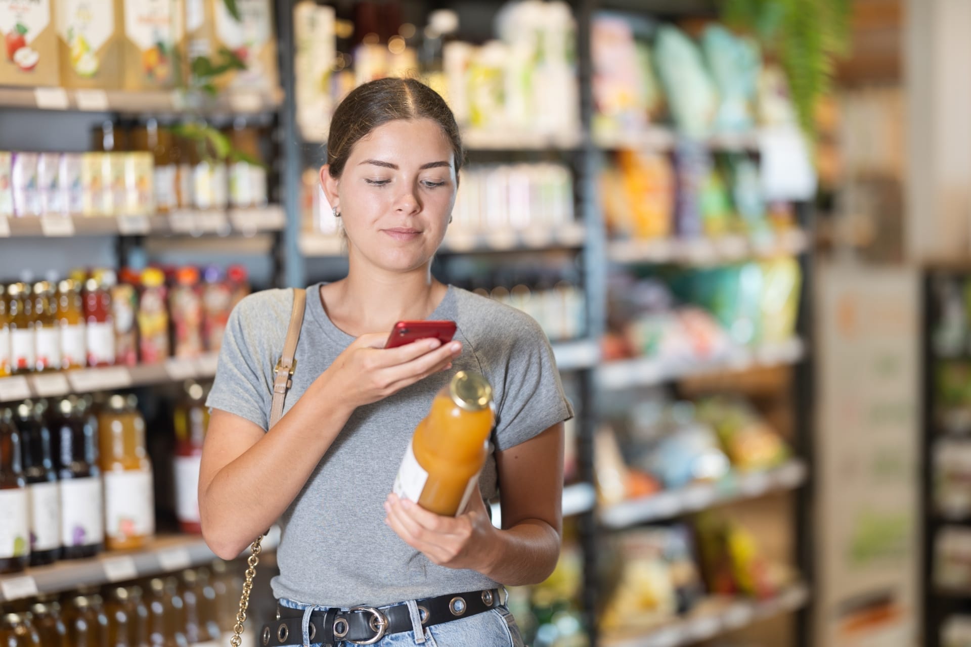
- Digital Twin & Smart Packaging: QR-Codes, NFC, AR – Verpackung als Interface zum digitalen Markenerlebnis.
- Minimal Impact Packaging: Reduktion von Material, Gewicht und Transportvolumen auf das Nötigste.
Wir verstehen diese Trends nicht nur theoretisch, sondern setzen sie in konkreten Projekten um – z. B. in unseren Future-Product-Konzepten.