ROOTS
“Young Talents” showcases visionary food and packaging concepts developed as part of the Packaging Design project workshop at the Media University Frankfurt. Under the guidance of guest lecturer Andreas Milk, students develop brands and products for the food industry of tomorrow—strategically sound, creatively conceived, and consistently designed with packaging in mind.
Less alcohol, but no less enjoyment: The “Sober Curious” trend is changing the way people consume alcohol mindfully, but genuine alternatives with character are still rare. Many non-alcoholic beverages taste too sweet, too simple, and are easily interchangeable. There’s a lack of complex, gourmet options for anyone who wants to drink less alcohol without sacrificing the experience. ROOTS aims to fill exactly this gap.

This project was developed by:
Andrea Sofia Perticcione
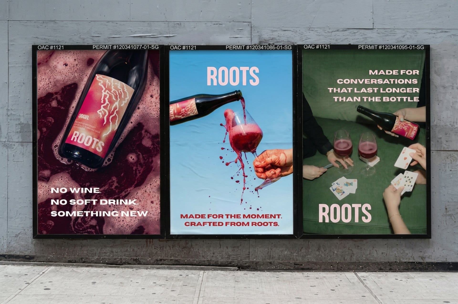
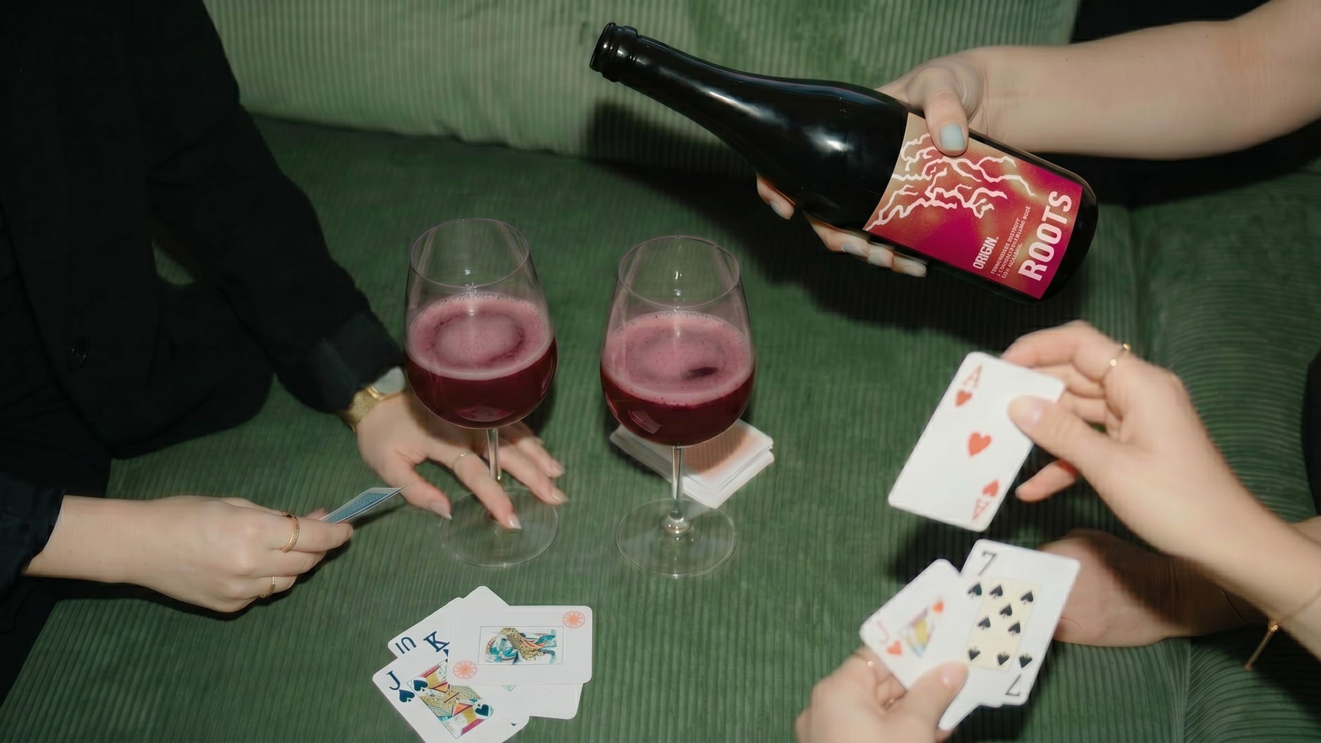
ROOTS is a fermented, non-alcoholic beverage made from roots and local botanicals, served in a wine glass and crafted like wine, without actually being wine. ROOTS does not view itself as a substitute for wine or a traditional soft drink, but rather as an entirely new beverage category with its own identity, rooted in the Alpine landscape of South Tyrol. The central message is therefore consistent: “NOT WINE. NOT A SOFT DRINK. SOMETHING NEW.” Behind this lies a clear conviction: “No alcohol. No apology.”
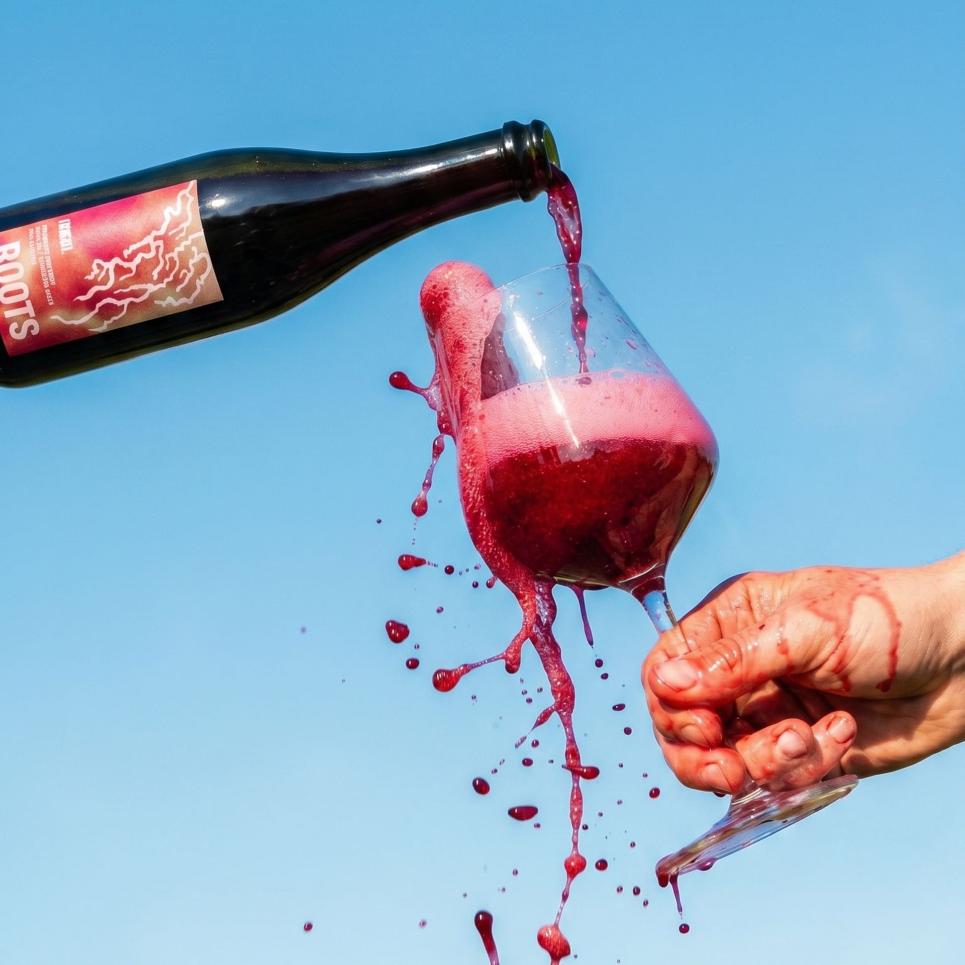
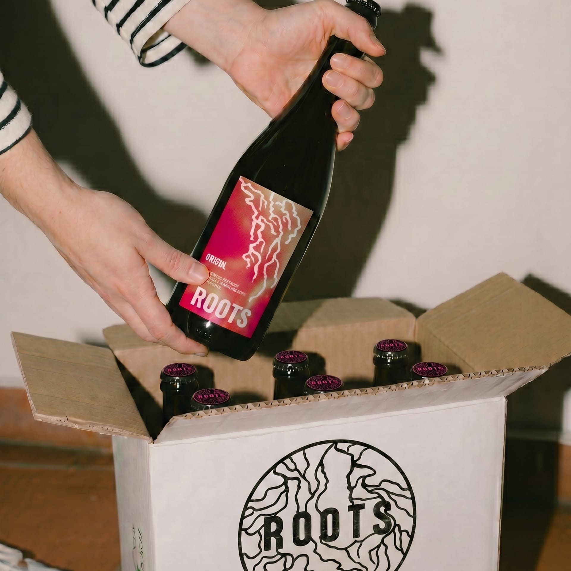
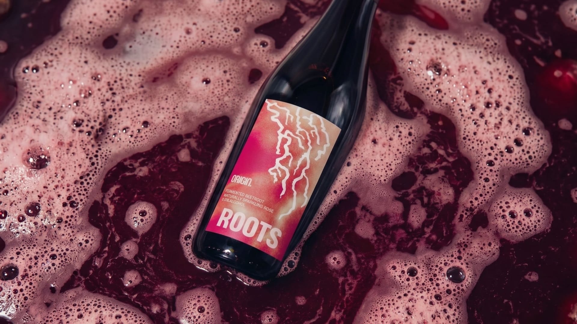
A drink doesn’t need alcohol to be complex and memorable. The first product in the line, ORIGIN, is a naturally fermented beverage with 0.0% alcohol by volume, sold in a 750-ml bottle and served at 8 °C. It is made from fermented beets, refined with rhubarb, black tea, rose hips, and Alpine juniper. In the glass, it displays an intense ruby red color, accompanied by fruity aromas, a delicate natural effervescence, and light tannins. The brand prioritizes local ingredients, sourced regionally and, in some cases, further processed as “Perfect Imperfects” in the spirit of upcycling.
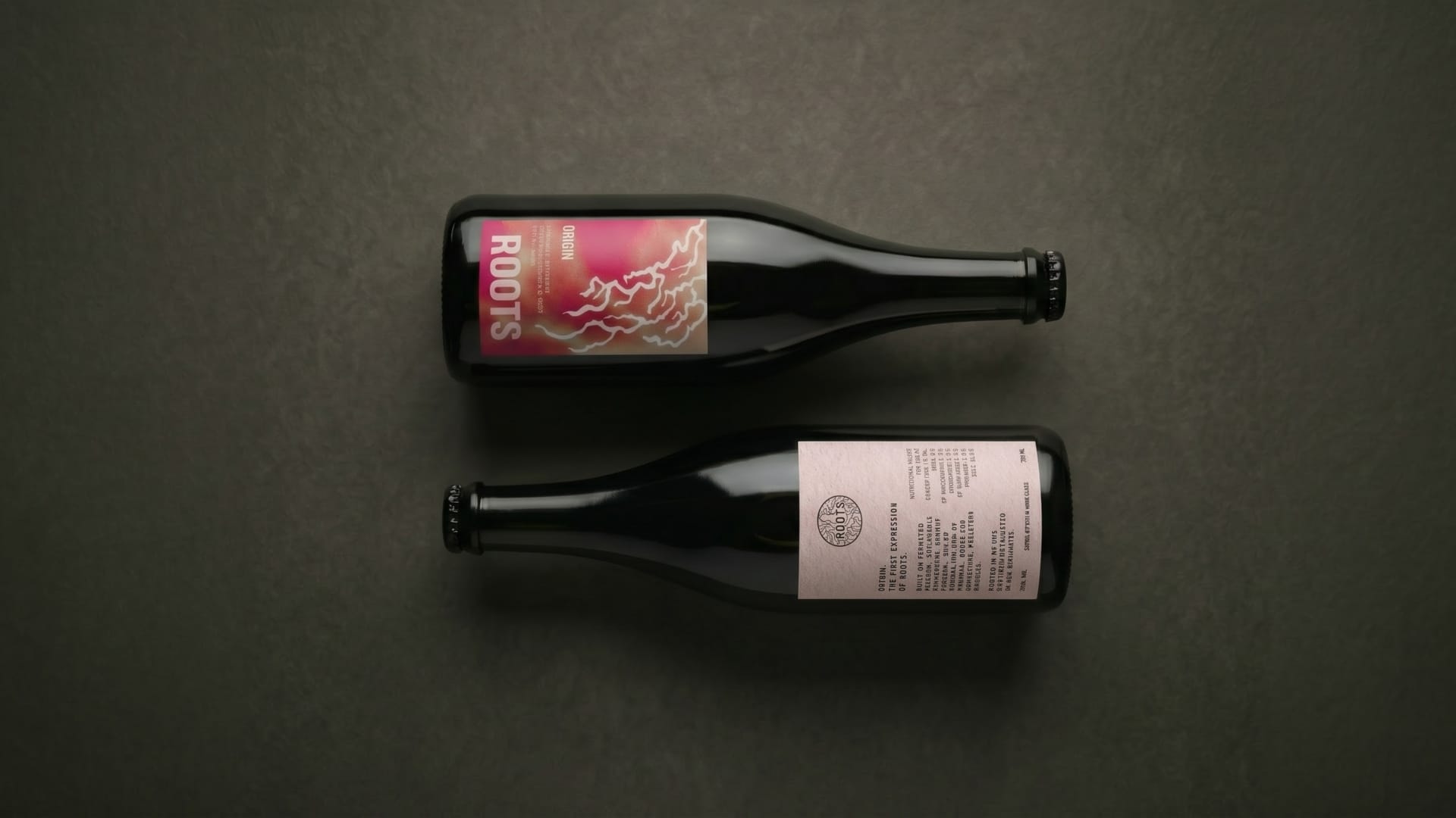
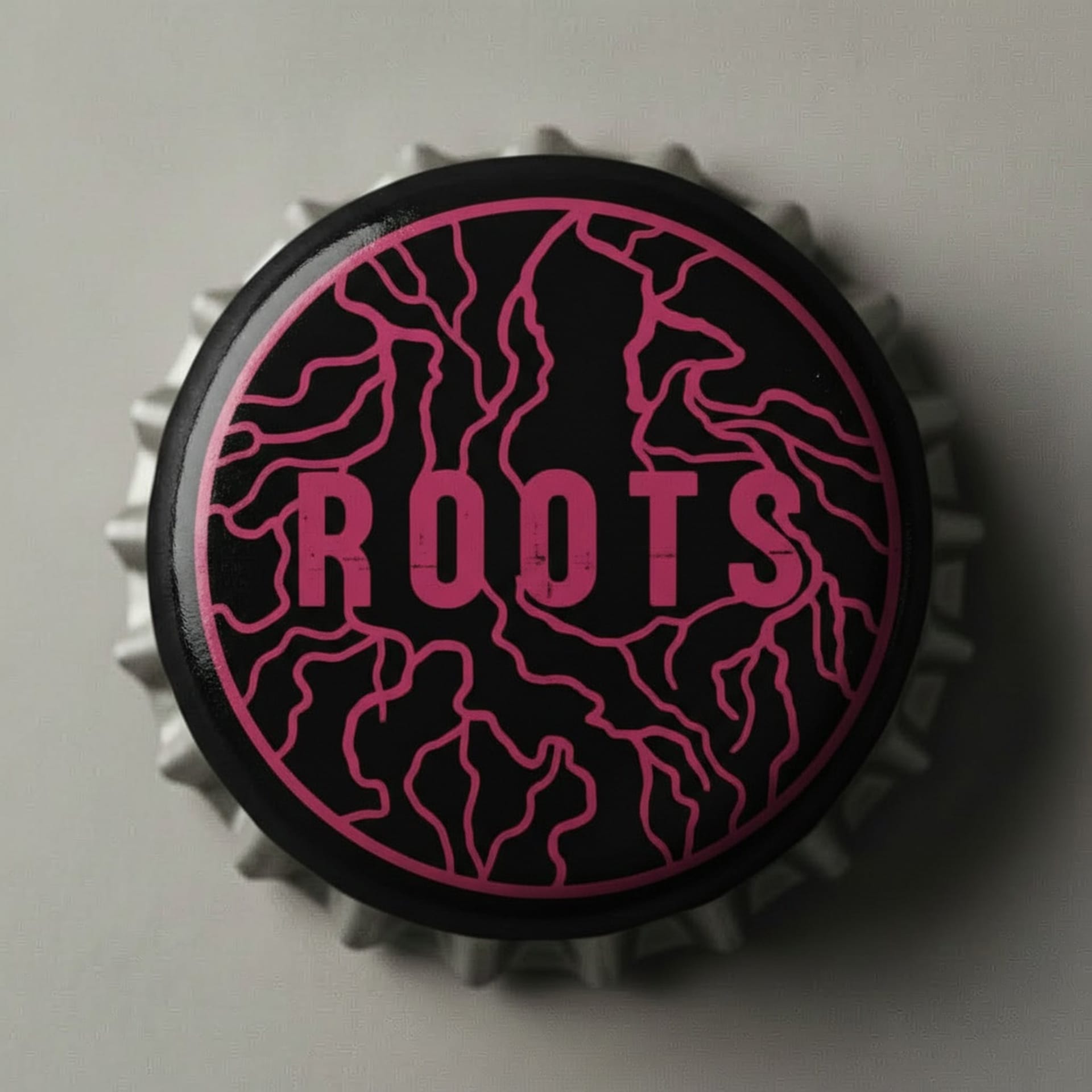
At the heart of the project is fermentation—not merely as a technique, but as a truly creative tool. Natural fermentation in the bottle develops structure, acidity, and effervescence over time. Tasted and blended by hand, without cutting corners: a slow, deliberate process that combines craftsmanship, creativity, and innovation. ROOTS also takes a consistent and clearly defined approach to design. The root emblem on the bottle cap connects raw materials, origin, and the fermentation process. That is why the name ROOTS embodies all these meanings.
Roots grow invisibly beneath the ground, deeply rooted in the soil from which they originate, and bring forth something new and visible. In the same way, fermentation takes place in the dark—a quiet, invisible process. It transforms simple ingredients into something entirely new, rooted in its own terroir. The dark brown champagne bottle protects the aroma and color from UV light. In addition, the label—made from sustainable apple paper—features the same color palette as the beverage itself. The brand’s messaging is deliberately concise, minimalist, and distinctive, avoiding wellness buzzwords like “healthy” or “detox.” It also refrains from making direct comparisons to wine in its communications.
“Made for the moment. Crafted from roots.” ROOTS is positioned in wine bars, bistros, and restaurants as an aperitif alternative and as a gastronomic companion for food pairing. The project arose from a very specific experience: that moment when you consciously choose not to drink alcohol during an aperitivo and can’t find an alternative that offers the same intensity as a glass of wine, leaving you feeling like you’re not really part of the social moment. The same applies at the table when no non-alcoholic beverage pairs well with the meal. This is precisely the gap ROOTS aims to fill: not just a non-alcoholic alternative, but a genuine taste and social experience. It’s meant for sharing, for conversations that last longer than the bottle itself.
Learn more about ROOTS here.
Copyright: Andrea Sofia Petriccione