Saltletts
The renewed appeal of a snack icon.
Services
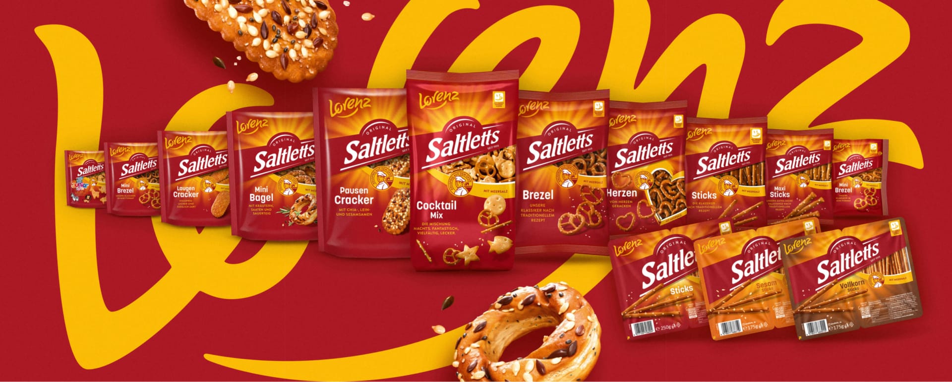
Together with Lorenz, we’ve thoroughly modernized this iconic brand while consistently building on its greatest strengths. The result is a focused redesign with maximum brand impact—ensuring clear guidance at the point of sale and a strong umbrella brand that turns heads and whets the appetite for something crispy.
The Power of an Iconic Snack.
Since 1935, Saltletts has been synonymous with distinctive pretzel products—baked to a golden brown and always deliciously crispy, just like they’re fresh from the oven.
More focus. More Saltletts.
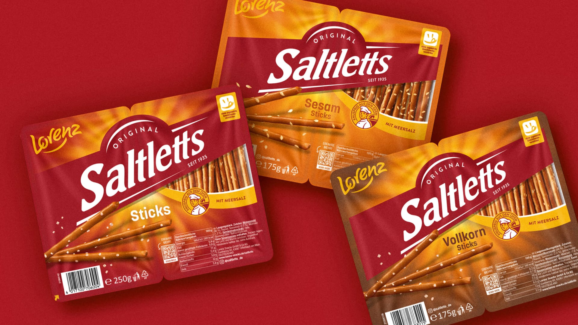
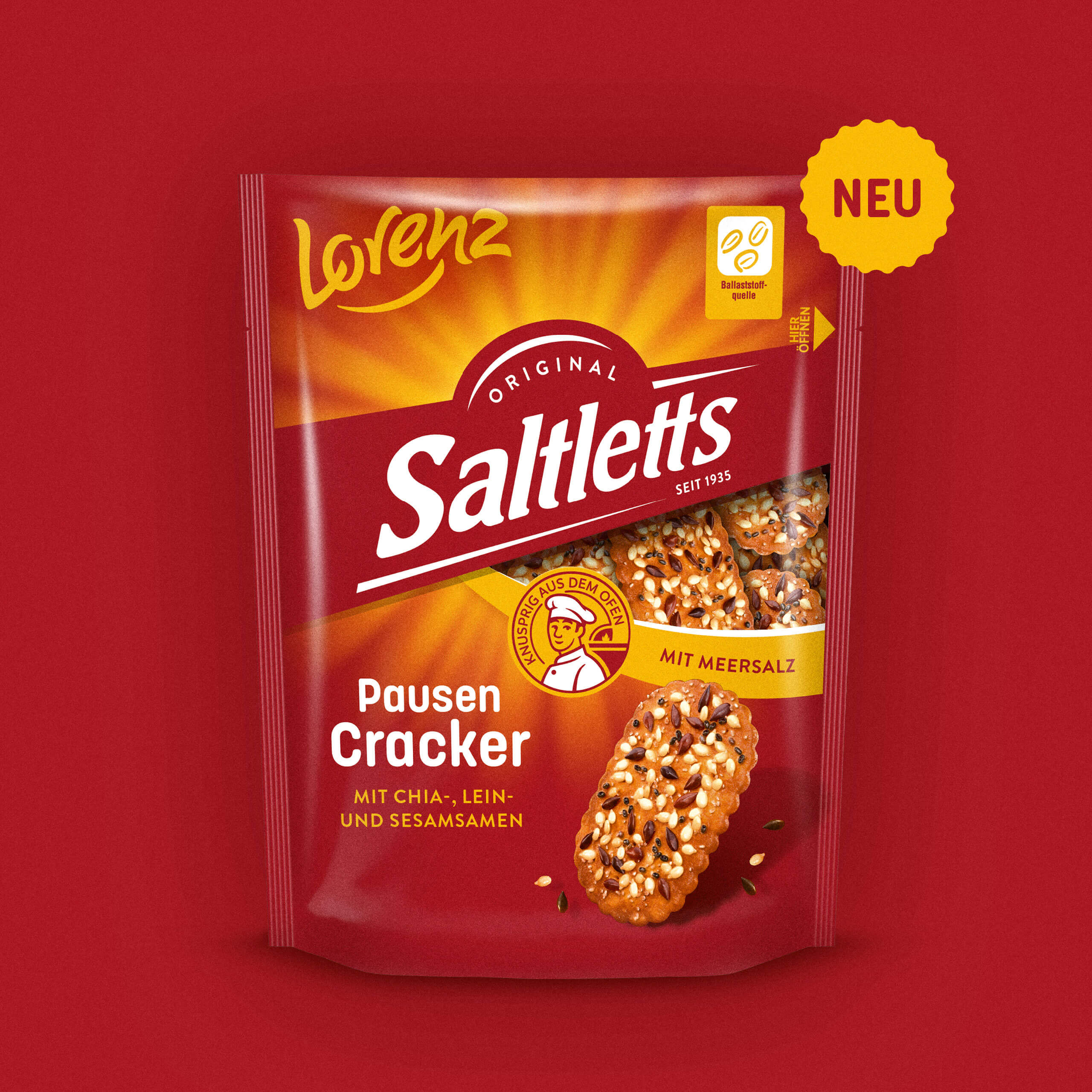
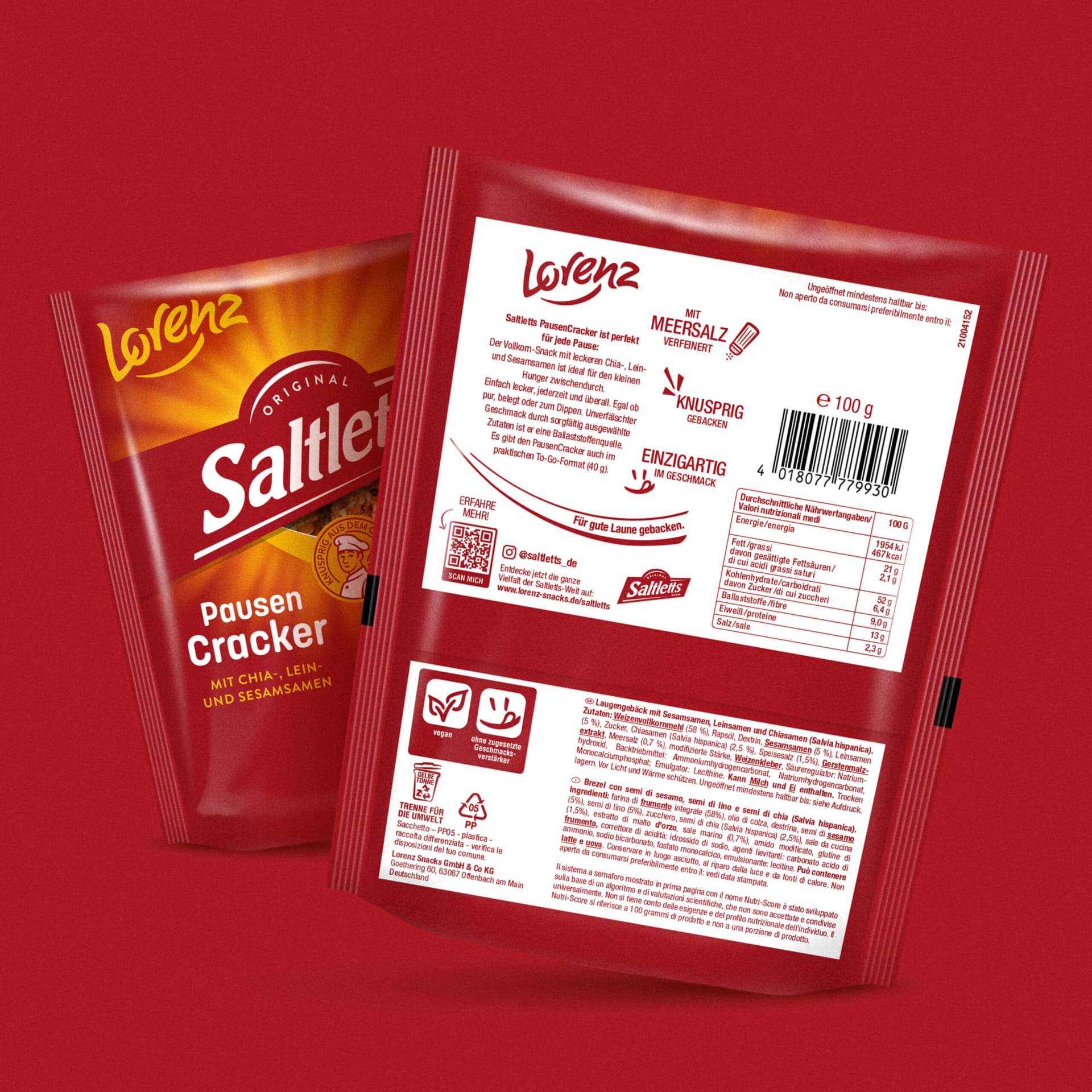
On the snack aisle, first impressions often make all the difference. That’s why we’ve completely redesigned the packaging hierarchy. The brand, product name, and variety are now much more clearly highlighted, allowing for faster recognition. New typefaces, optimized sizes, more precise placements, and a unified color scheme ensure significantly better readability and orientation—both from a distance and when directly compared on the shelf. The result: more attention, more clarity, and a significantly stronger shelf impact.
One logo. No limits.
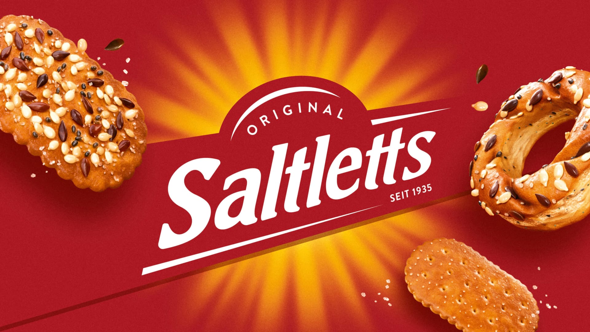
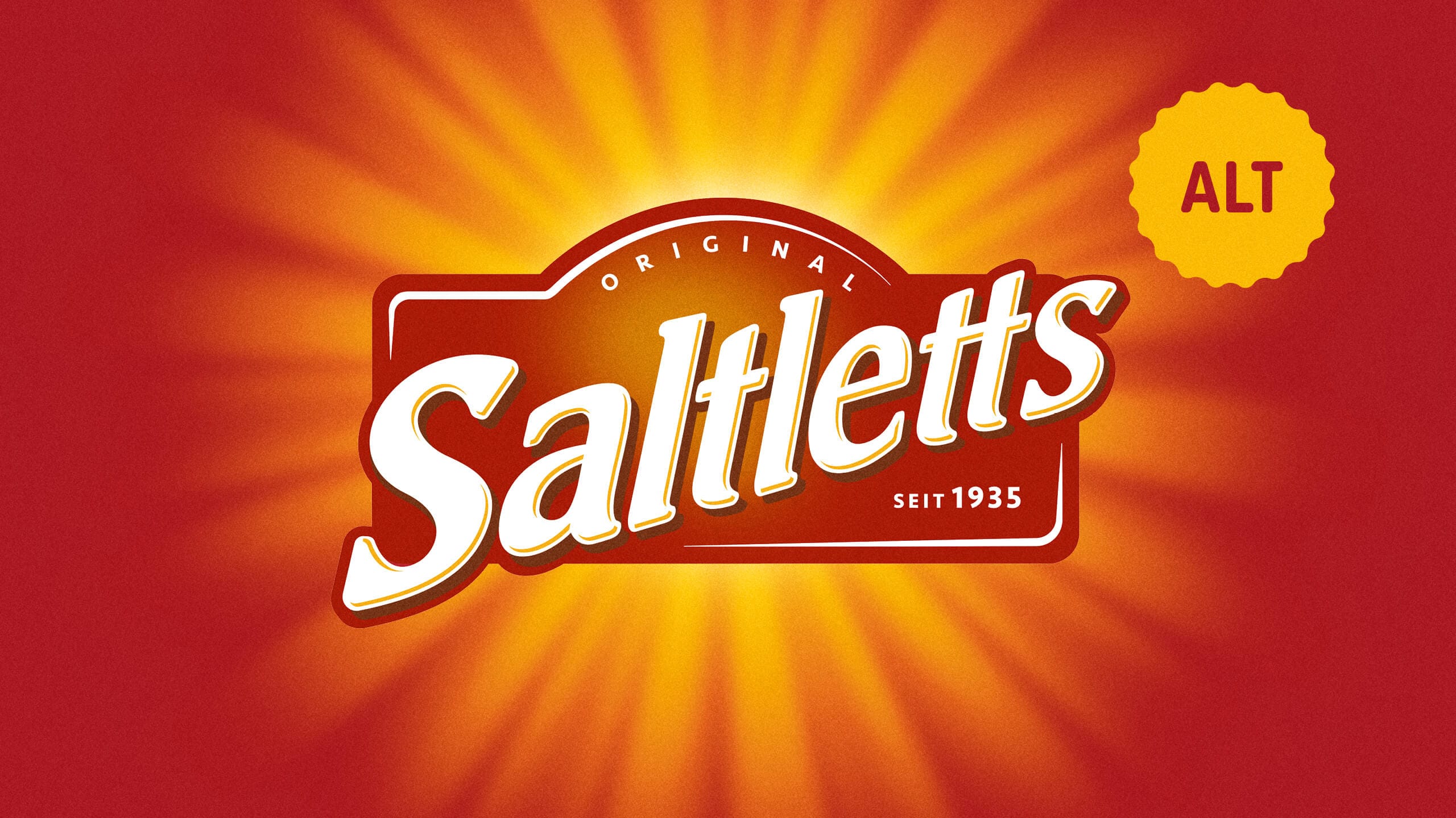
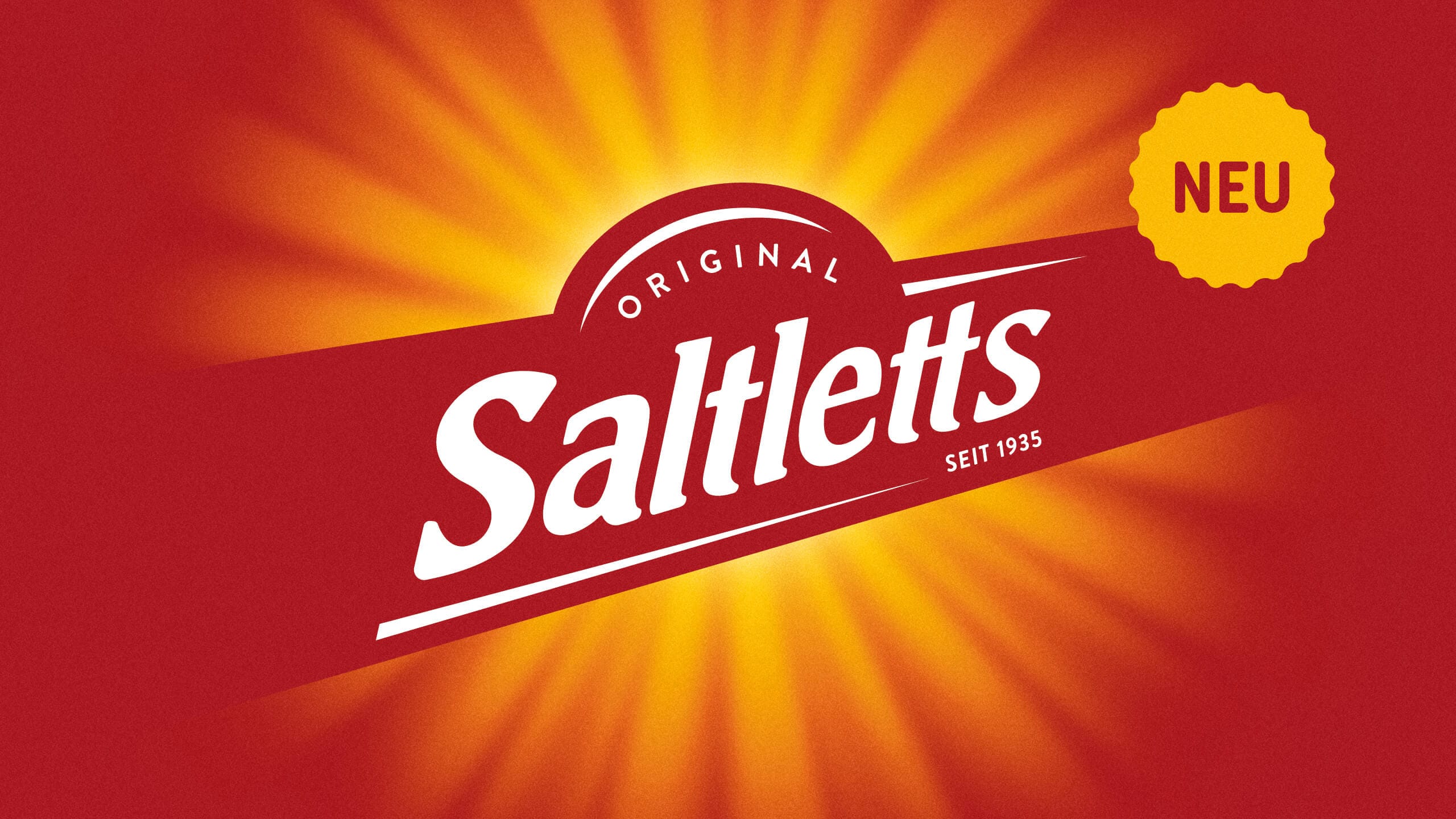
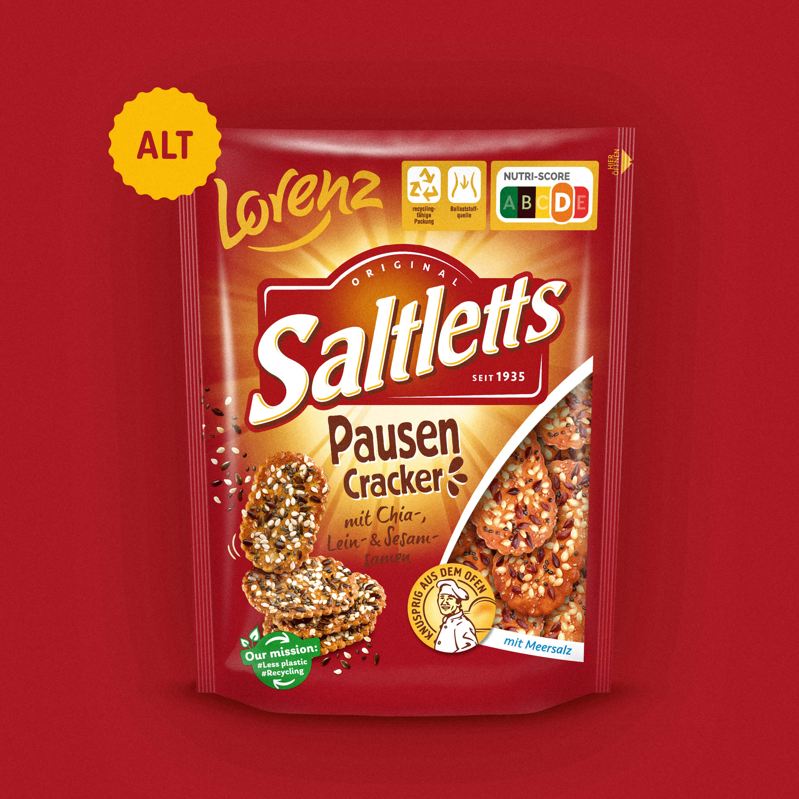
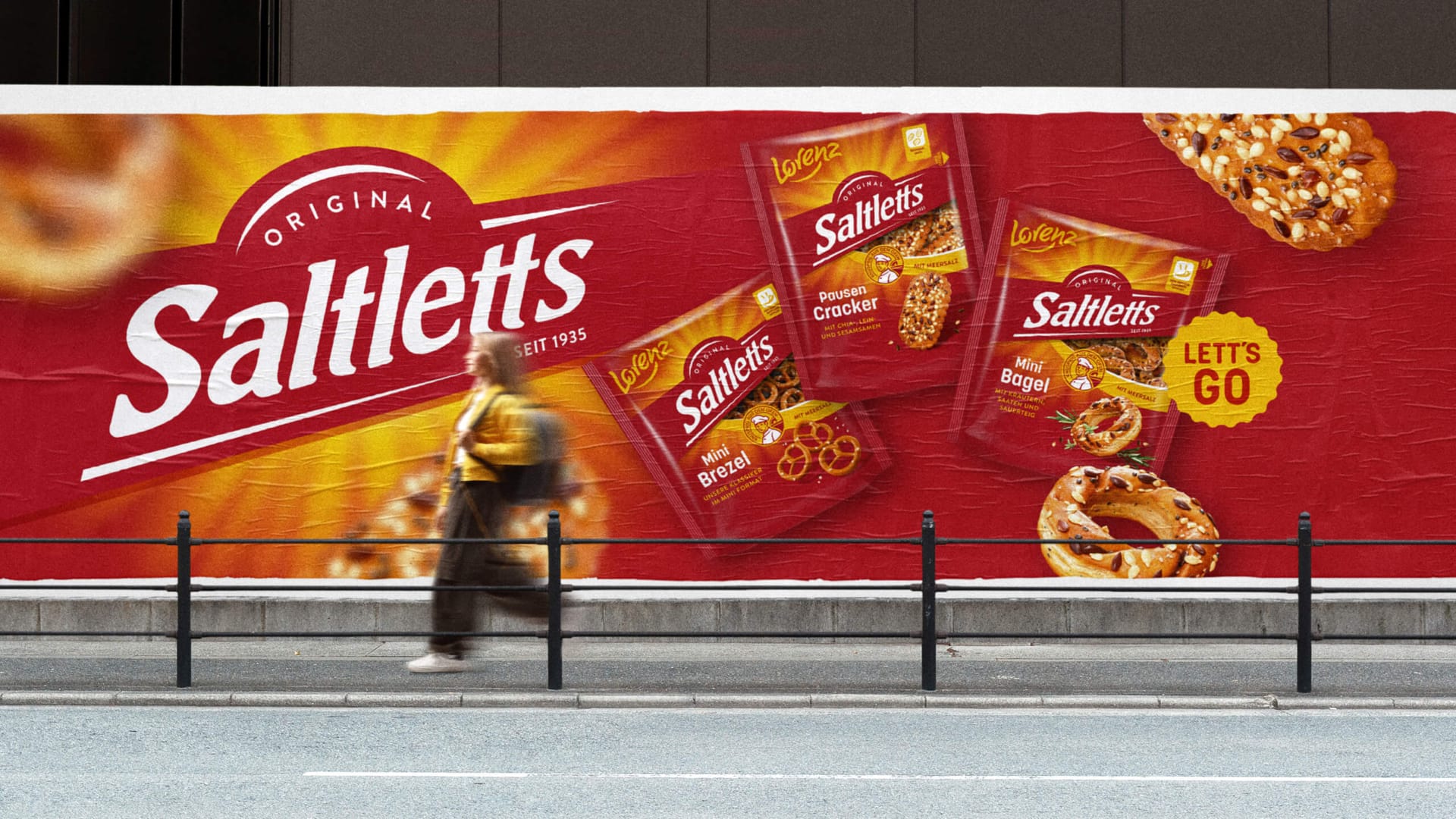
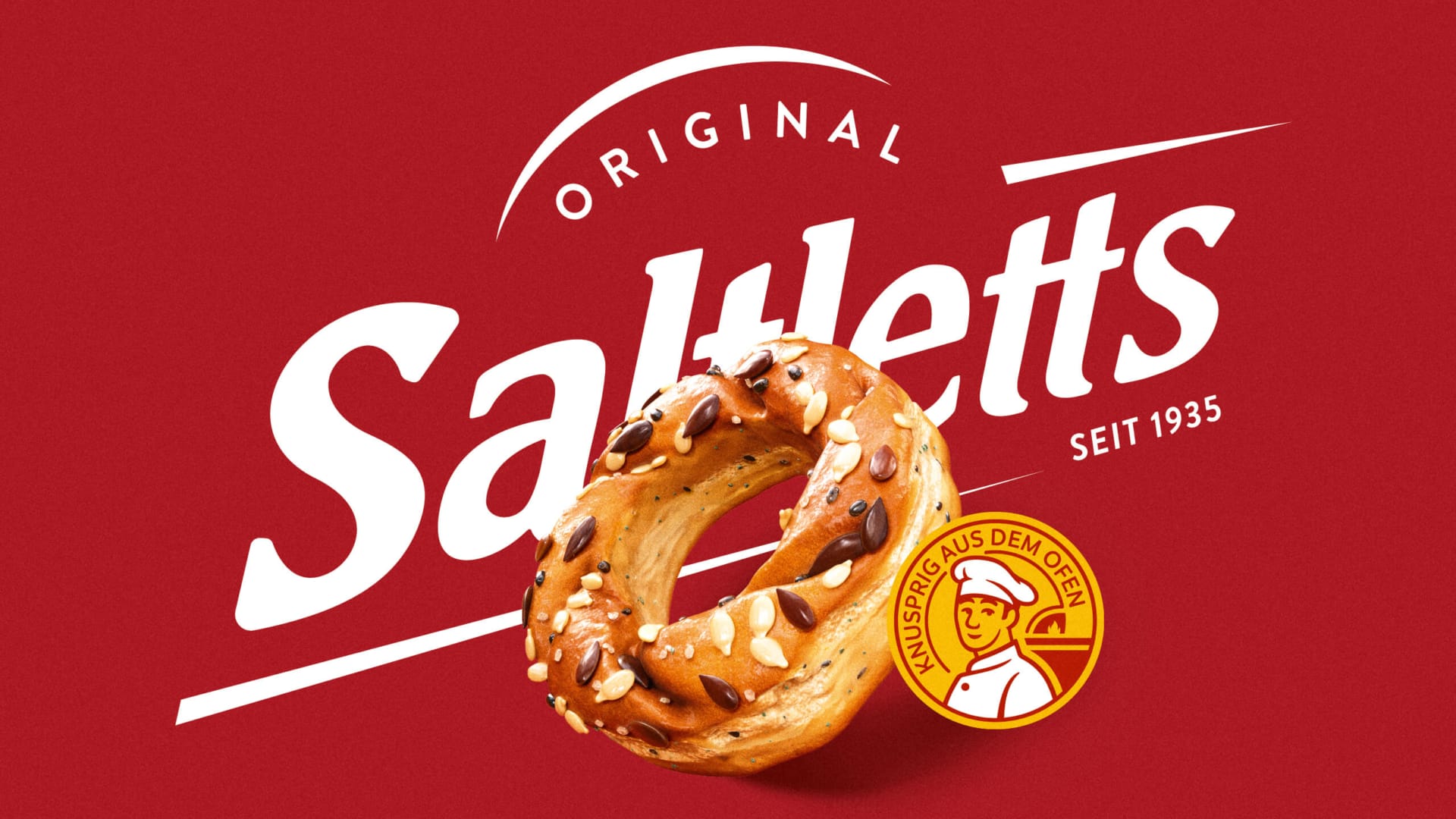
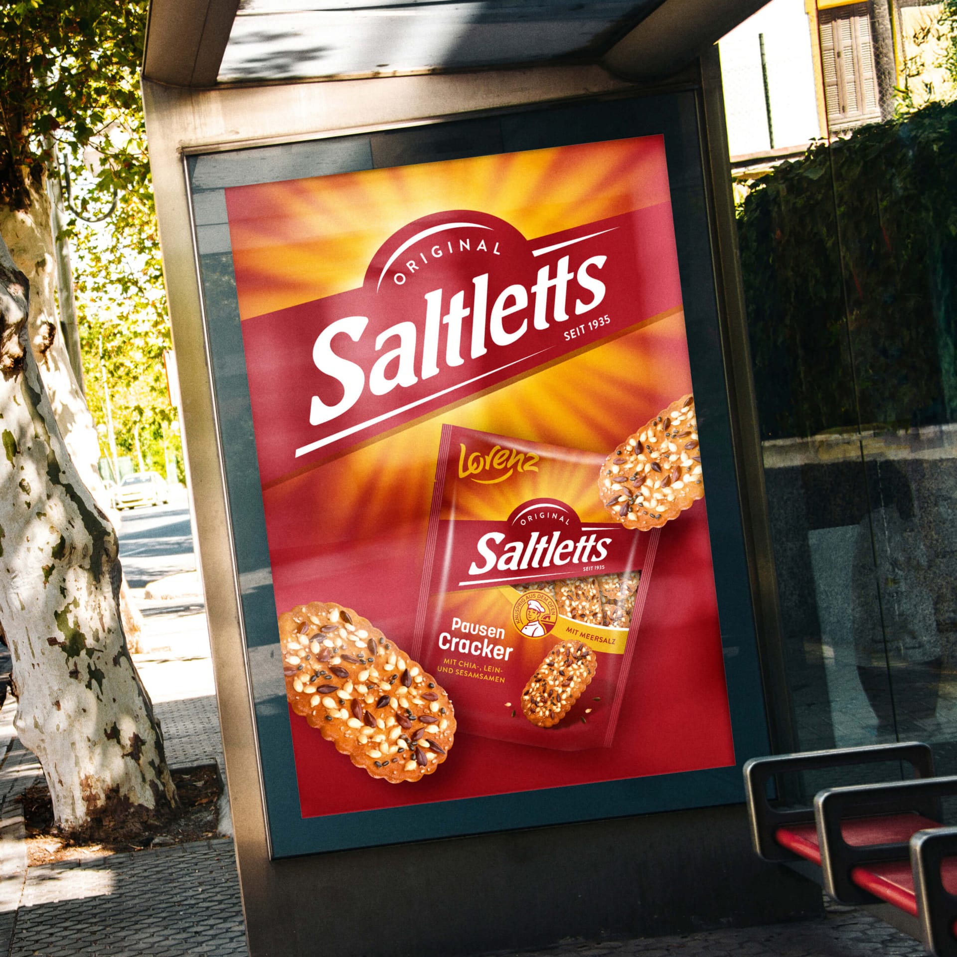
Saltletts is the original—and that’s exactly what the new design conveys. The iconic red-and-white logo with its distinctive oven shape is becoming even more central to the brand and its overarching identity. The borderless logo, which extends seamlessly across the entire package, conveys the values Saltletts has stood for for generations: true expertise in pretzel-making, the highest quality, and unmistakable crispness.
A timeless brand with a new sparkle: fresh from the oven and warm.
The consistent standardization of all design elements has resulted in a modern brand architecture with high brand recognition. The redesigned sunbeam motif conveys warmth and freshness—as if fresh from the oven. Today, the product line appears significantly more cohesive, premium, and impactful. This creates a strong umbrella brand that unites both classic products and innovations under a clear visual system.
The Lorenz Smile. More energy. More charm.
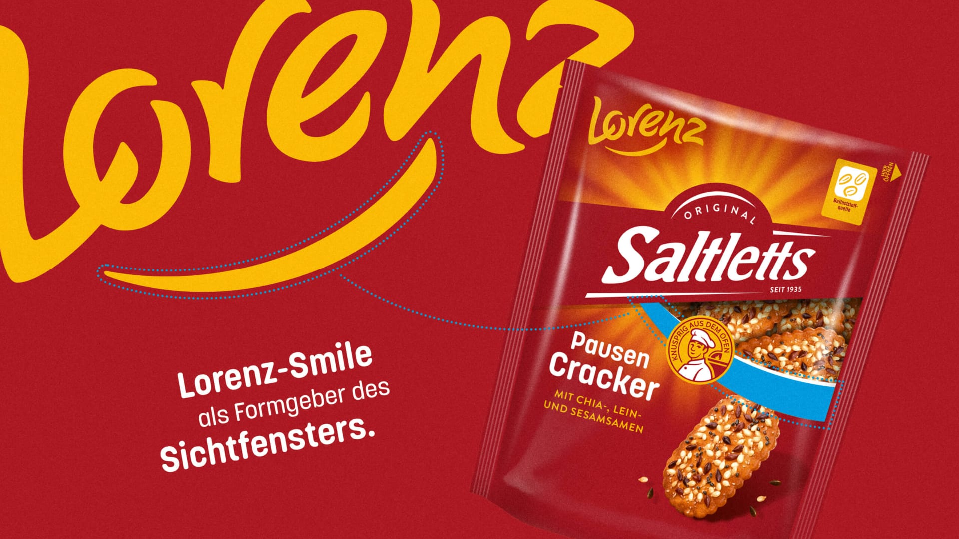
Well-known brand elements were also purposefully refined. The logo, display windows, and brand architecture were given more dynamic lines and more harmonious proportions. The “smile” in the Lorenz logo (underscore) served as the inspiration for the shape of the new display windows. They create a sense of movement, dynamism, and a positive vibe. As a result, the packaging appears more modern, friendly, and emotionally engaging.
Taste Appeal Redefined.
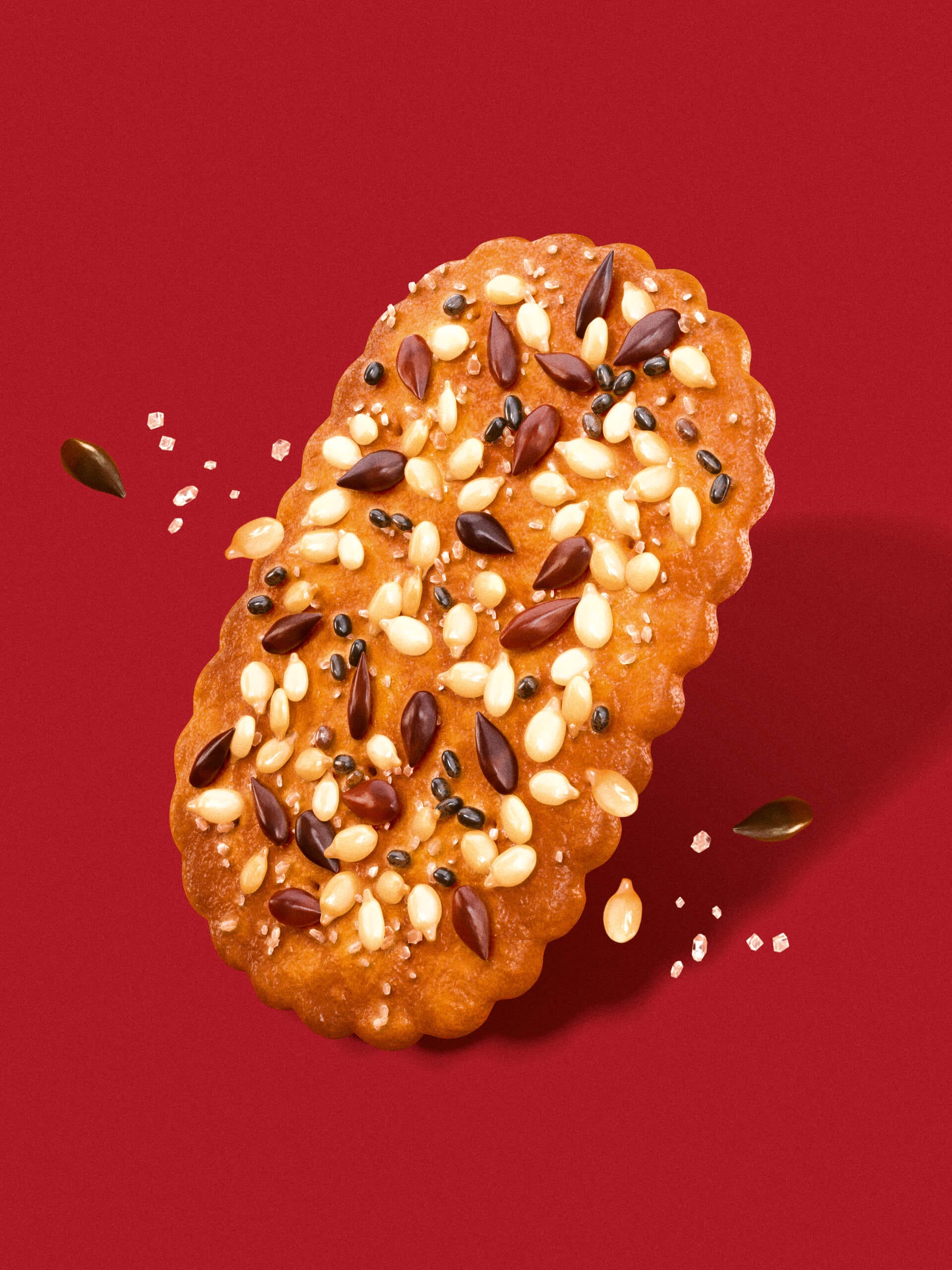
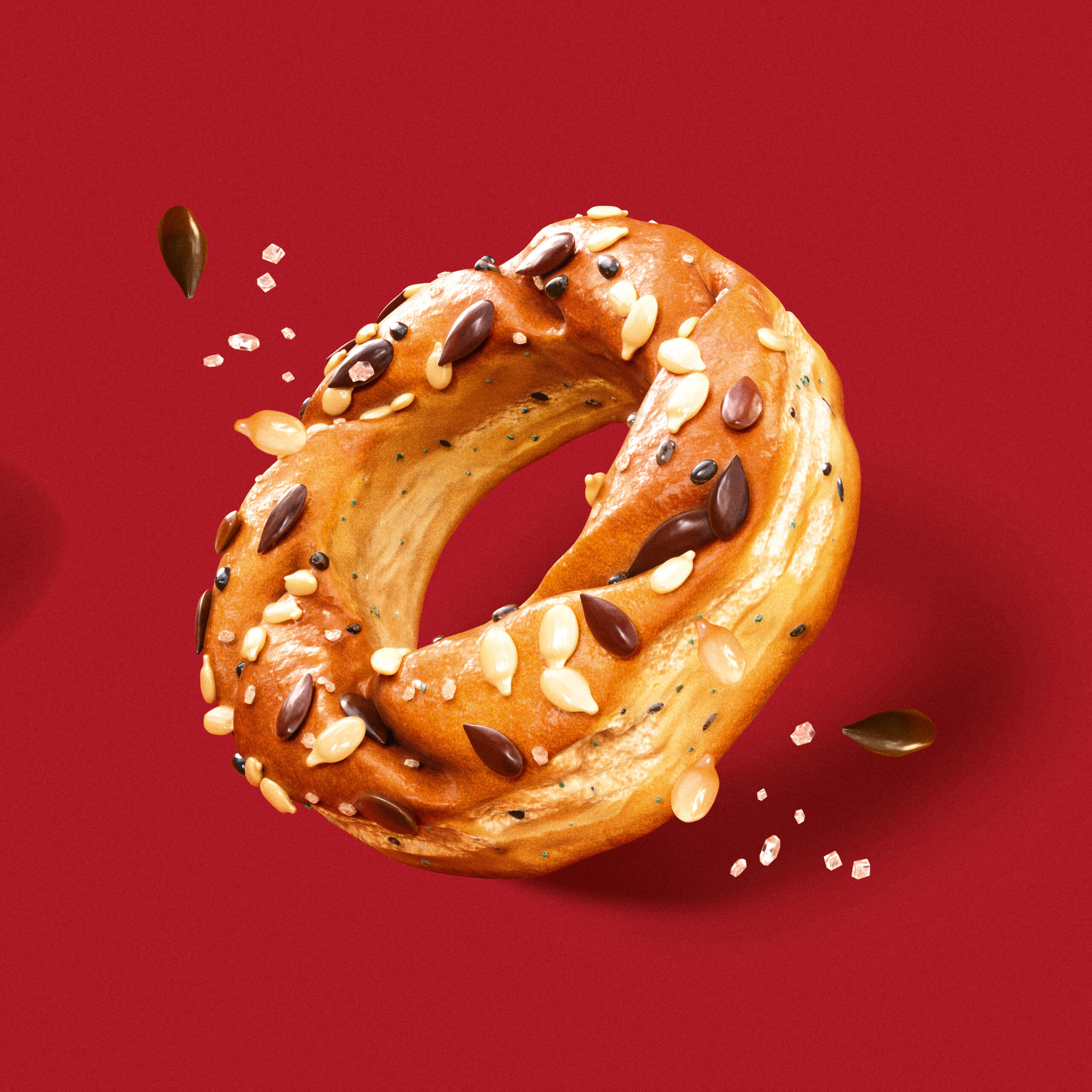
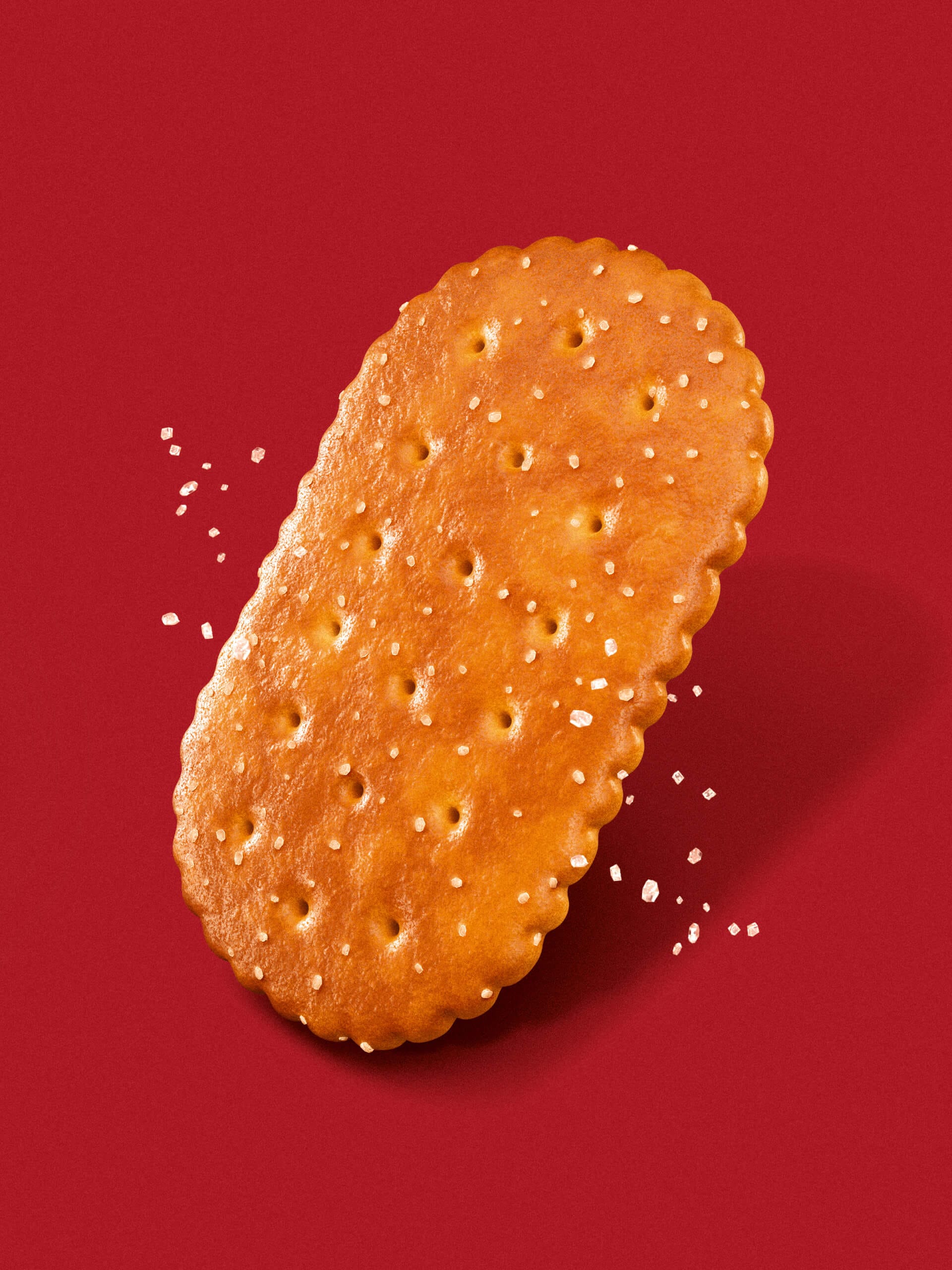
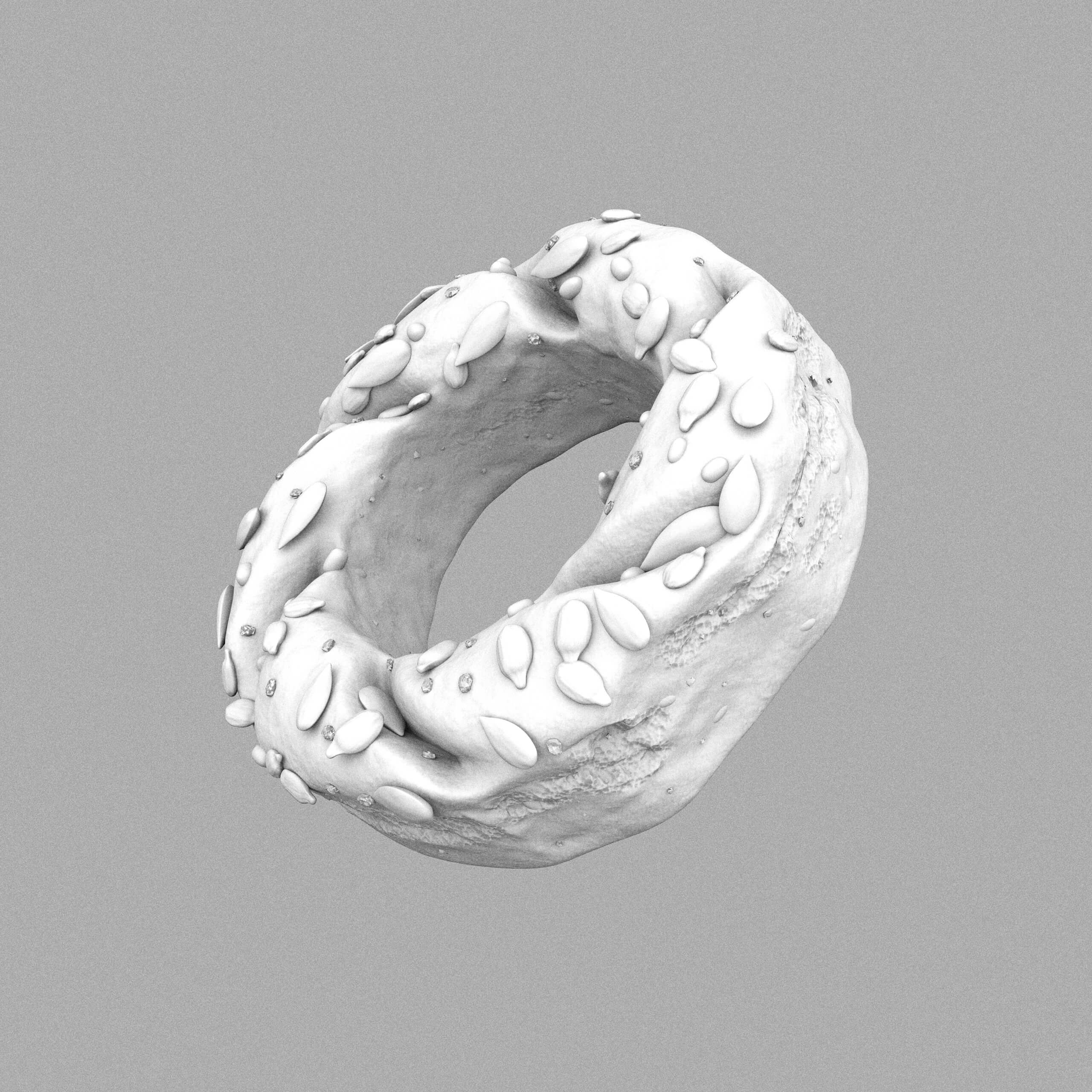
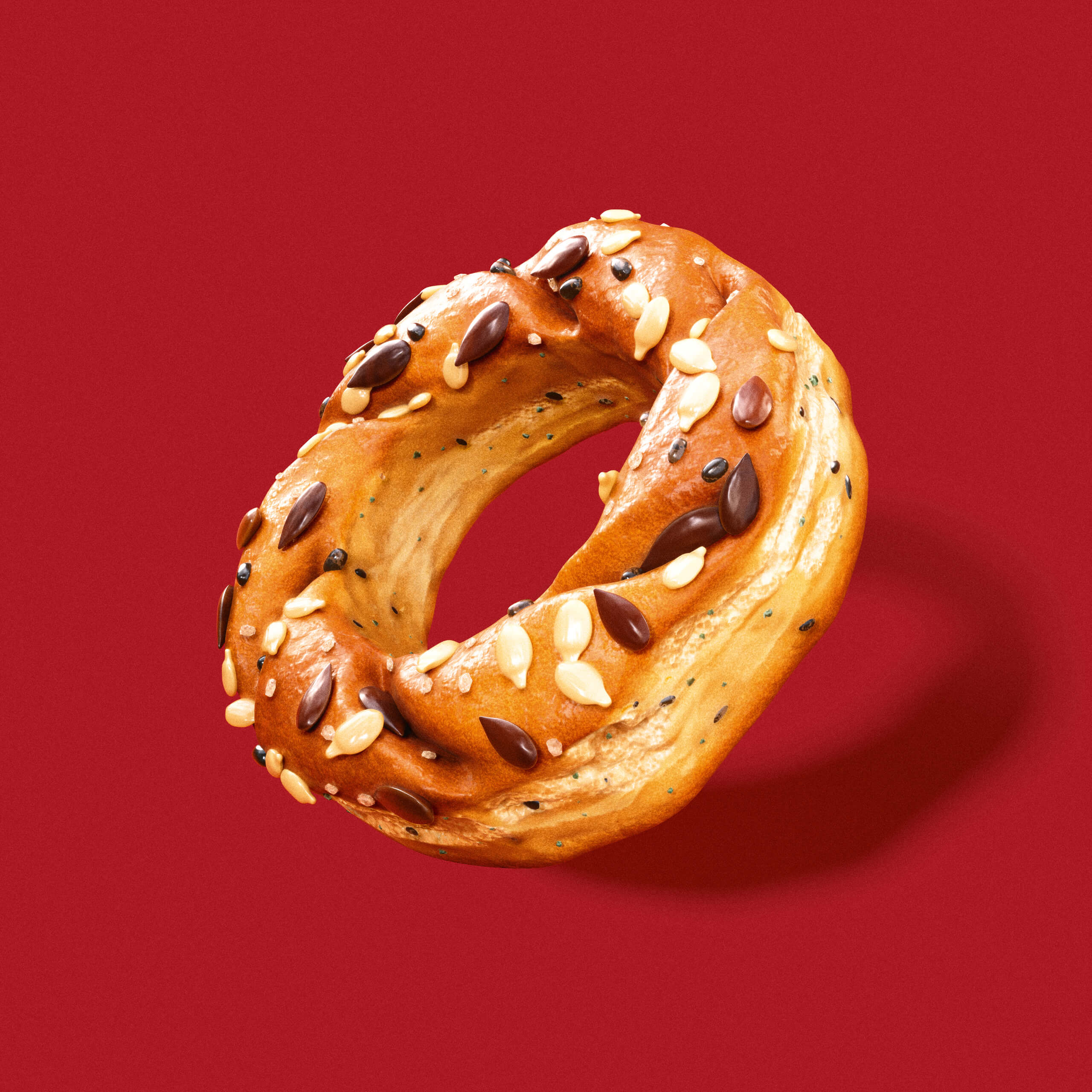
All product images were completely recreated as 3D renderings. The product shots were simplified, refined, and made more emotionally engaging, forming the basis for multifunctional use across packaging, POS, campaigns, and digital media. Each product now looks even more appetizing—golden brown, aromatic, and offering the ultimate taste experience at first glance.
A New Stage for Innovation.
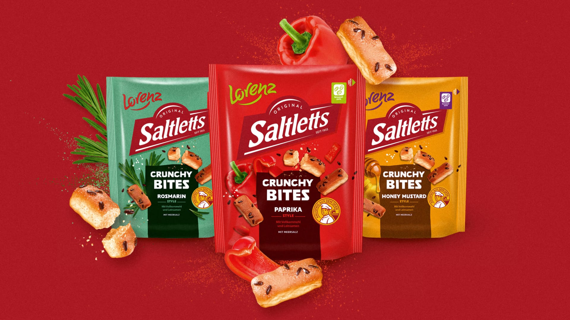
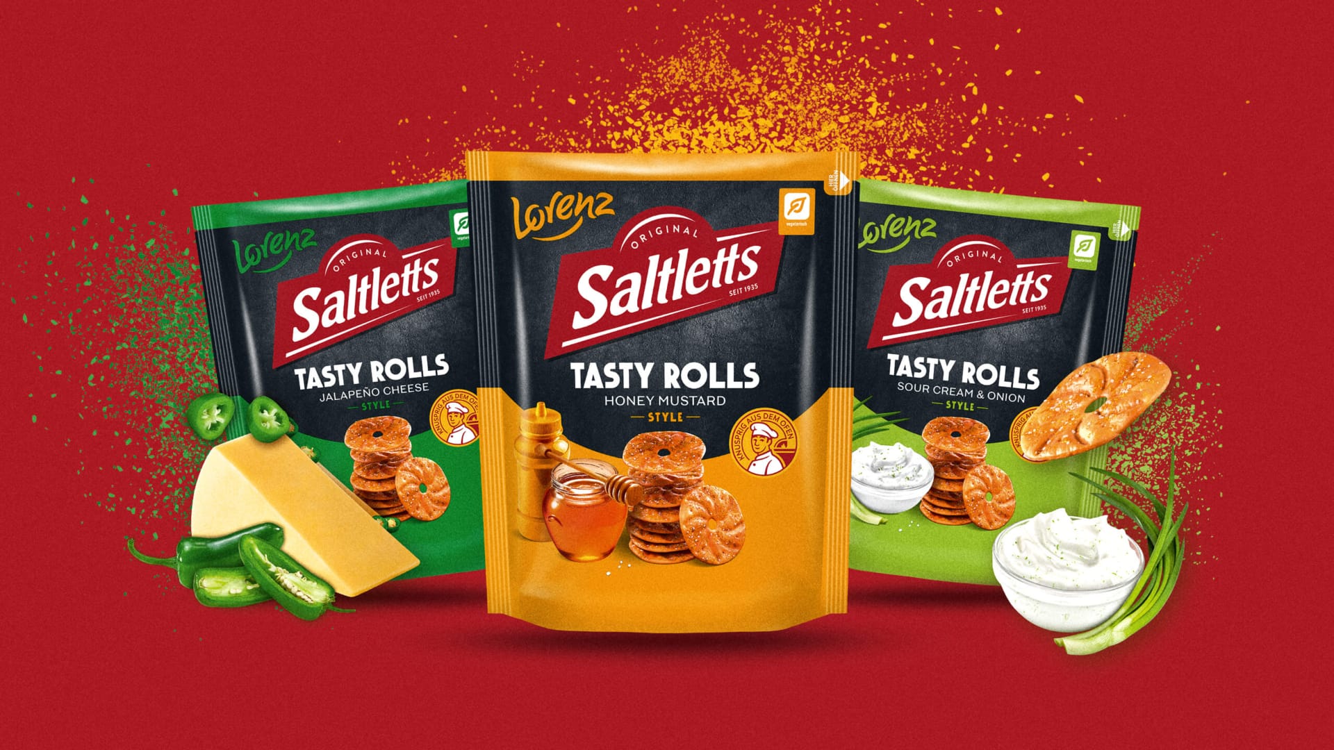
For new, flavorful products like Crunchy Bites and Tasty Rolls, we developed a distinctive design style within the new brand universe. Expressive flavor codes, modern visual presentations, and a high “appetite factor” capture attention and create desire, all while seamlessly integrating with the new Saltletts umbrella brand.
The elephant in the room.
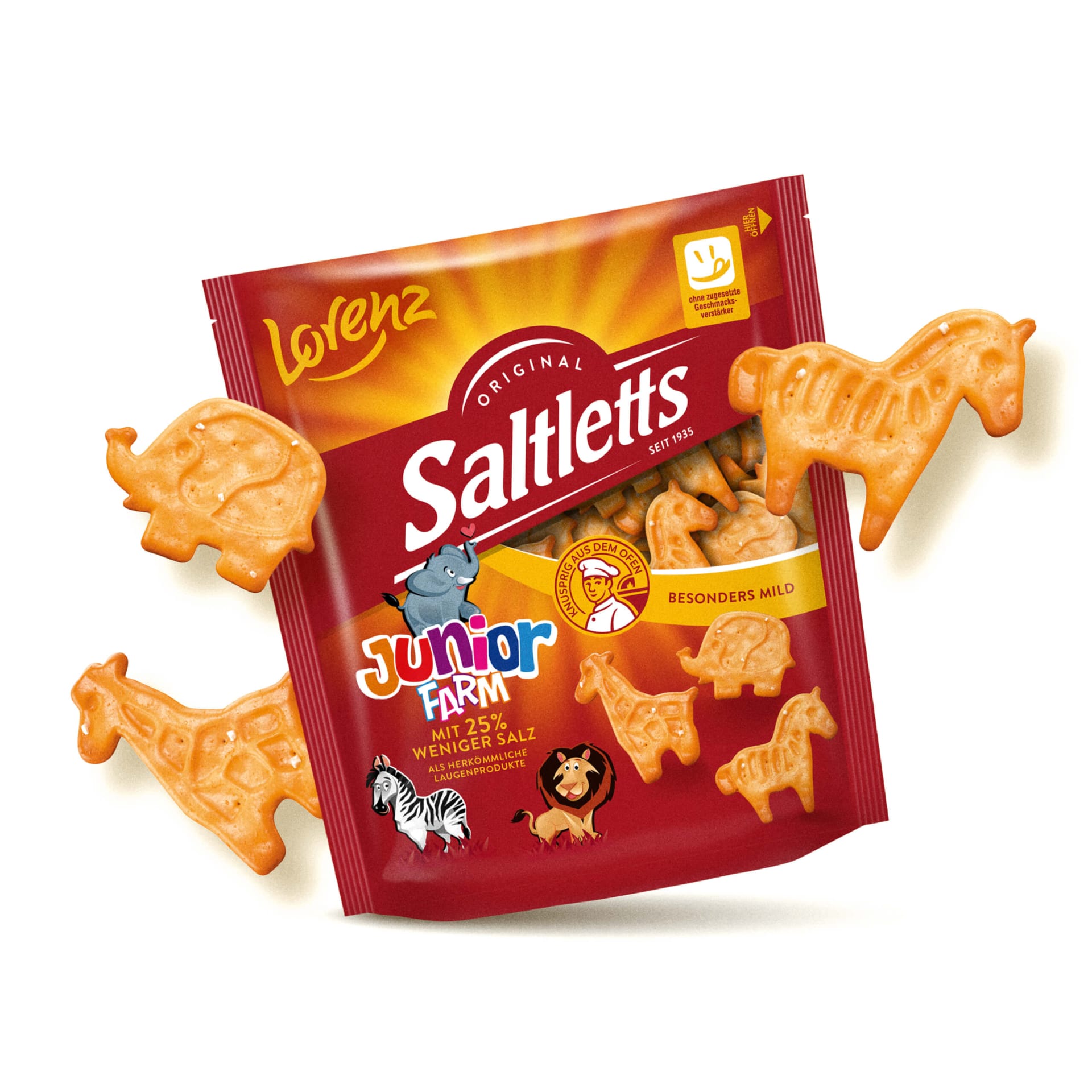
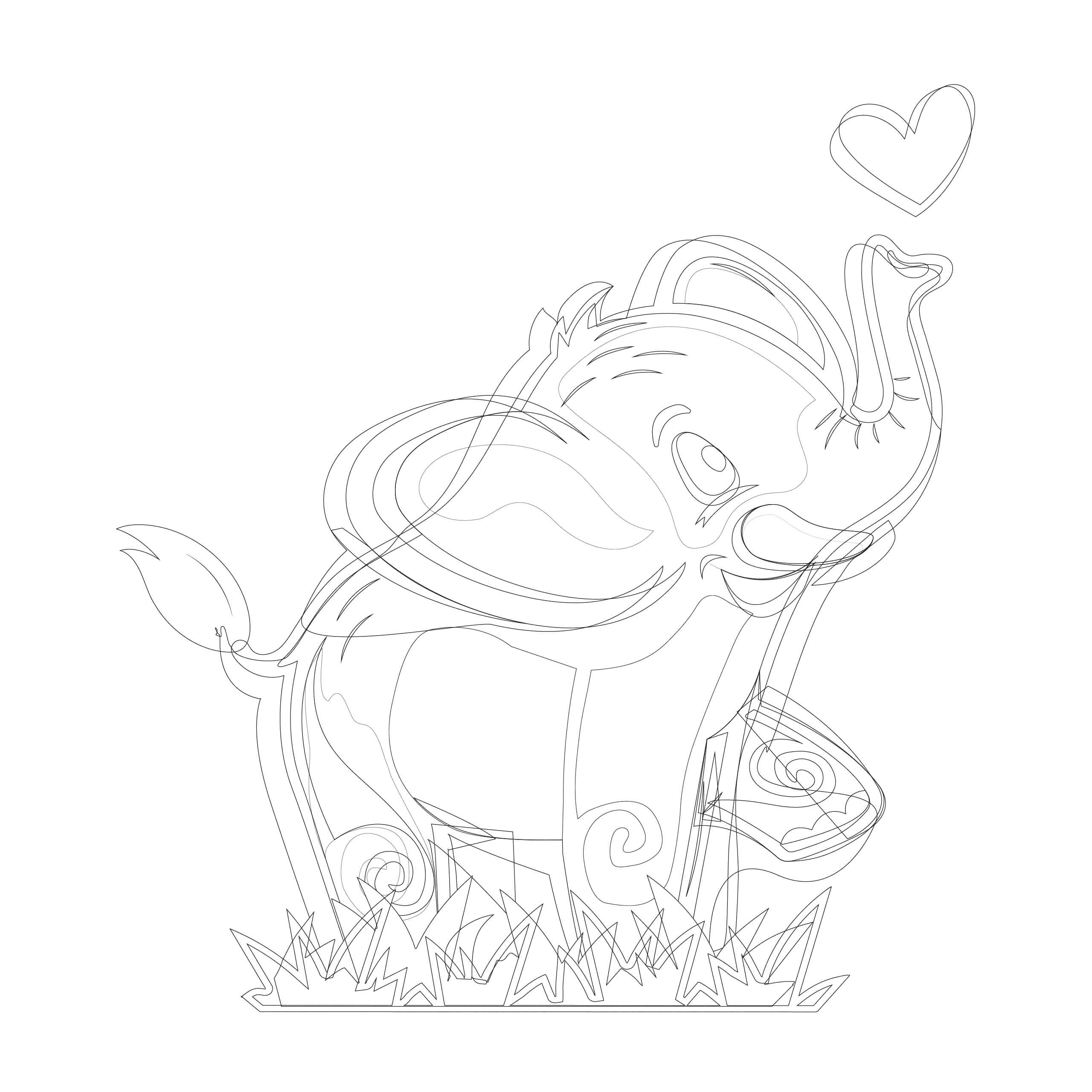
In addition to revamping all graphic elements, the animal illustrations for Junior Farm were also updated. New hand-drawn and vectorized illustrations—such as a little elephant—give the line even more personality, warmth, and authenticity, and underscore the brand’s endearing character. Great snacking fun, even for the littlest ones.

Ready for the shelf. Ready for the future.
Today, Saltletts presents itself as a modern, strong snack brand with maximum brand recognition—eye-catching on the shelf, visible in campaigns, and soon to be found in the snack bowl on your coffee table.
Want to give your brand more appeal, too? Let’s talk! 😉