Emmi
Lila is lactose-free.
Services
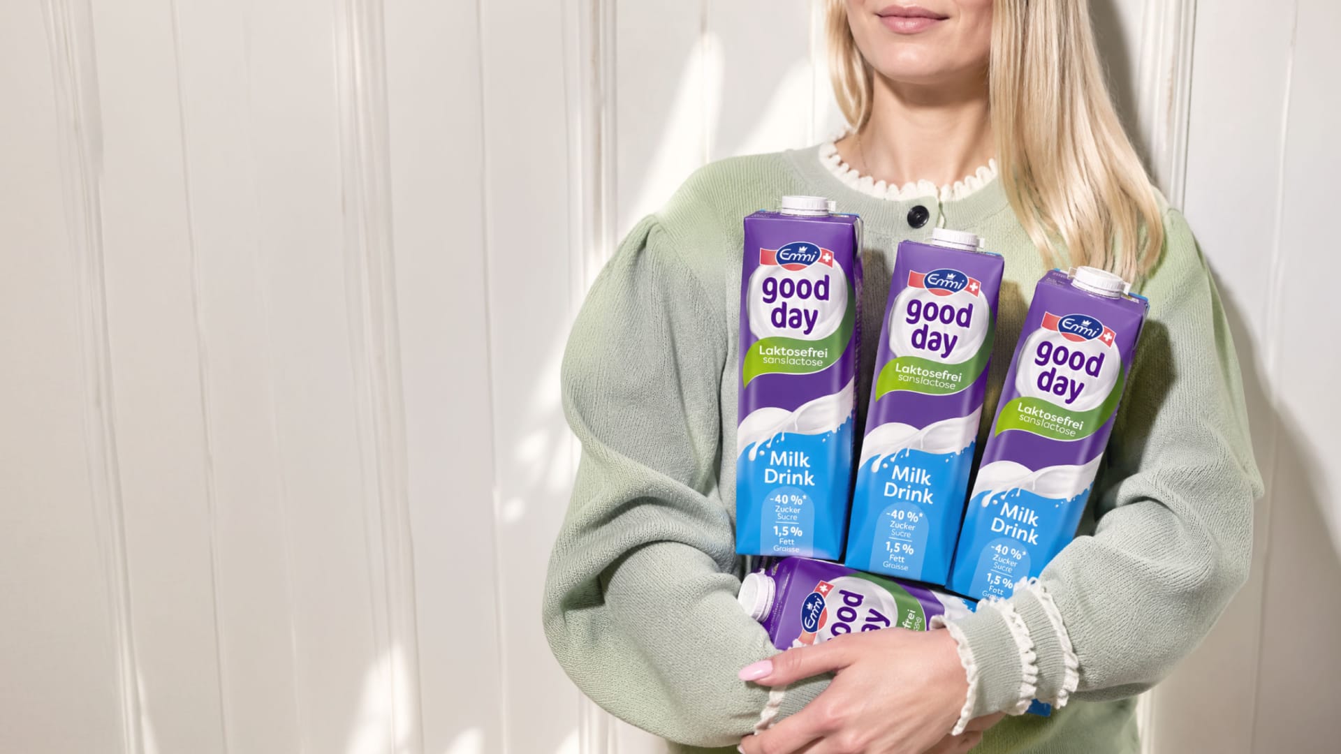
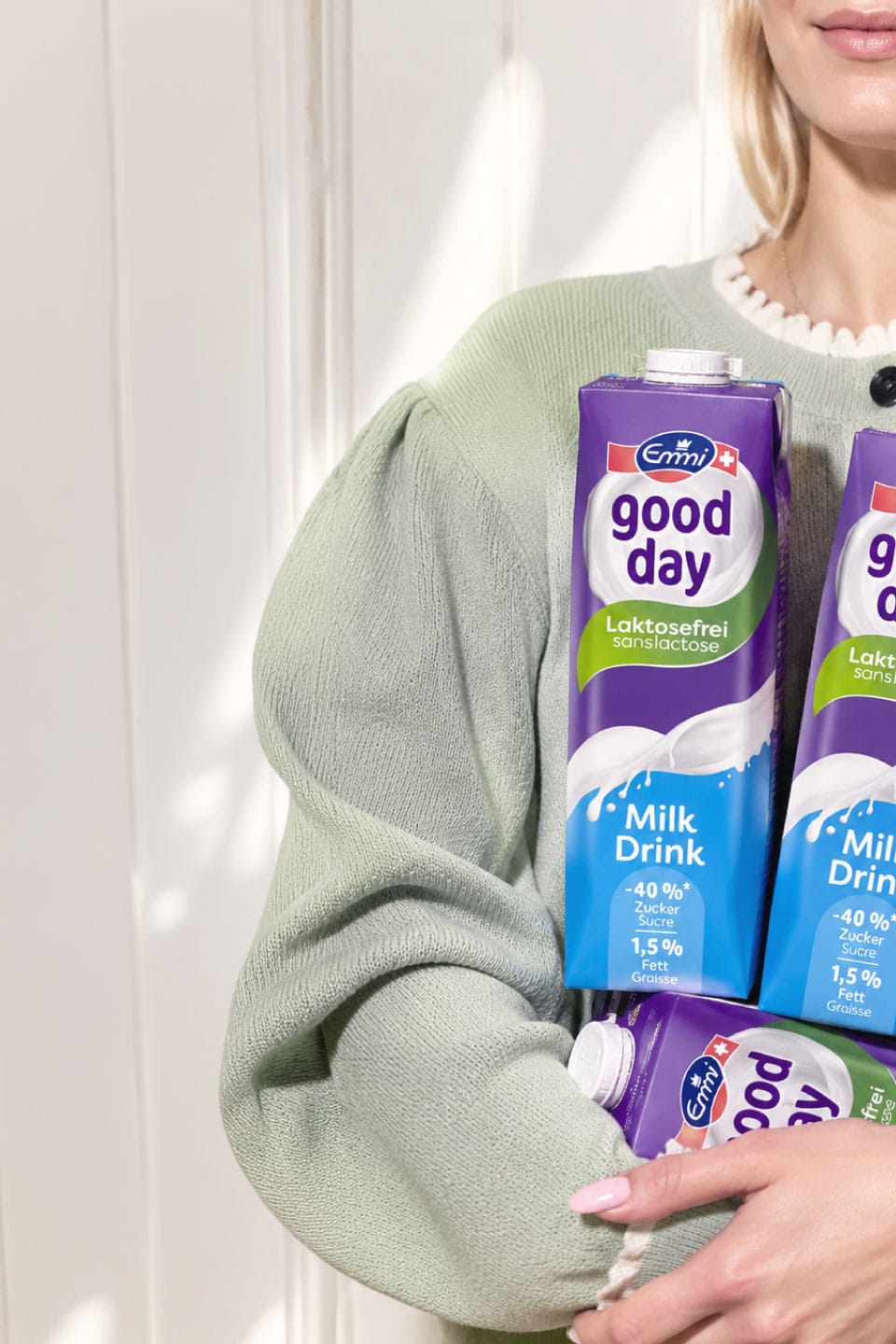
Enjoy lactose-free products without sacrificing the taste of real milk—that’s what Emmi good day stands for in Switzerland. Together with Emmi, we’ve rebranded the line: from the logo and color scheme to its shelf presence. A product line has been transformed into a brand block that’s instantly recognizable from three meters away.

A brand display you can’t miss.
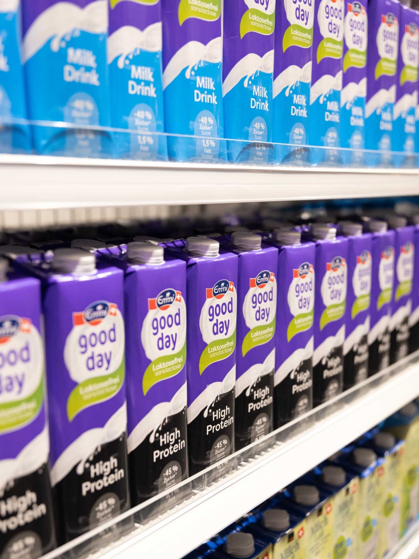
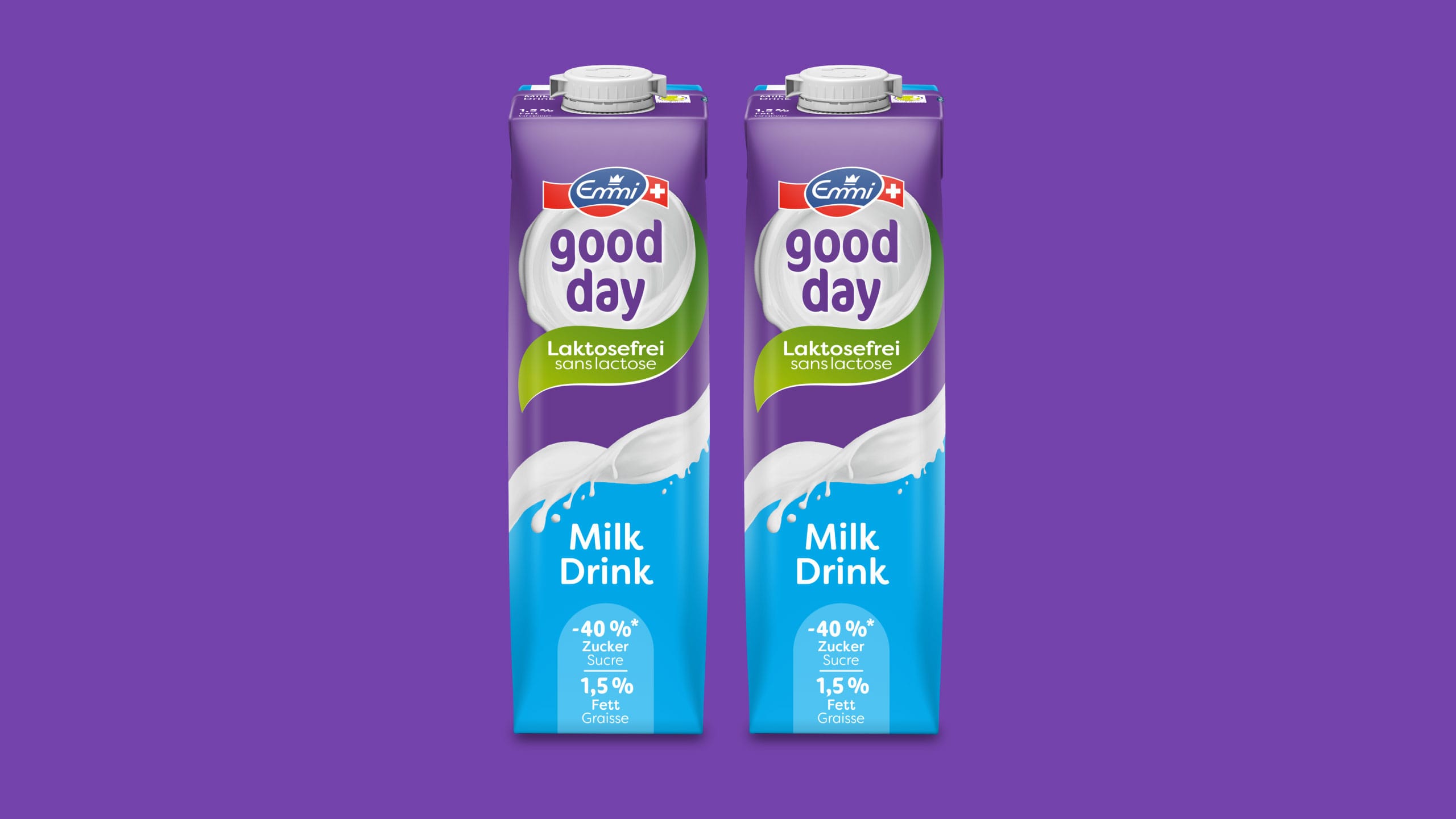
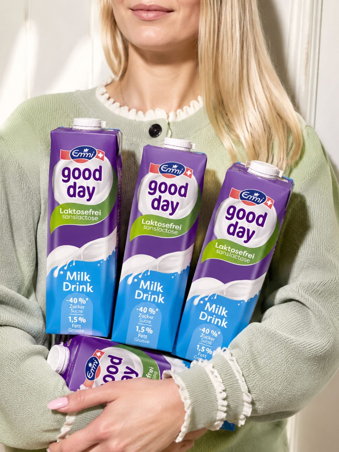
Everything on the dairy aisle is white and blue. That’s exactly why we took the purple from the “good day” logo and applied it to the entire package. What used to be a small detail is now a trademark: a purple “wall” that unifies the product line on the shelf and gives the brand maximum shelf impact. Purple means lactose-free—shoppers learn this connection in seconds.
The true pleasure of milk—lactose-free.
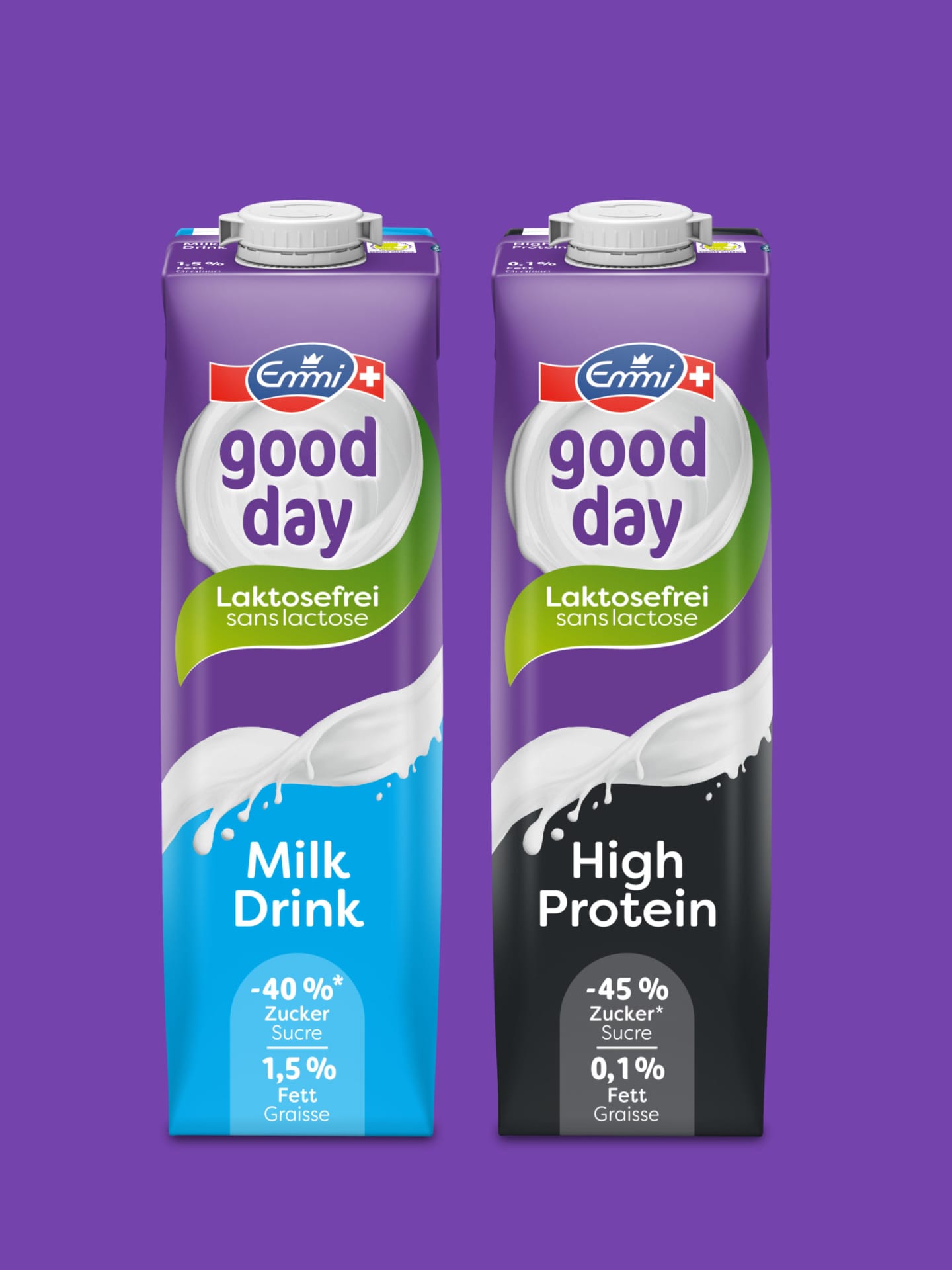
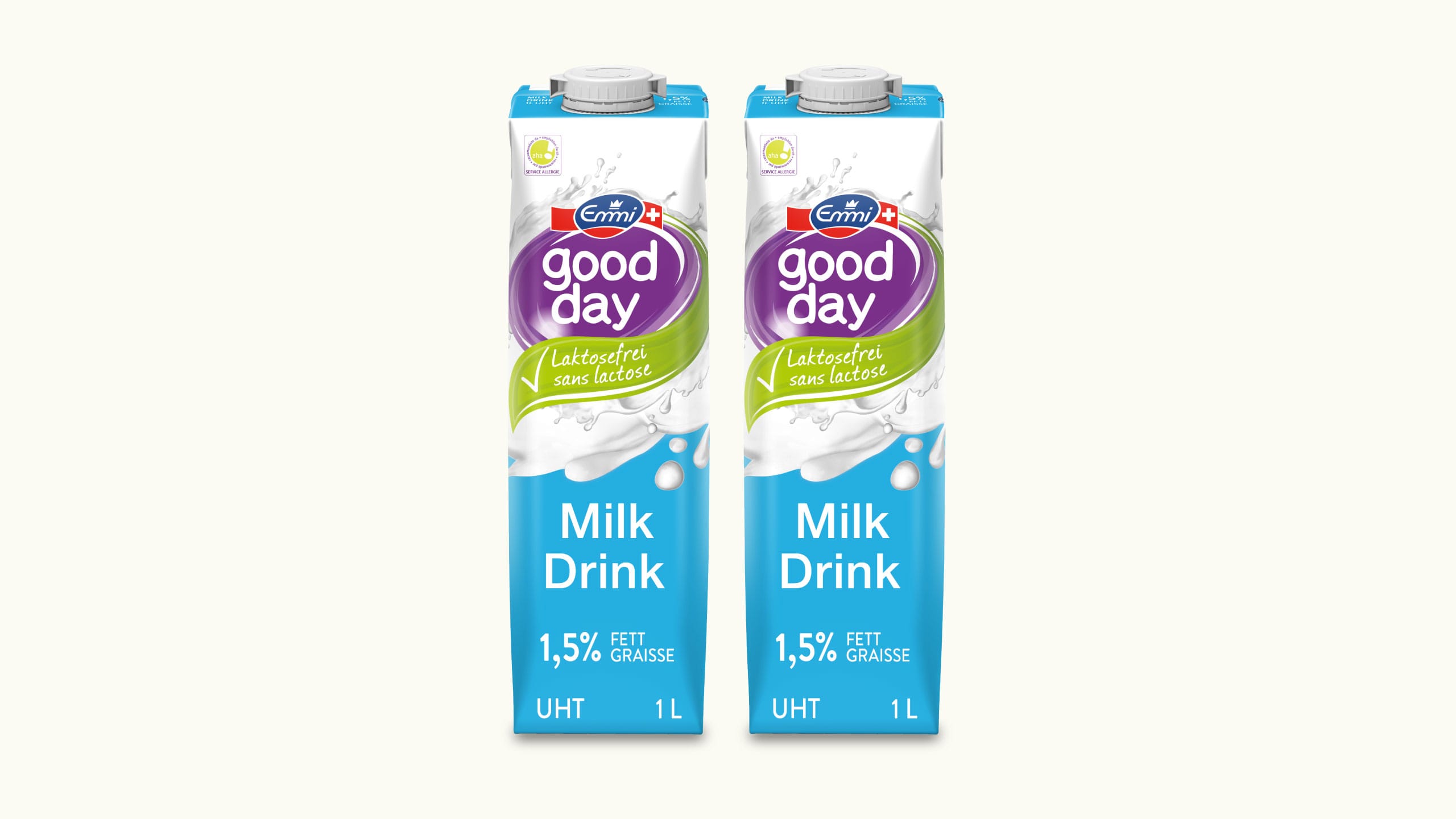
The new logo captures exactly what it’s all about: milk. Instead of gradients and outlines, the brand name now appears on a swirl of creamy, stirred milk, surrounded by a green leaf bearing the bilingual tagline “Laktosefrei / sans lactose.” Clear hierarchy, clear message, clear legibility —in German and French, as required by the Swiss market.
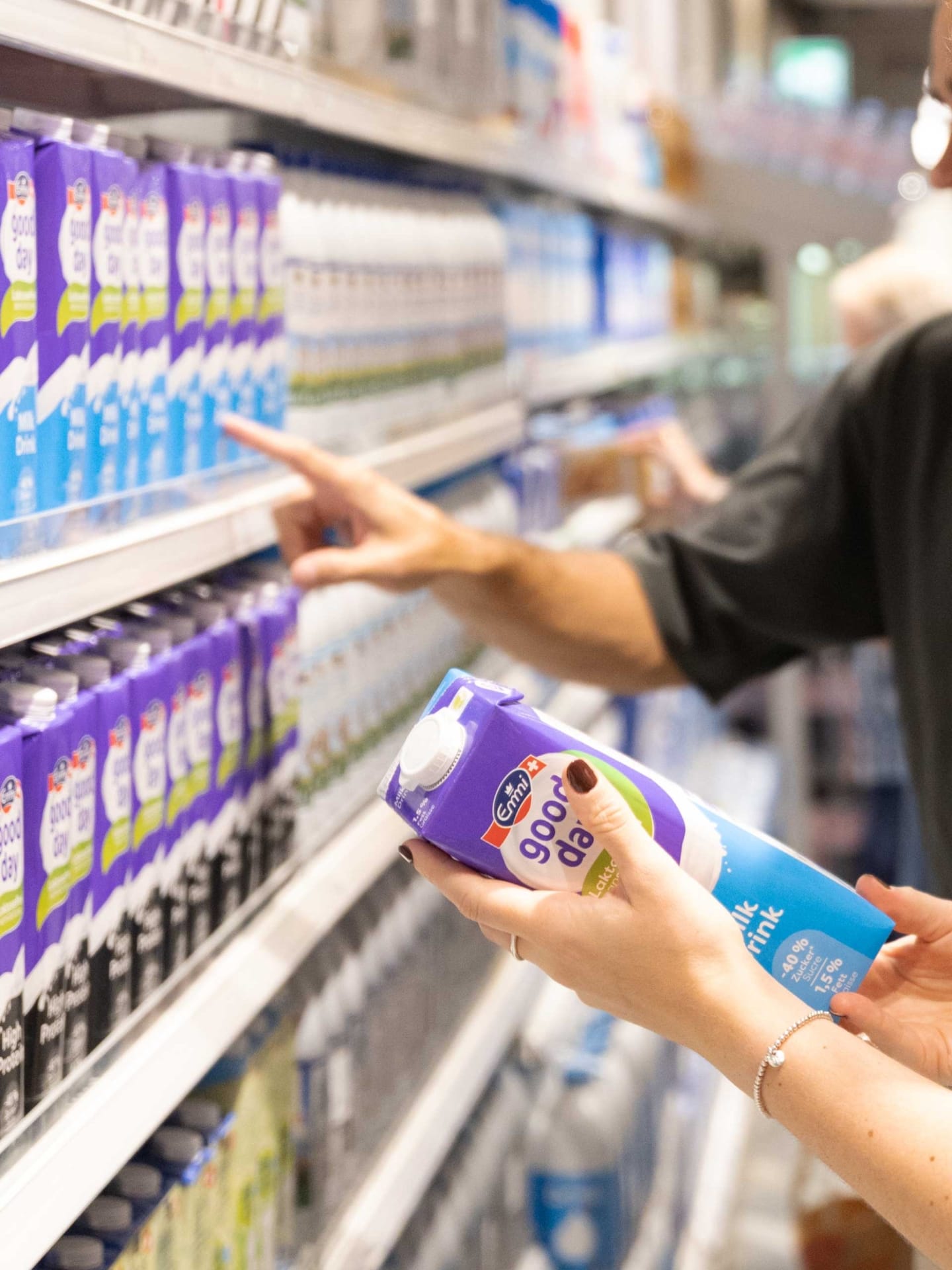
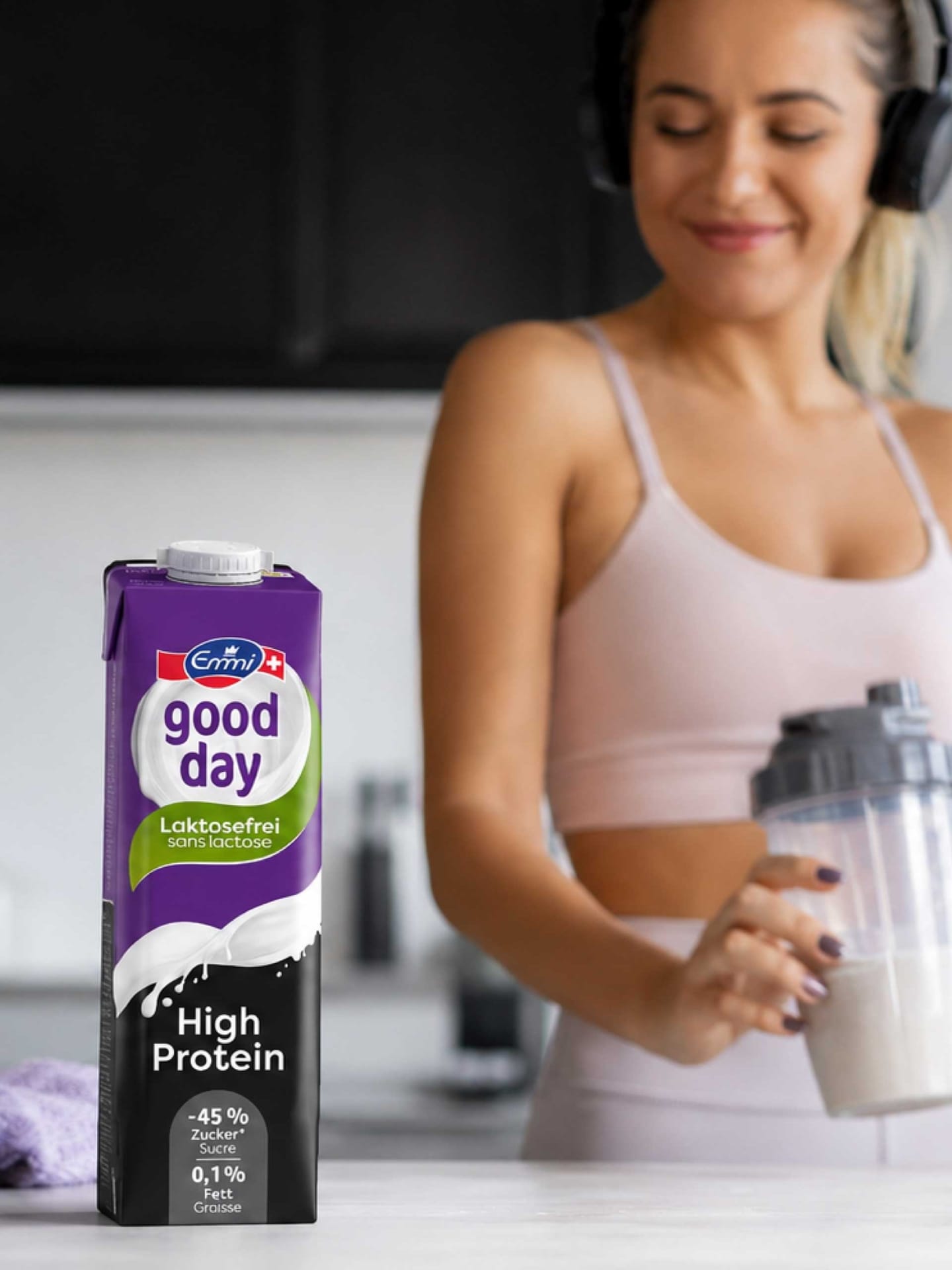
A bold color-coding scheme in the lower third of the package distinguishes the varieties: fresh blue for the Milk Drink, confident black for High Protein. The two worlds are separated by a freshly poured splash of milk, which adds visual appeal and dynamism to the design. Below that, the benefit call-to-actions clearly communicate the key selling points: 40% and 45% less sugar, and 1.5% and 0.1% fat, respectively.
From the shelf to your feed.
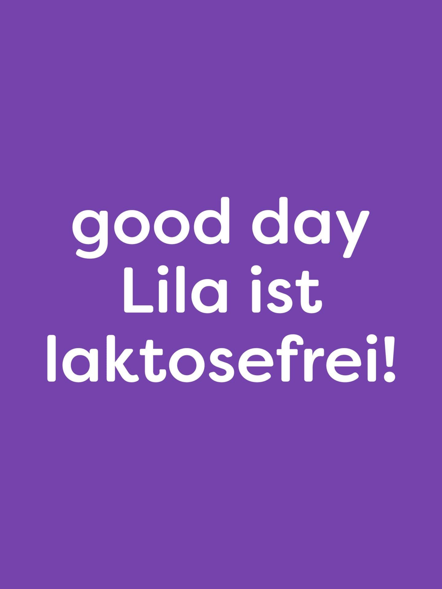
We’ve expanded the new design into a flexible branding system that works across all touchpoints. Key visuals, color blocks, and typographic statements like “good day: Lila is lactose-free!” ensure a consistent brand experience at the point of sale, in retail, and on social media. One look, one color, one message—from the refrigerated aisle to the kitchen table.