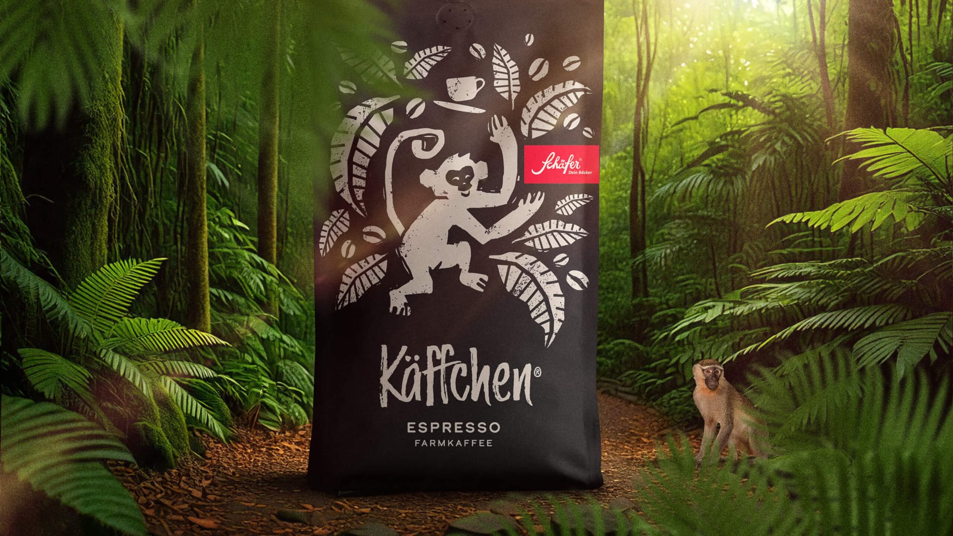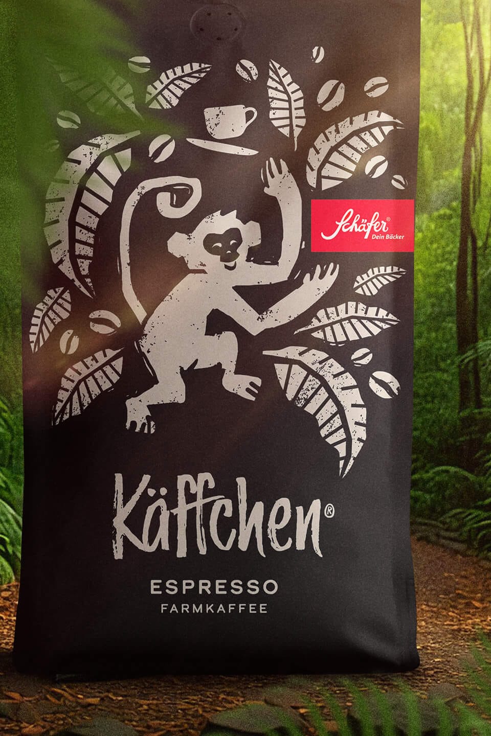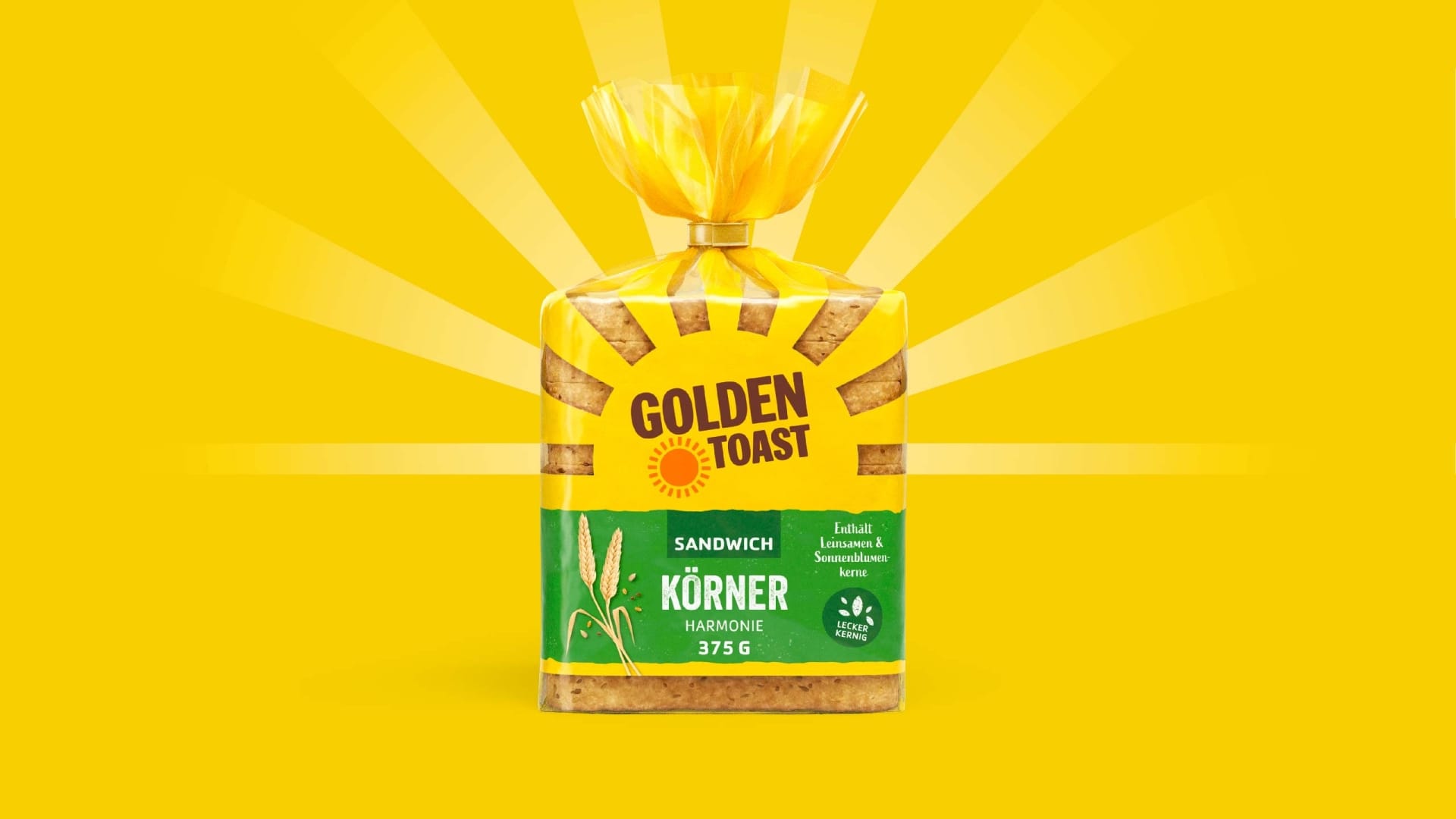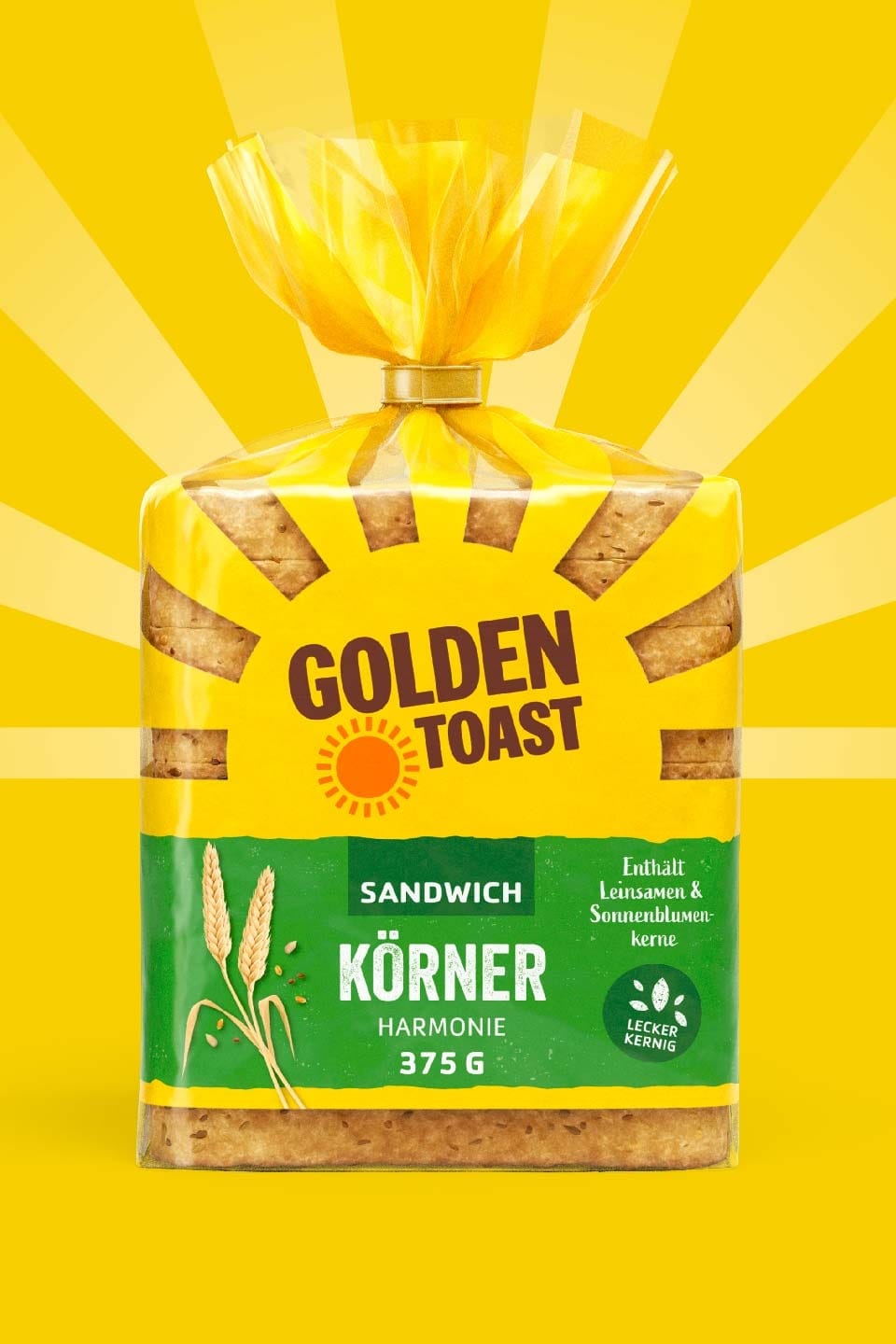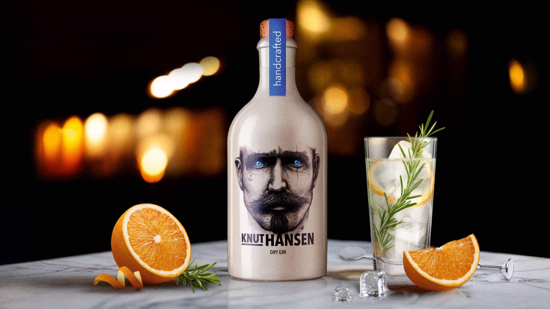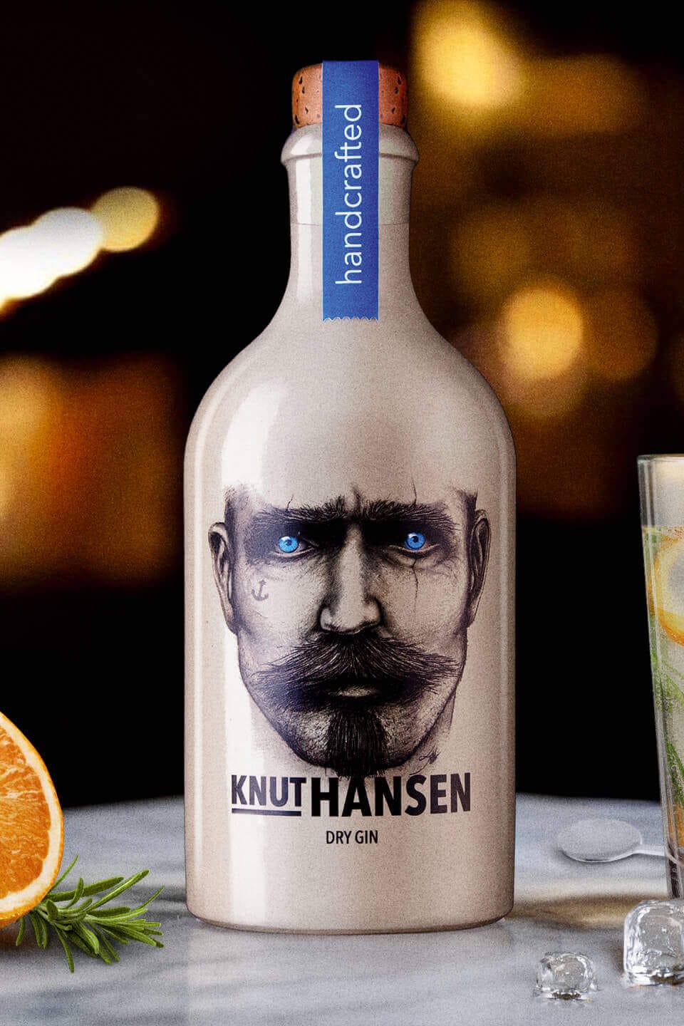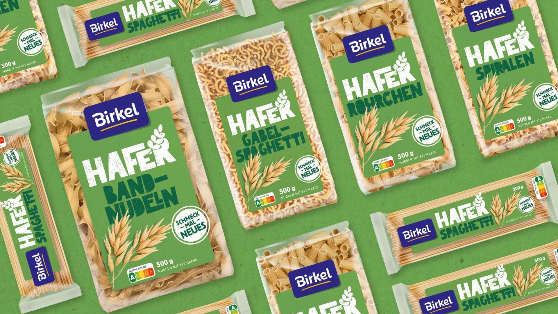
Debeukelaer
Decor On Ice: A Redesign of a True Dessert Classic.
Services
Food packaging design is not an end in itself—it is the visual promise of an unparalleled moment of enjoyment. With our redesign of the time-honored waffle cups, we have bridged the gap between proven, top-quality products and a forward-looking, emotionally charged brand presence.
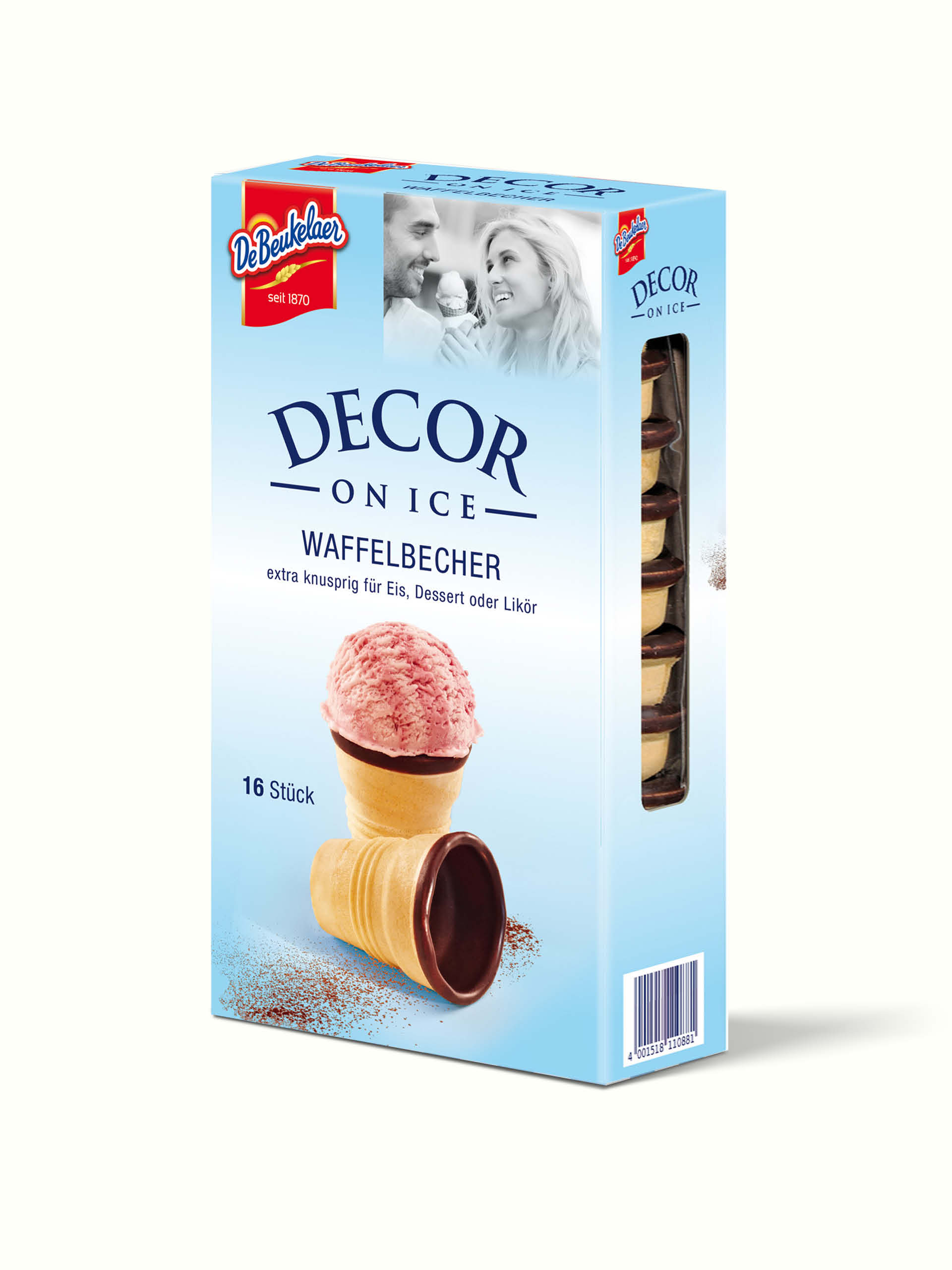
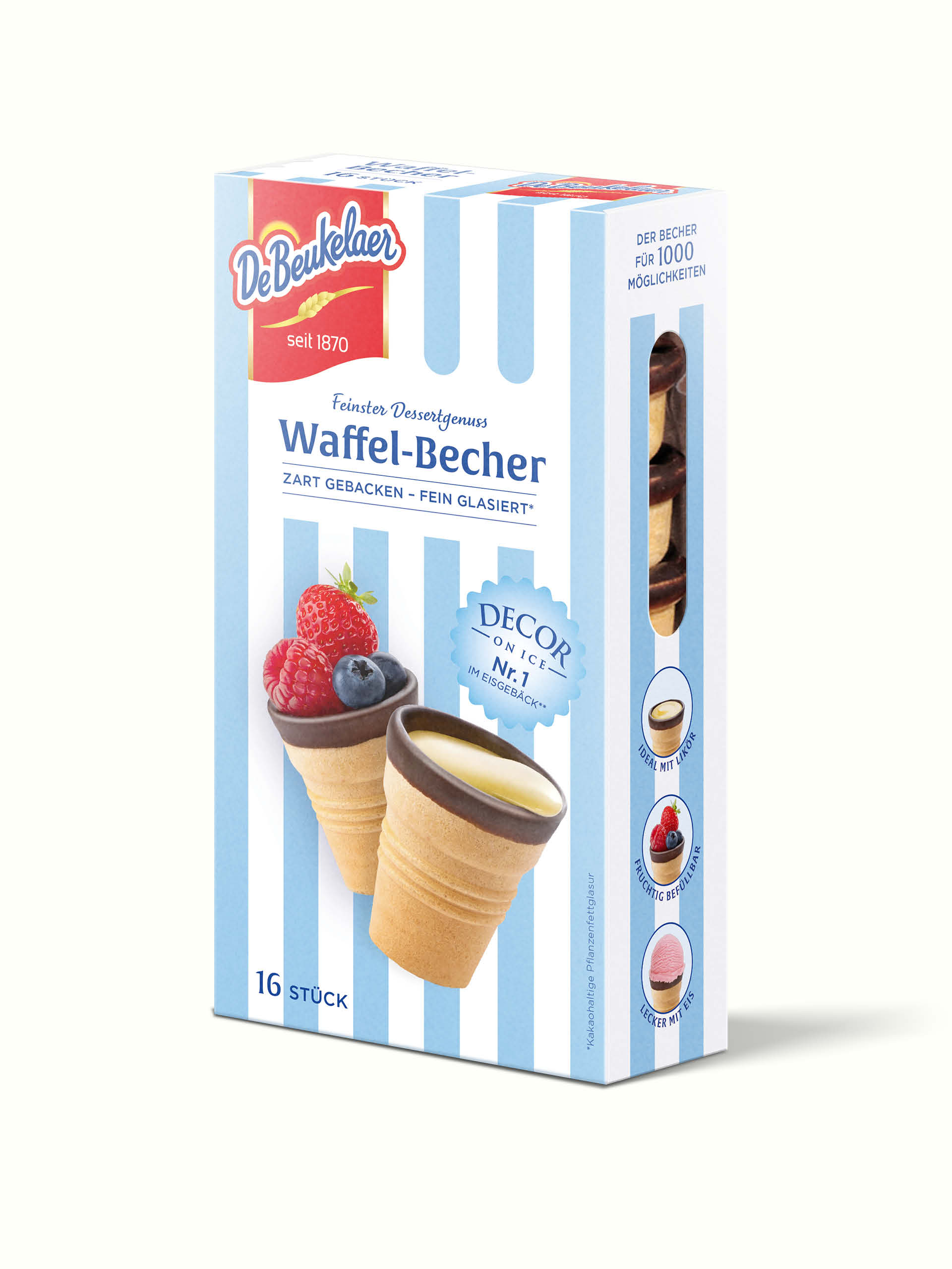
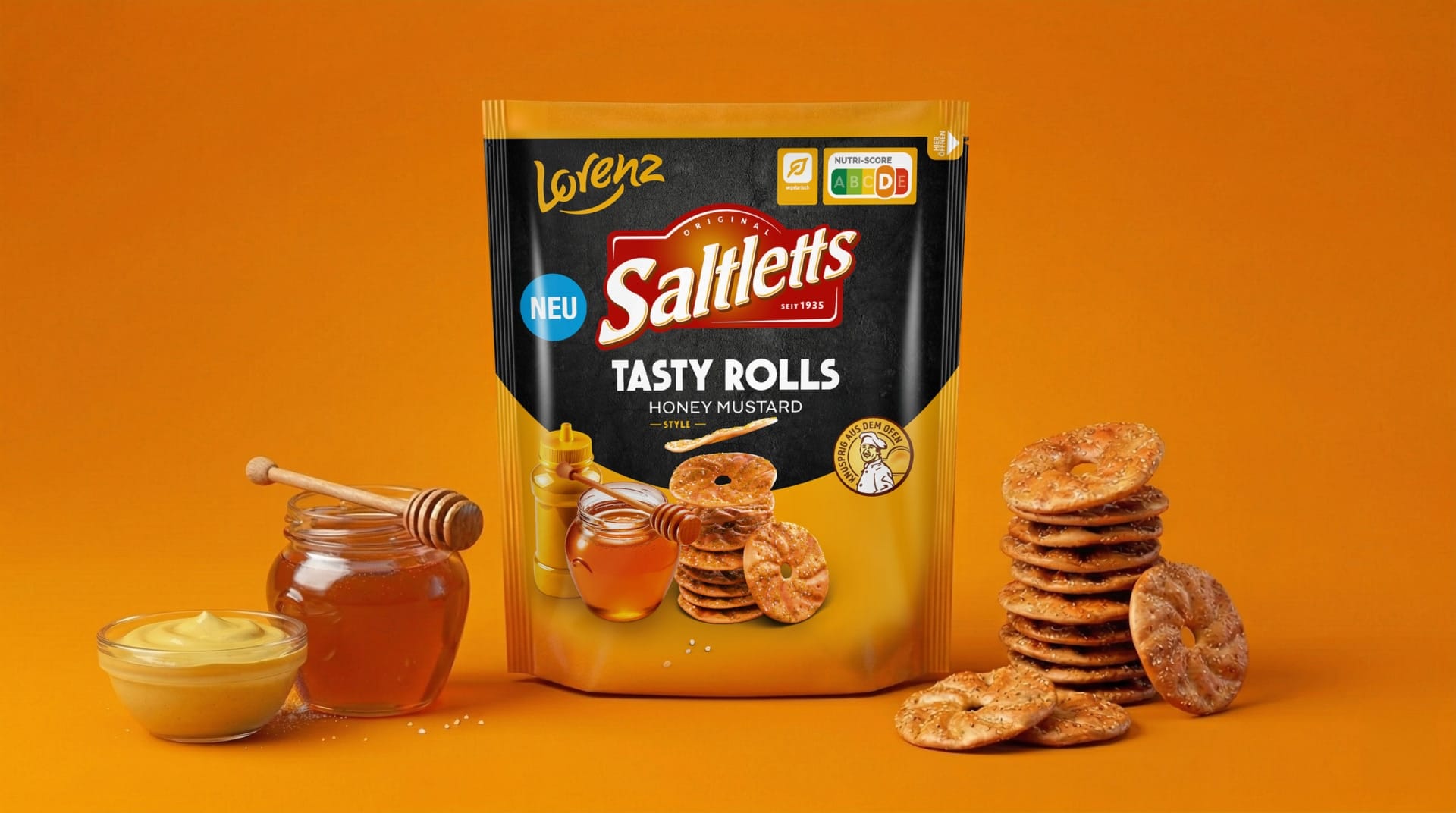
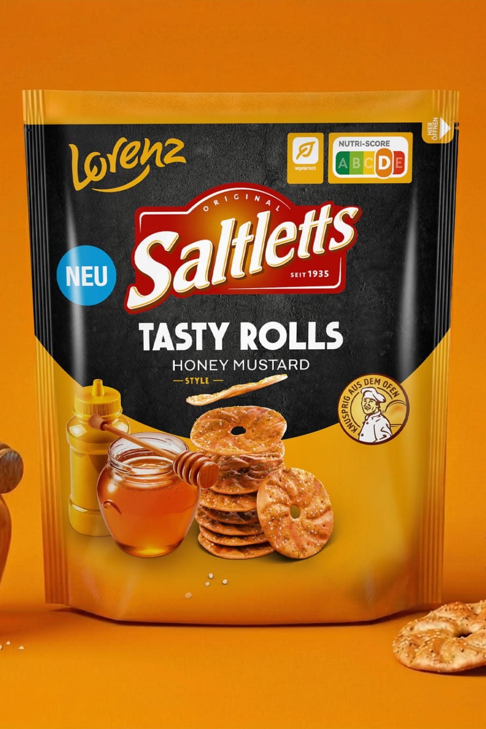
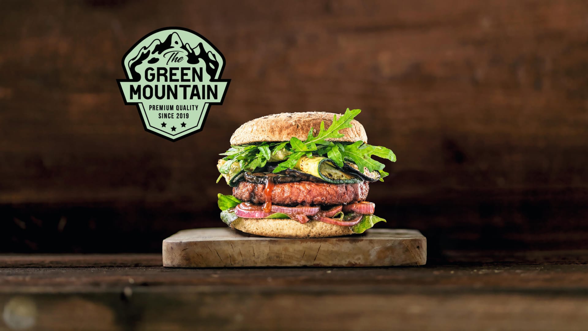
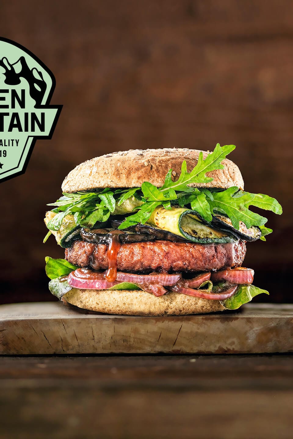
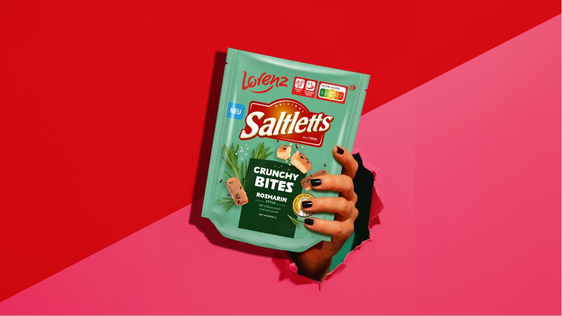
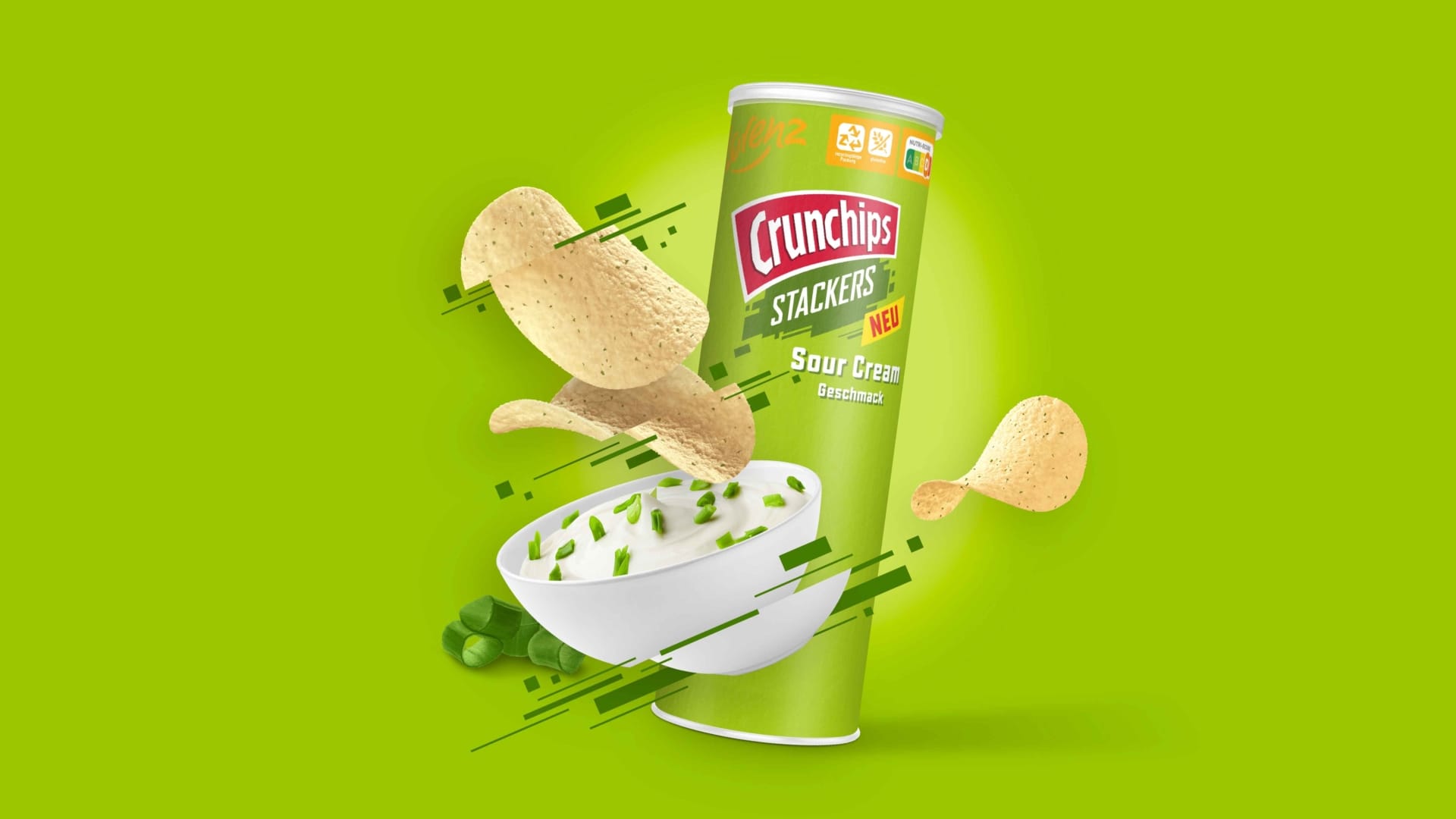
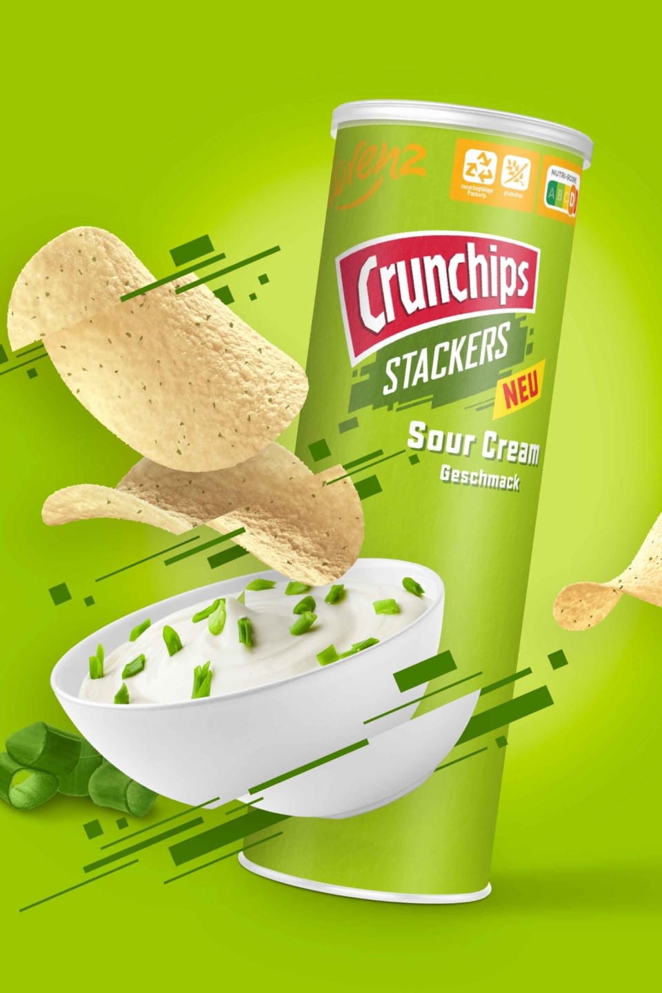
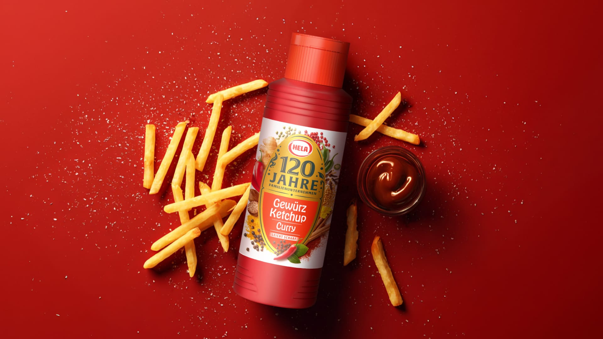
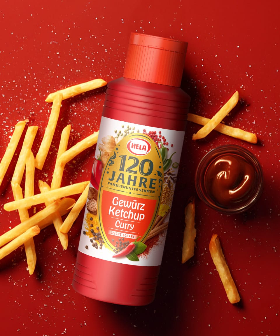
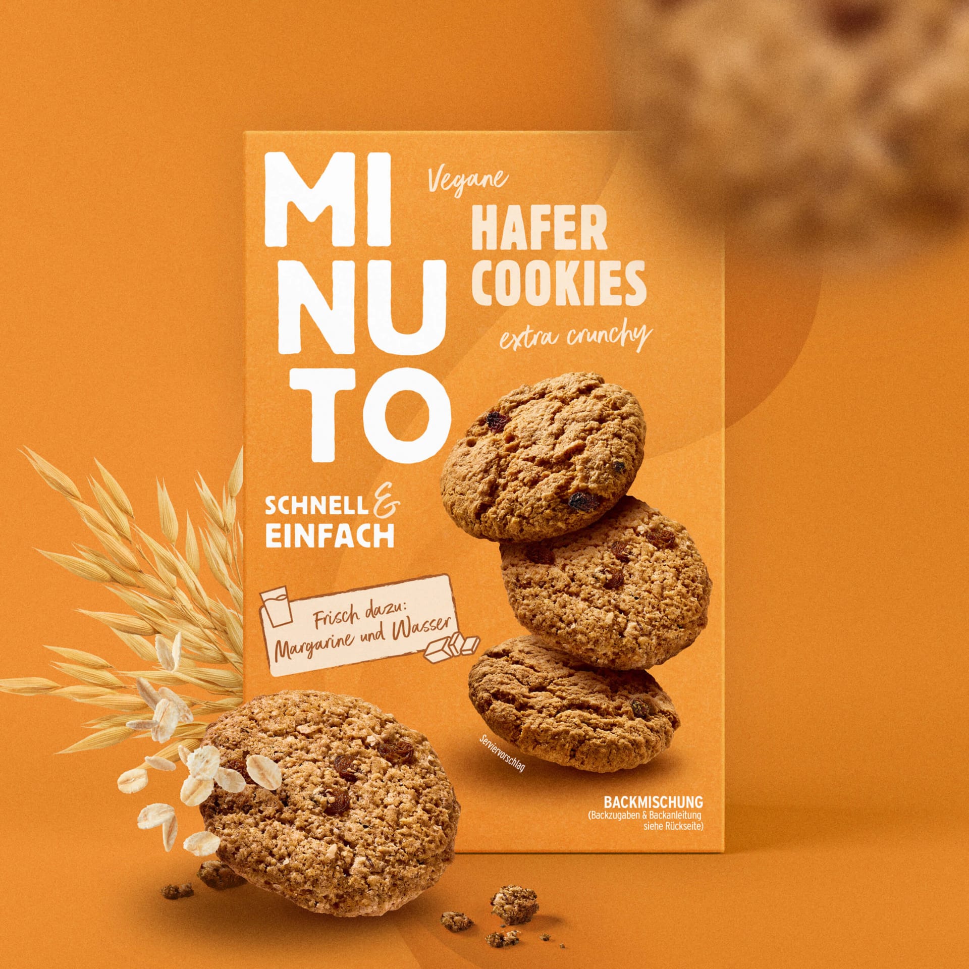
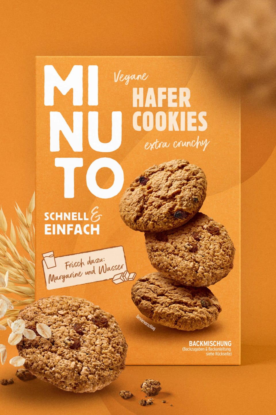
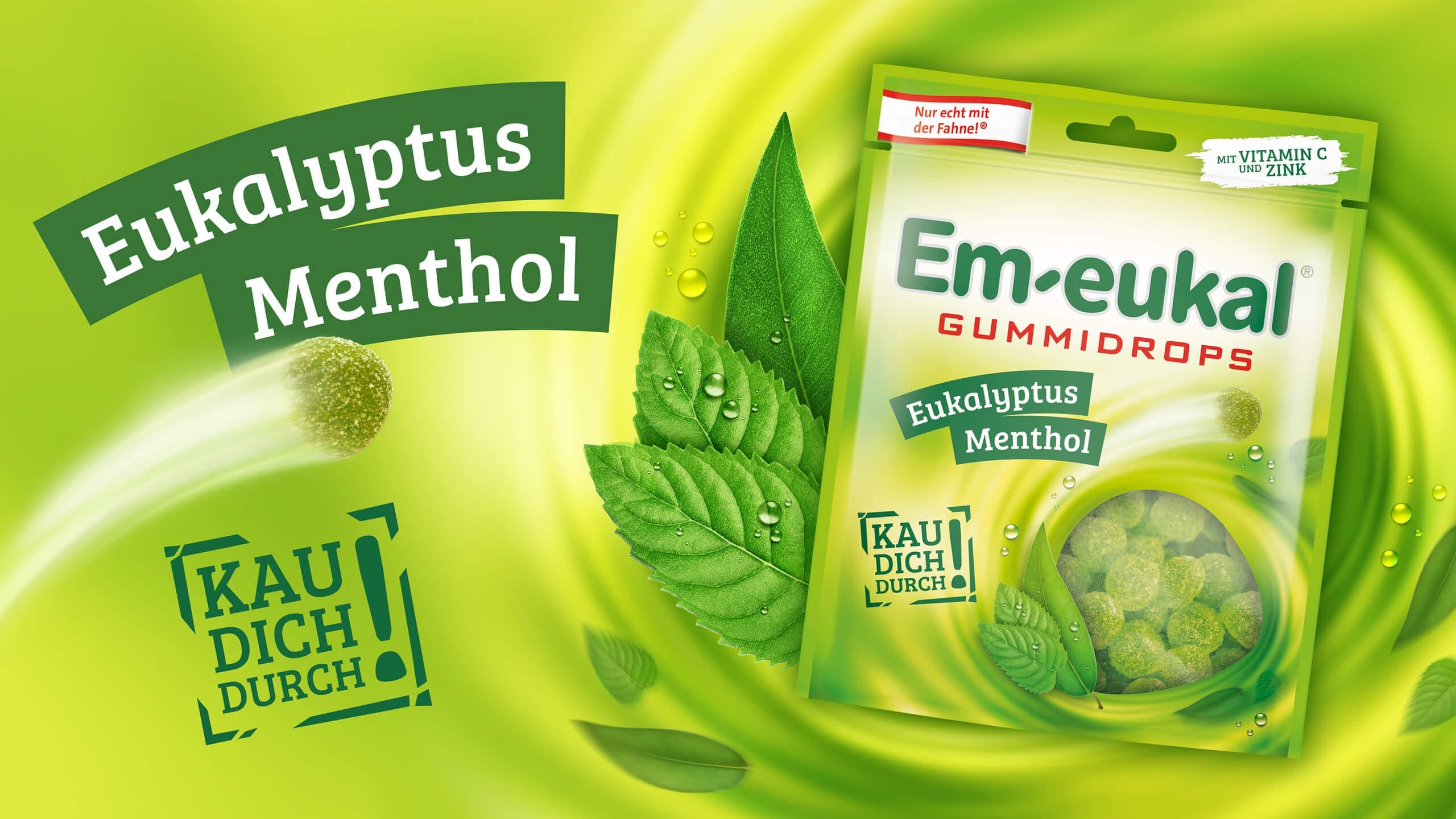
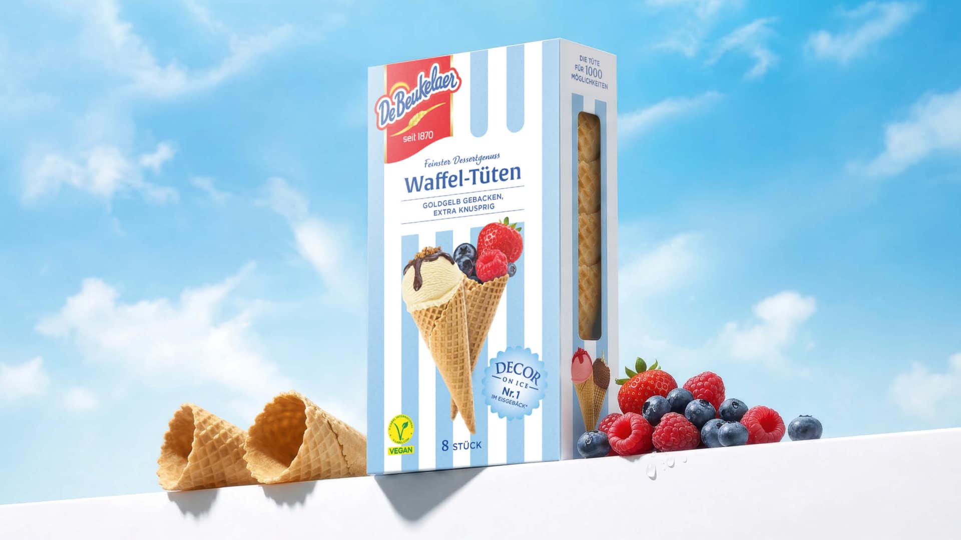
The new look: Striking stripes that stand out from a distance.
Where a cool, monotonous light blue once dominated, an iconic striped design in pastel blue and white now comes to life. This new background lends the packaging an elegant sense of dynamism and lightness. The stripes immediately evoke positive associations with carefree summer days, traditional ice cream parlors, beach umbrellas, and beach towels.


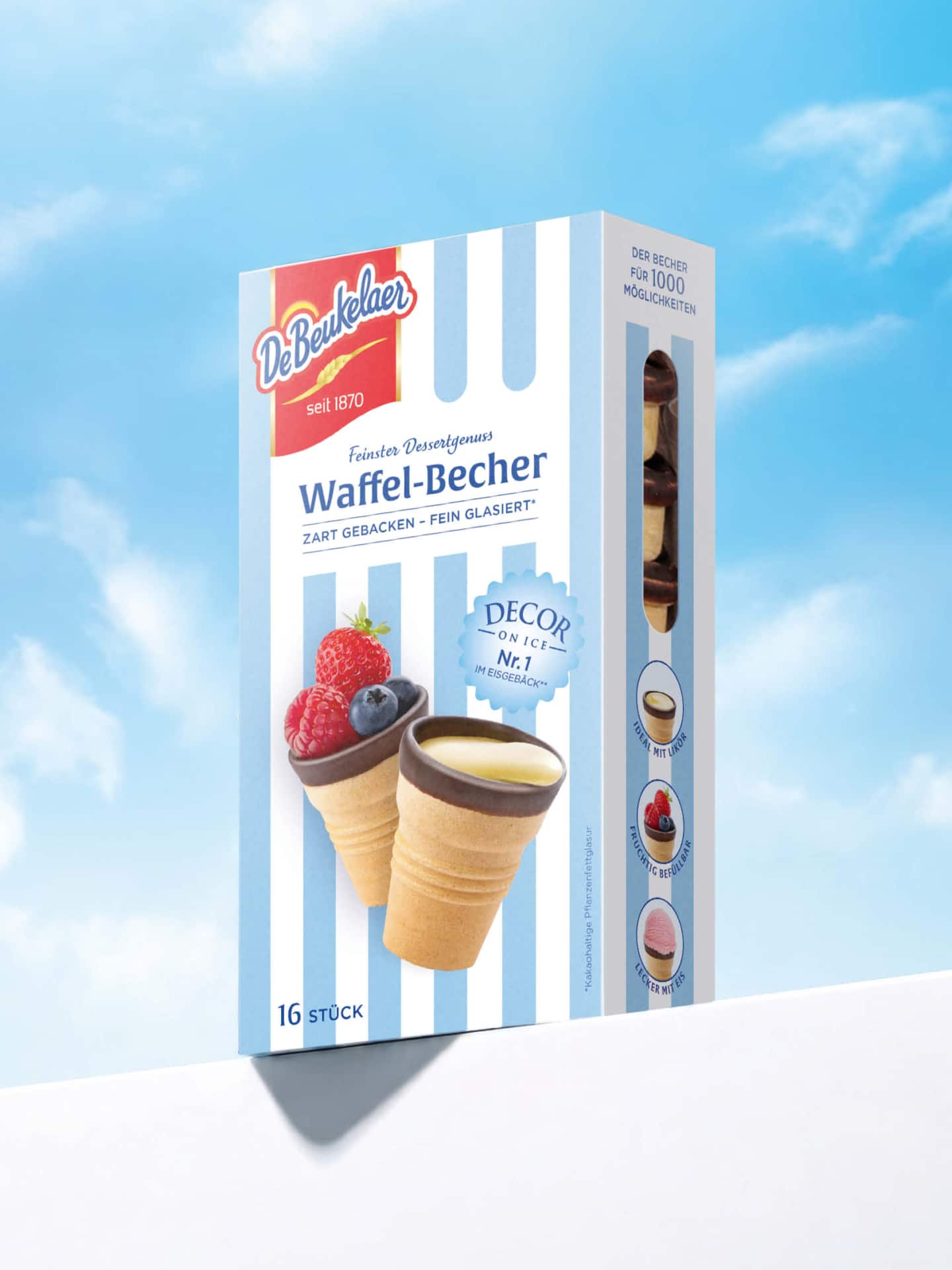
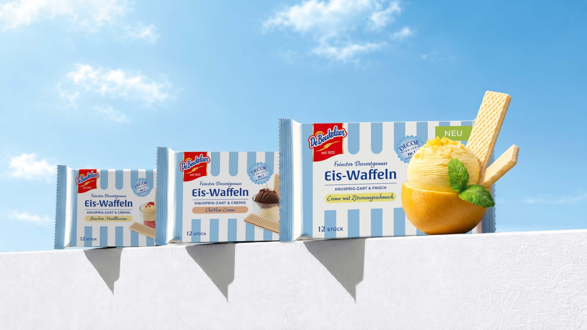

A key strategy for increasing awareness and relevance is the new, uncompromising prominence of the long-established DeBeukelaer brand. The iconic red logo takes center stage, significantly enlarged. It positions the waffle creations firmly in the premium segment of dessert waffles. Combined with the clean, white product display area and elegant, contemporary typography, the packaging exudes a new, confident calm. The design now conveys pure high quality and clarity at first glance.
Taste Appeal: A delight that appeals to the senses.
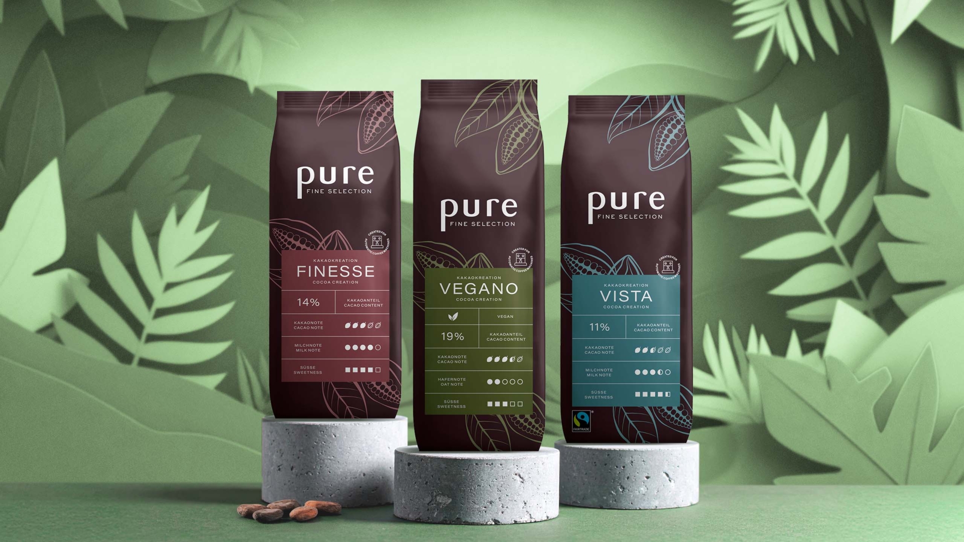
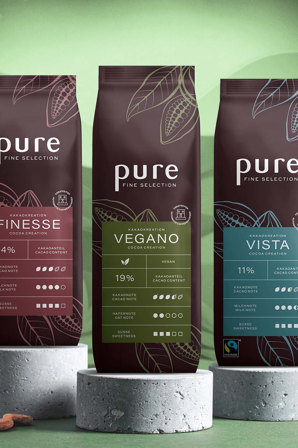
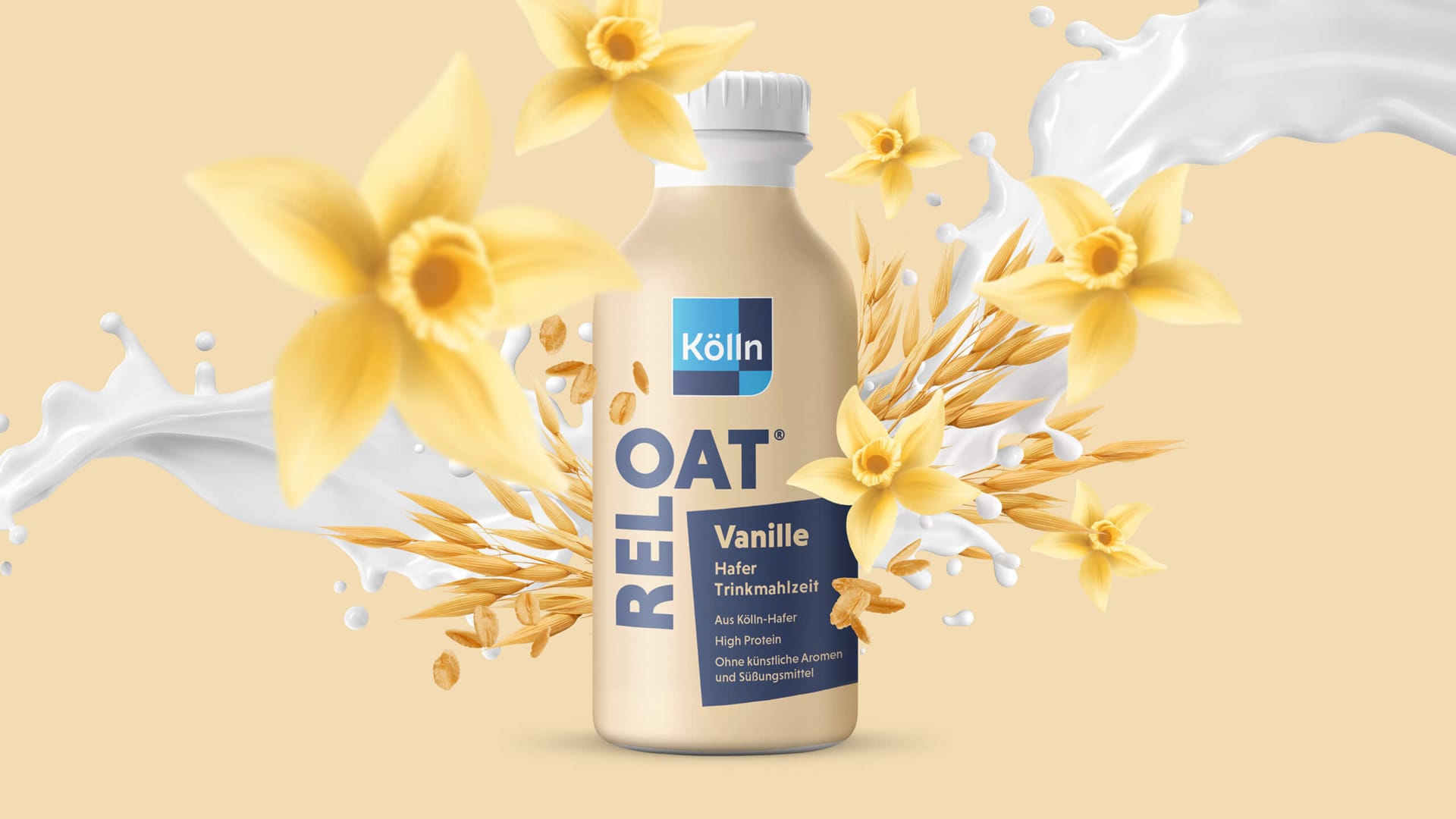
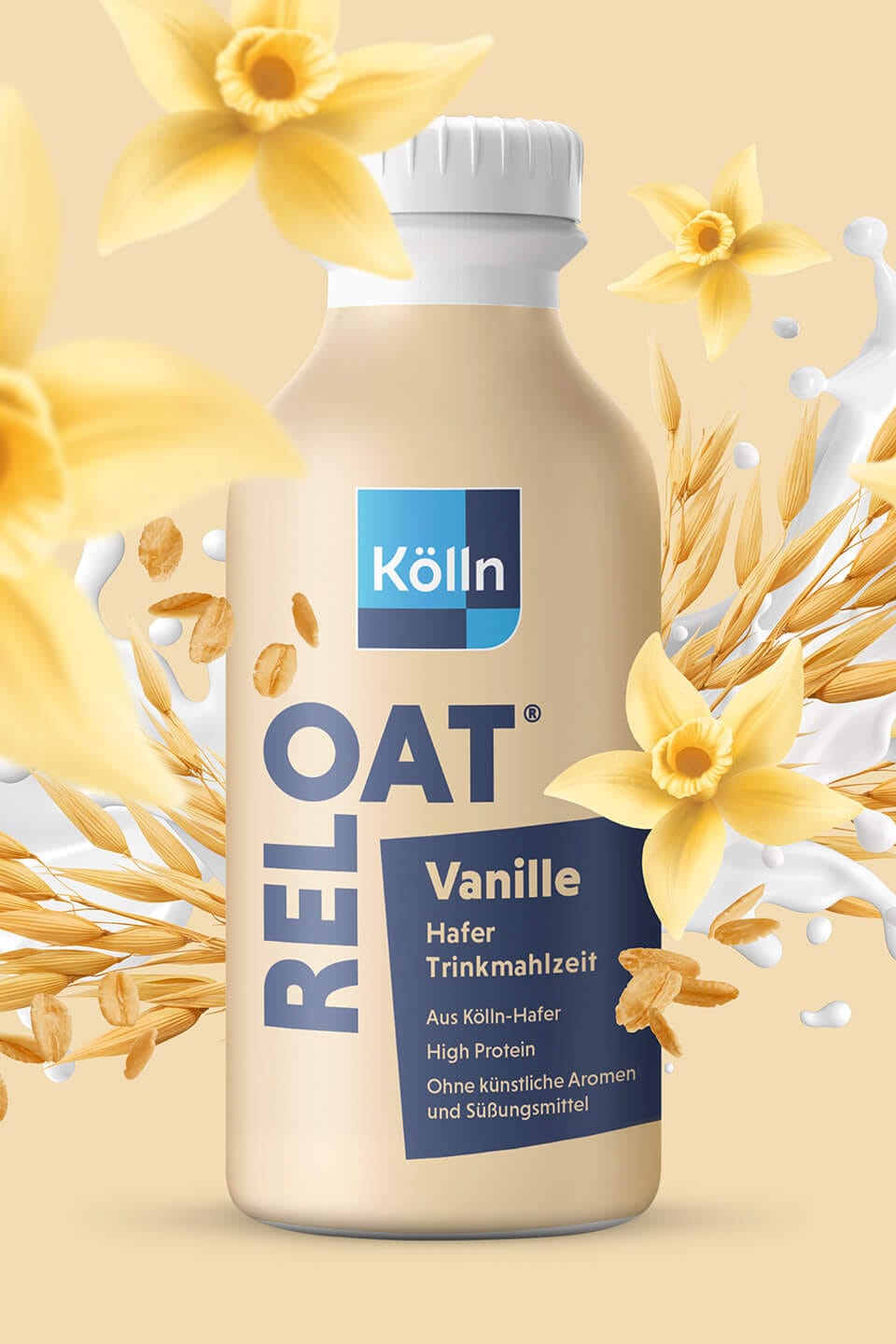
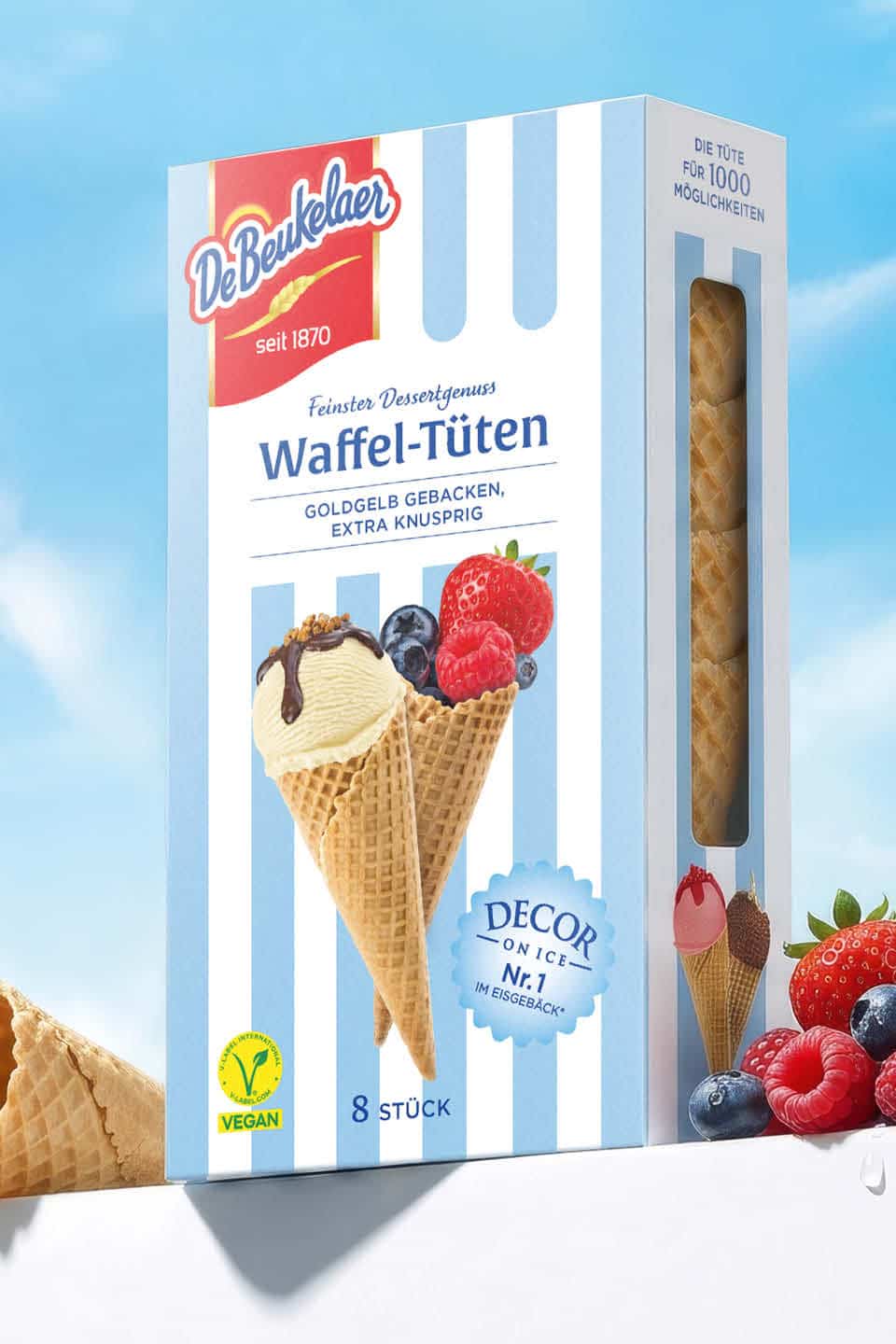
The new visual language celebrates moments of pure, crispy indulgence. Delicate wafer textures, finely glazed layers of cocoa, and tempting topping ideas featuring fresh, vibrantly colored berries and creamy ice cream come together to create visual treats that make the viewer’s mouth water.
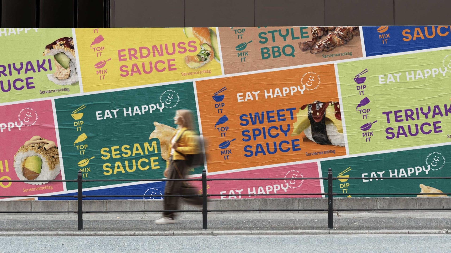
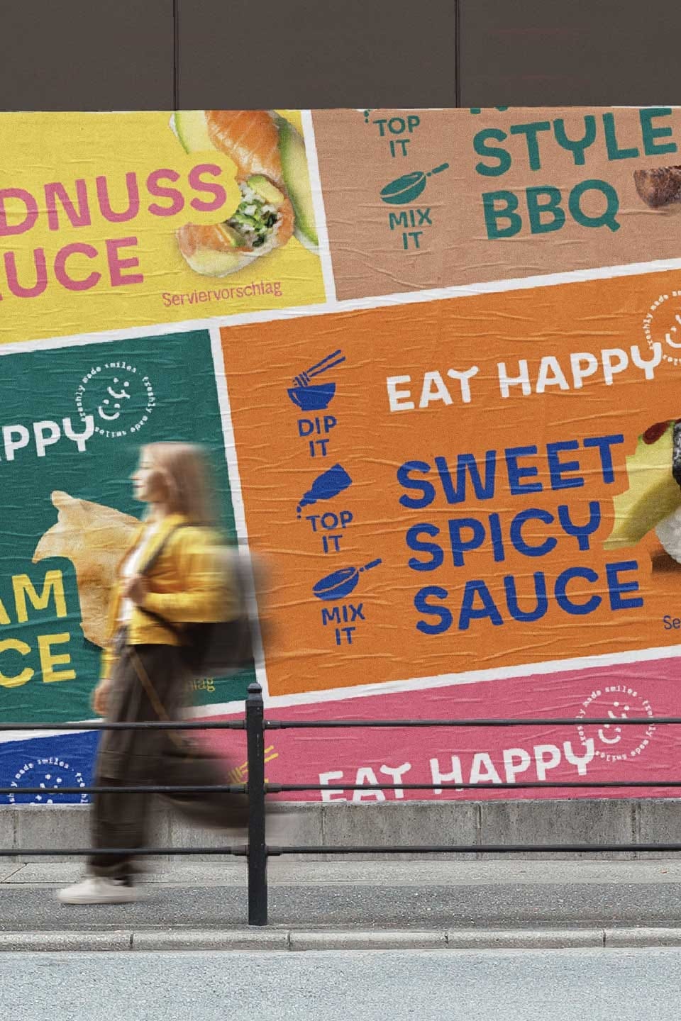
In a competitive retail environment, a fraction of a second can make all the difference. With this striking striped design, we achieve maximum shelf visibility at the point of sale. Multiple packages placed side by side blend into an eye-catching, harmonious brand block that magically draws the eye.
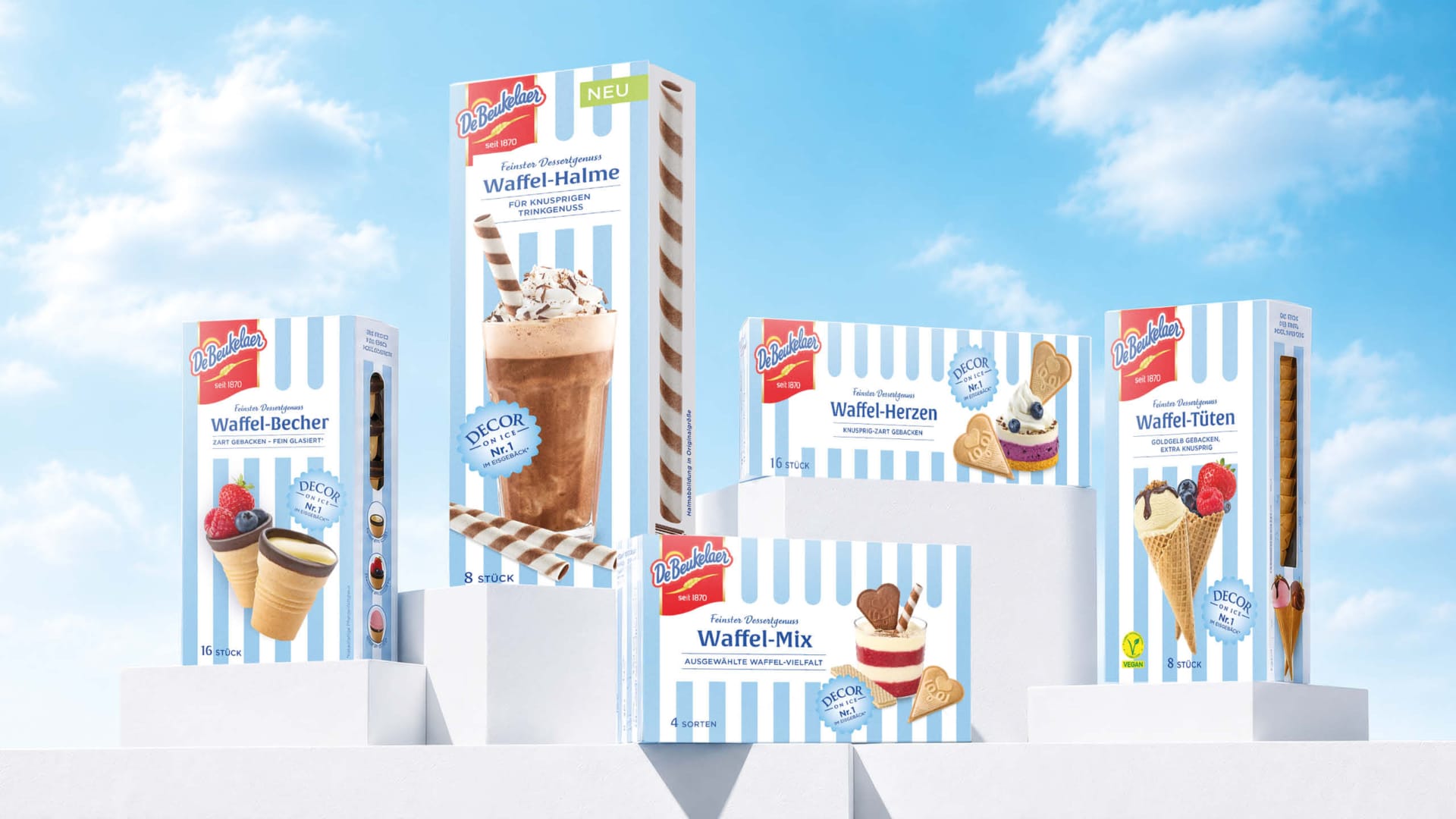
One product—many possibilities.
Decorative examples on the product side panels intuitively convey appropriate occasions for consumption:
- Delicious with ice cream: A classic dessert treat with a new twist. Perfect for kids.
- Fruit-Filled: Inspiration for creative recipes with a fresh, fruity twist.
- Perfect with liqueur: The sign of a premium adult drinking experience.
Outlook & Innovation Potential: Sustainably Expanding Reach.
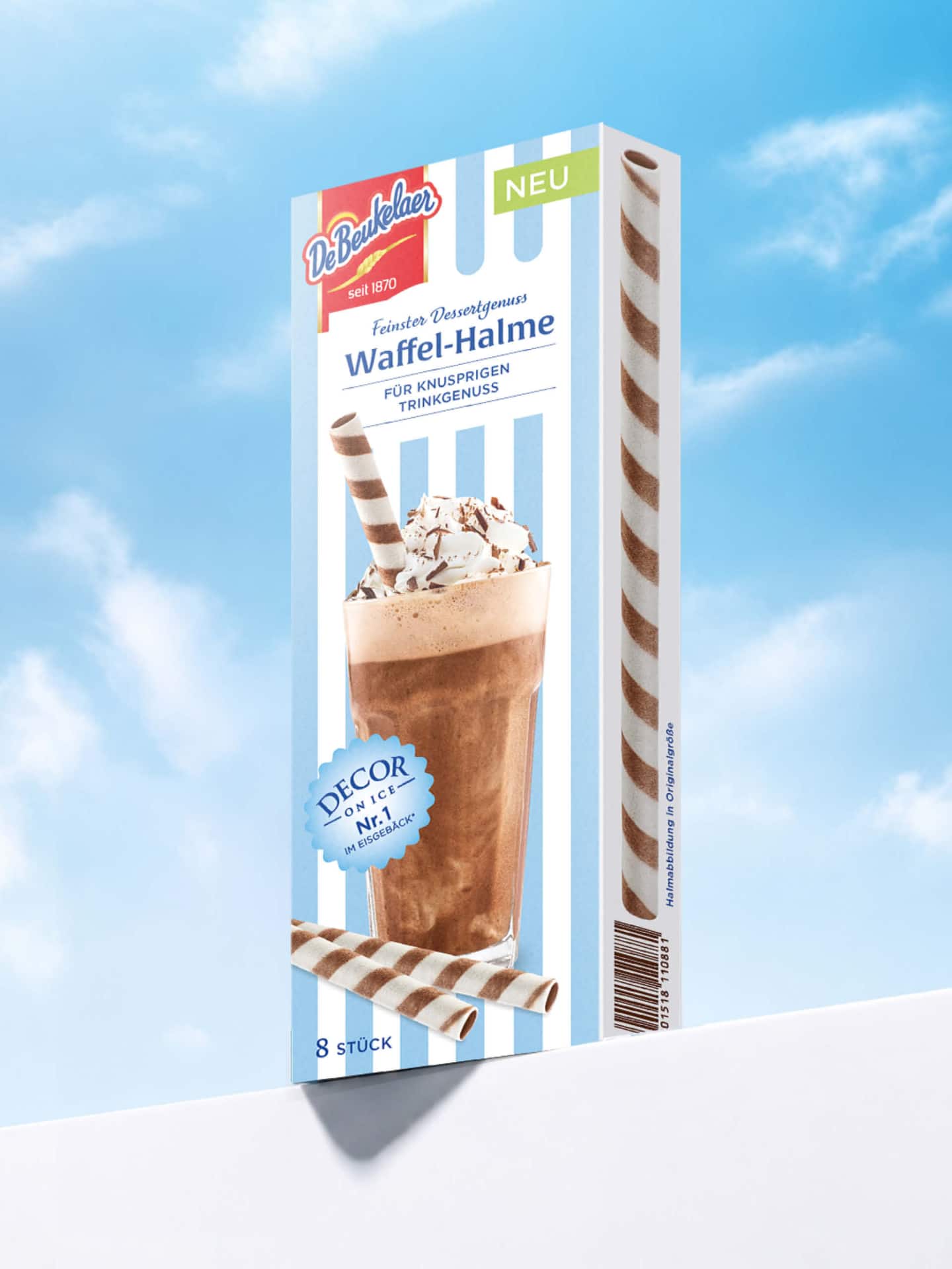
This redesign is more than just a visual refresh—it marks the strategic launch of a massive expansion of our customer reach and the sustained acquisition of first-time buyers. The new design DNA offers tremendous flexibility and provides the perfect foundation for forward-looking line extensions and innovative product concepts.
- Highly recognizable: The established elements were preserved but adapted to a new, modern design era.
- Expanding the Target Audience: The modern, fresh vibe appeals to both loyal brand enthusiasts and young, trend-conscious impulse buyers.
- Future-proof brand architecture: Establishing the brand as THE leading brand in the dessert wafer category, with great potential for future innovations—such as the delicious and creative crunchy (drink) straws.
The new design celebrates the joy of life, brings color to everyday life, and invites you to treat yourself and your loved ones to a special moment. For summer days full of joy and creativity!