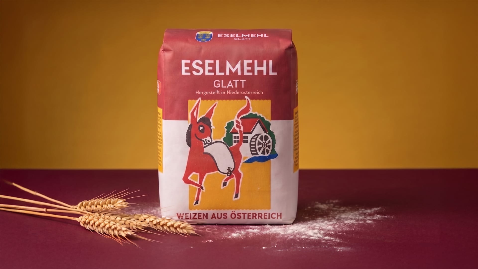
Eselmehl
Tradition reimagined.
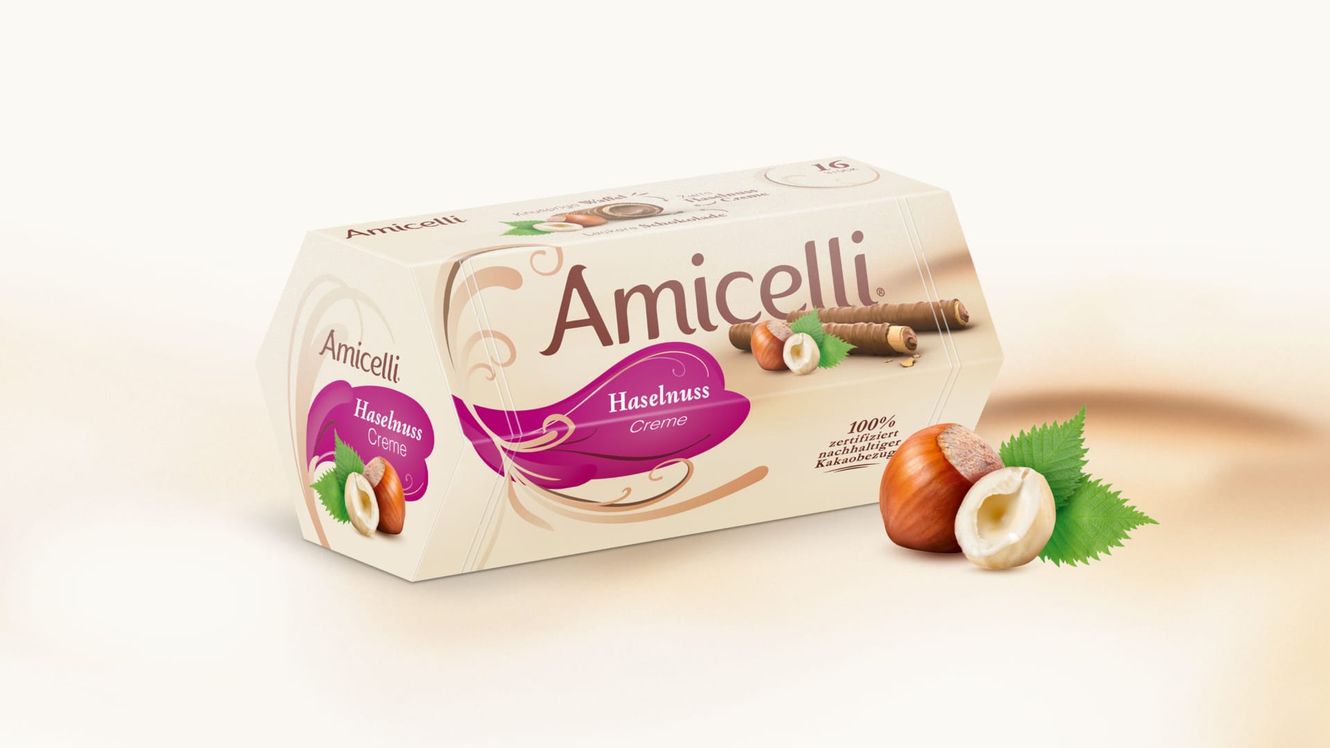
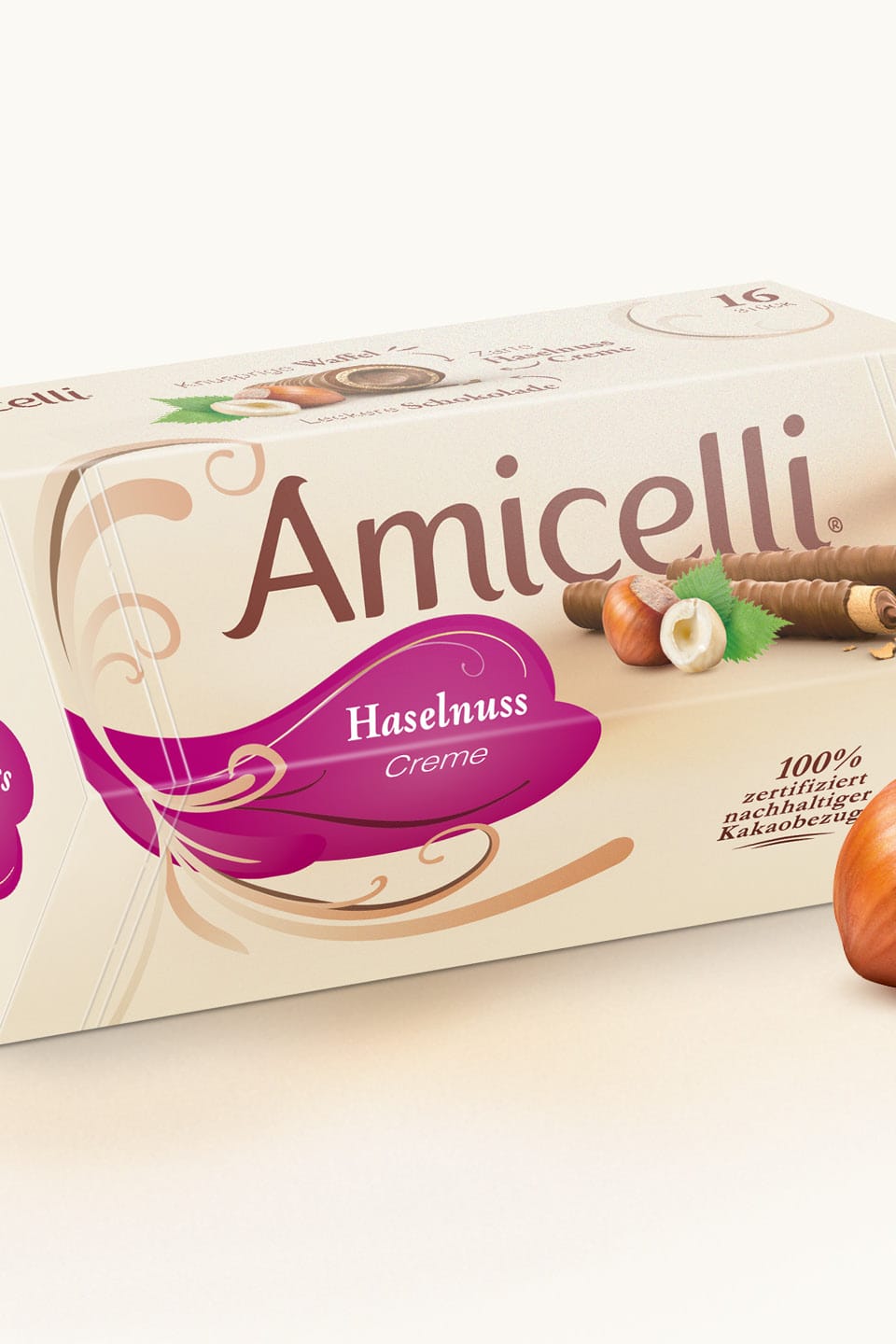
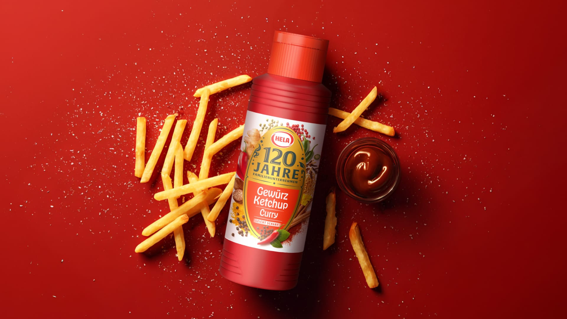
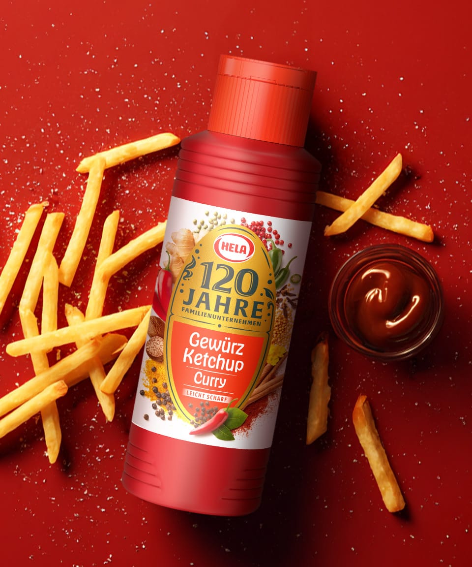
Services
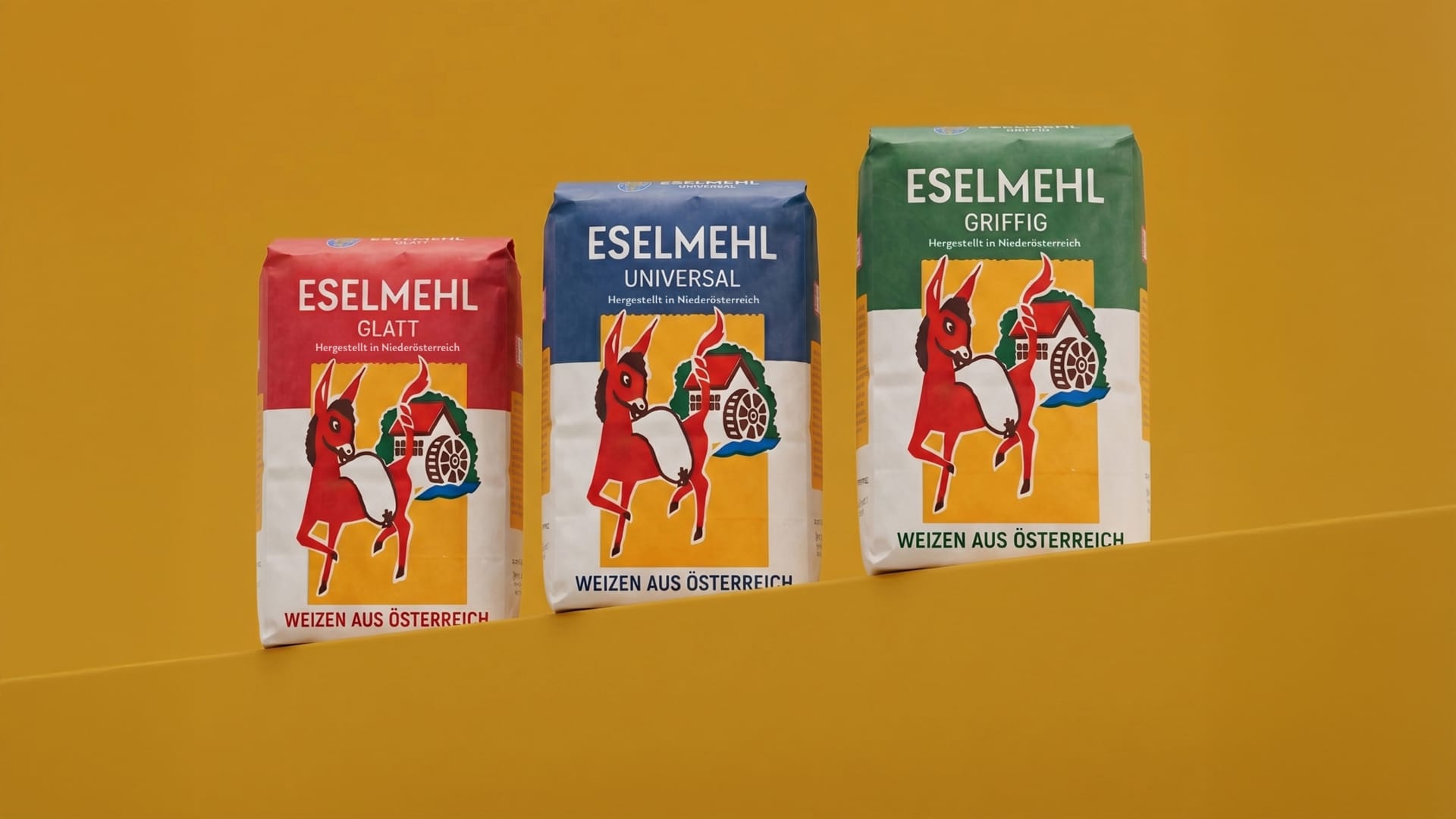
The relaunch of GoodMills’ long-established Austrian brand “Eselmehl” focused on the careful modernization of an iconic packaging design. The goal was to maintain the brand’s high level of recognition while developing a contemporary, eye-catching design for the shelf.
Eselmehl – tradition reimagined.
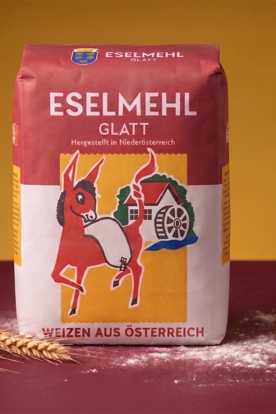
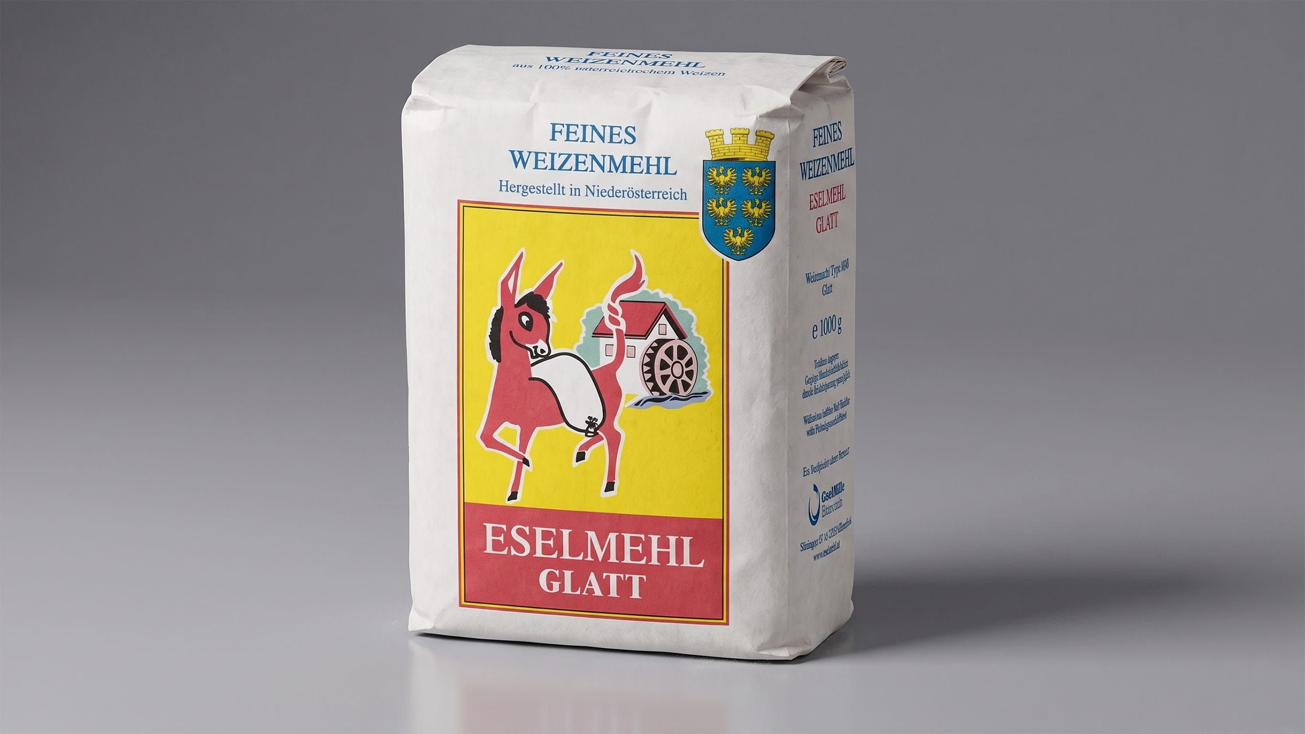
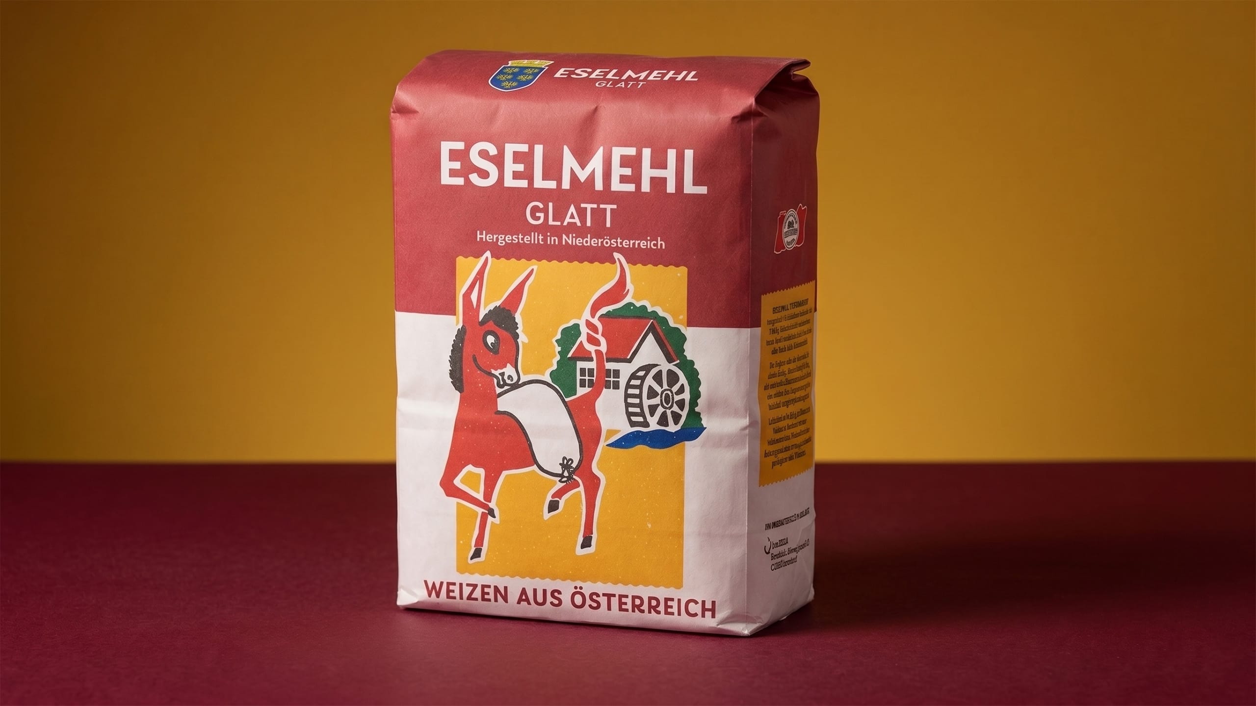
The existing design was characterized by its illustrative imagery and bold colors, but its overall look felt cluttered and outdated. The new design has been deliberately streamlined: clean lines, a minimalist color palette, and more precise typography create a sense of calm and structure.
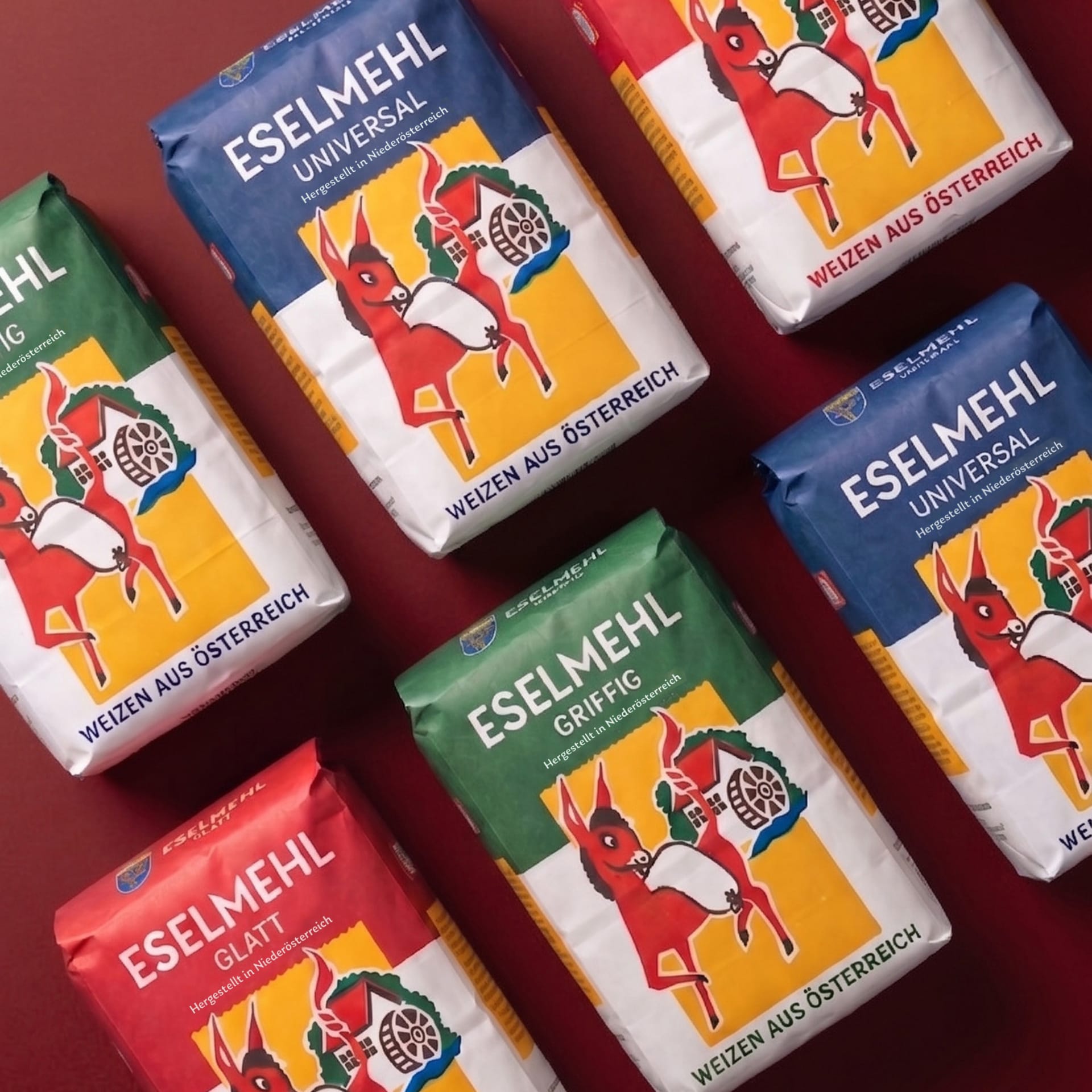
The iconic donkey illustration remains a central brand element, but its impact has been enhanced and it has been better integrated into the layout. At the same time, the new content hierarchy improves readability and guides consumers’ eyes more quickly to the relevant product information—a crucial factor in purchasing decisions at the shelf.
The result is modern packaging that preserves tradition and heritage while significantly enhancing its visual impact, clarity, and perceived value—thus successfully guiding the brand into the future.