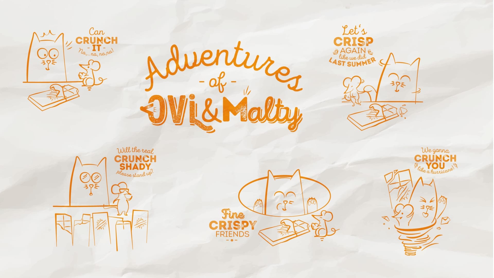
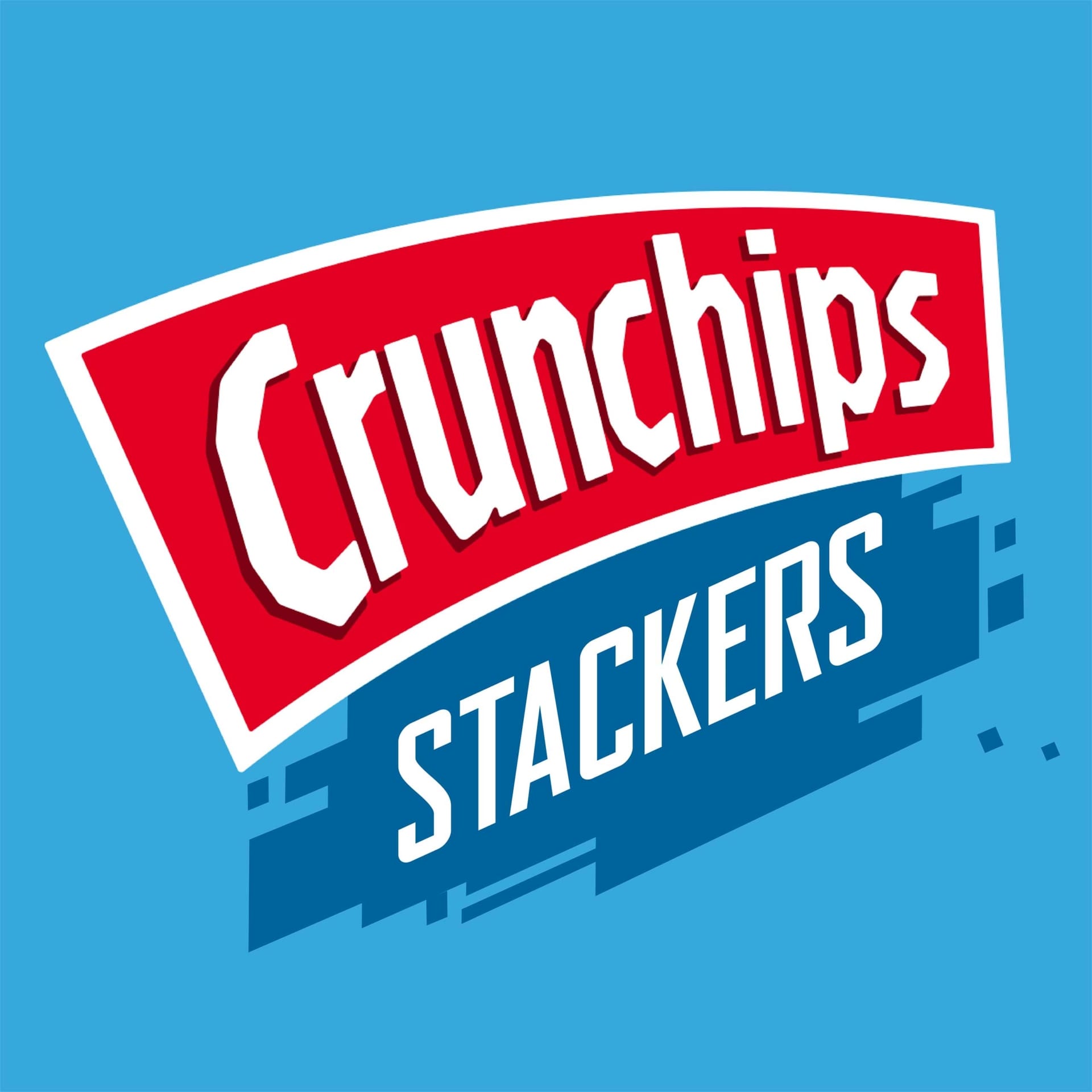
Crunchips
The new Stackers - Crunch it. Love it.
Services
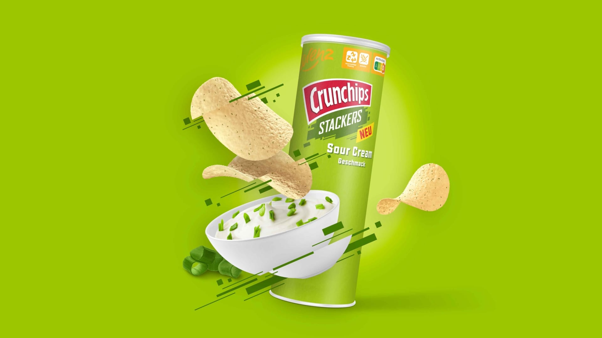
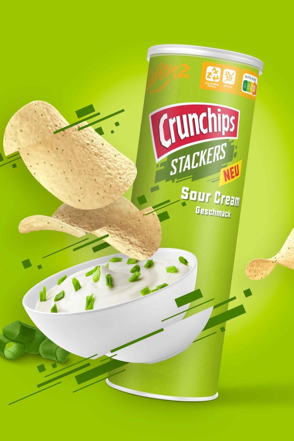
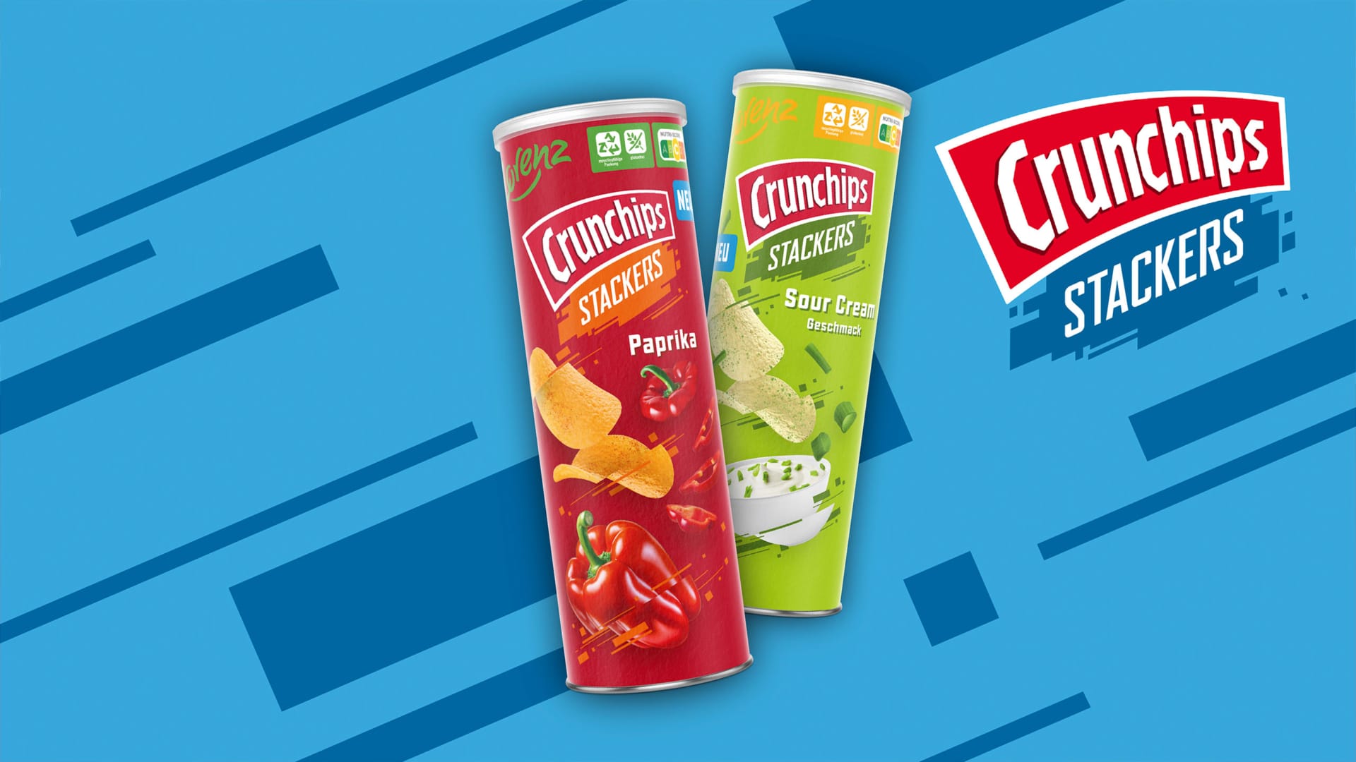
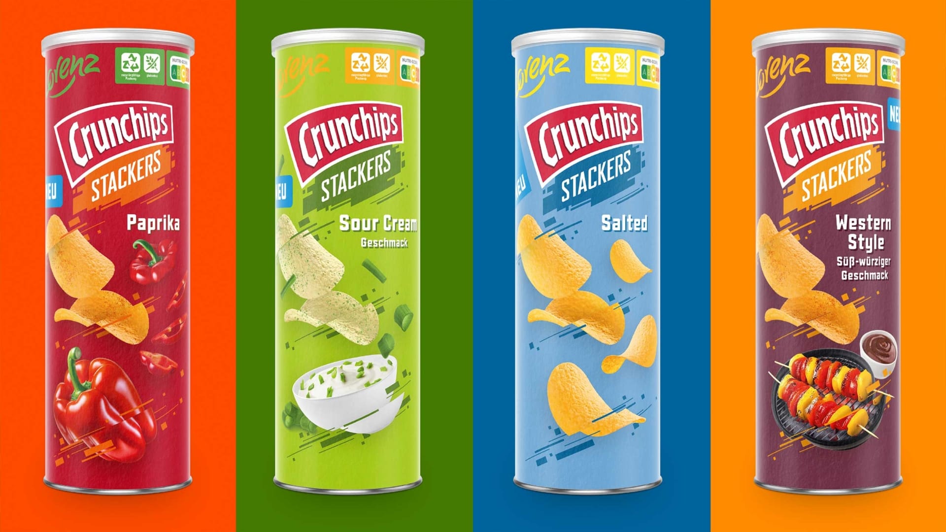
The new Crunchips Stackers by Lorenz. Stacks of intensely aromatic crunch – meets bright colors that visually reinforce the character of each product. Our new design provides targeted impulses for shelf impact and brand differentiation. How to create snacking pleasure at first glance!
Packaging design – with crunch!
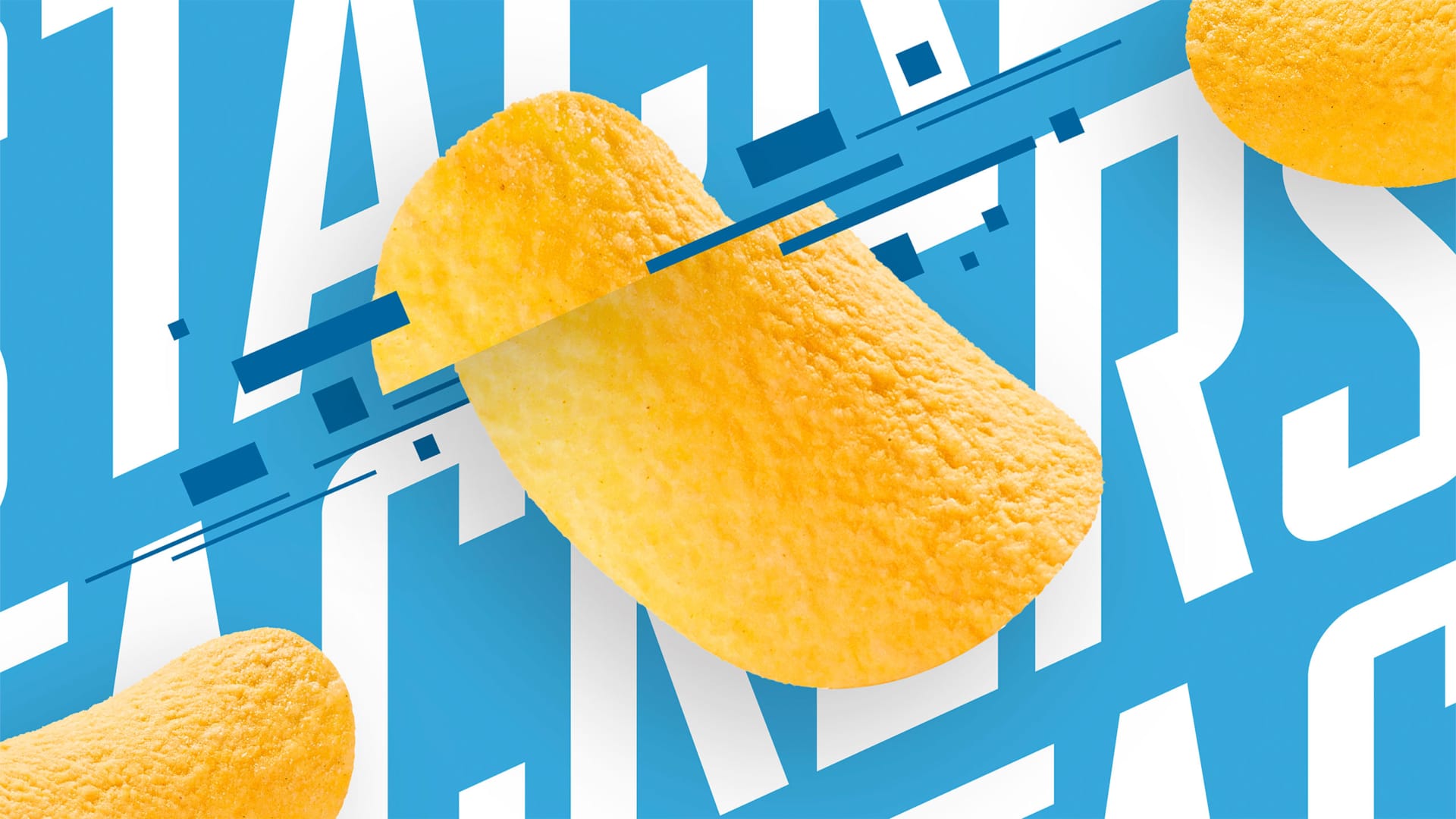
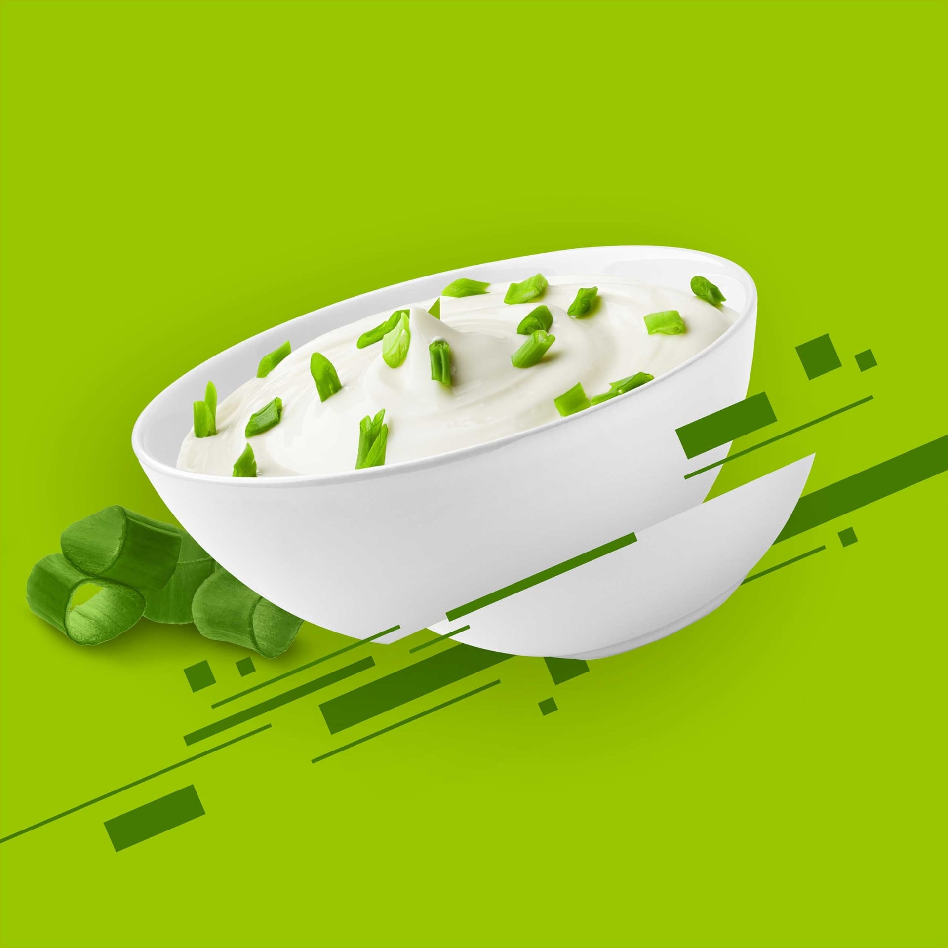
The striking glitch effect in the key visual makes the stacked chips on the tin literally explode. A little foretaste of the flavor kick later on the tongue. With the tasty touch shots, which immediately whet the appetite for spicy potato chips, the design makes the product tasty even before you lift the lid.
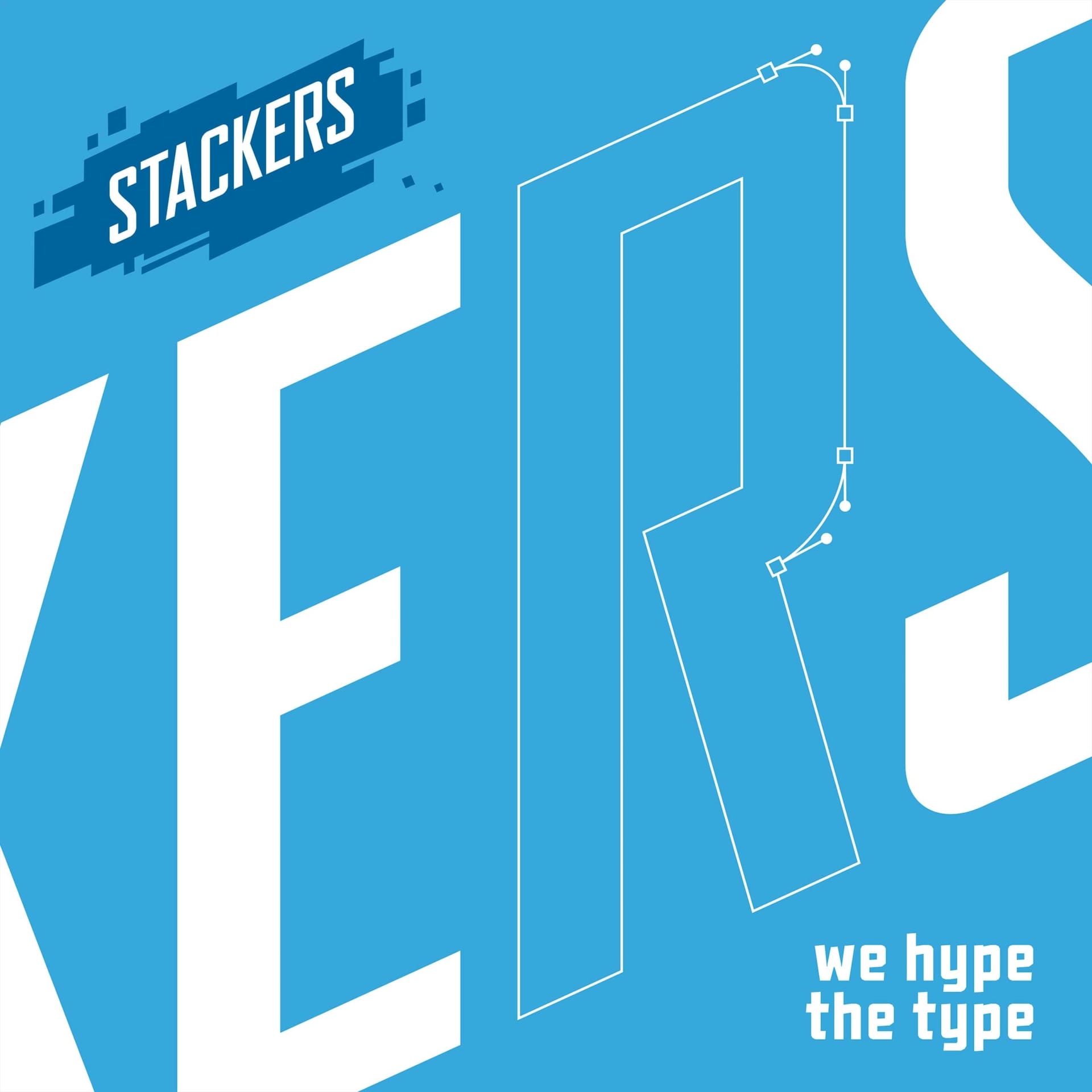

Stack it. Love it. Design it.
The Stackers bring Crunchips into a new segment – and we were allowed to develop the brand image for it. From the precisely balanced logo development to the careful choice of colors, the packaging not only conveys varieties, but also brand power.
This is how brand building through design works.
Thanks to a well thought-out all-round design, a clear structure of the packaging elements and modern staged moments of indulgence and crunch, the result is packaging design that sells – not just stacked potato chips, but heaps of brand experiences.
Does your brand need more bite?
Let’s crunch!