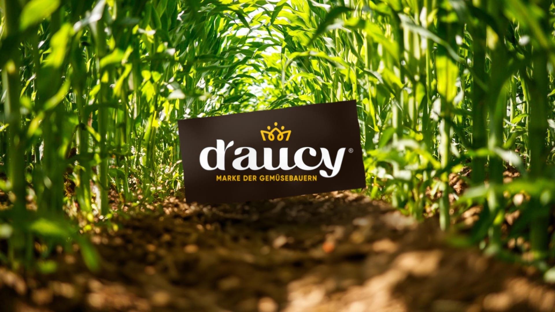
d’aucy
The vegetable growers' brand.
Services
The brand relaunch for the German-speaking market. Our task was a comprehensive packaging redesign with strategic repositioning: moving away from a functional, technical appearance towards an independent brand attitude that stands out on the shelf and sticks in people’s minds.
Initial situation.
The traditional French brand d’aucy has stood for vegetable expertise from producers for decades. The aim was to reinterpret this origin for the German and German-speaking market – clearer, of higher quality and closer to the expectations of a conscious target group.
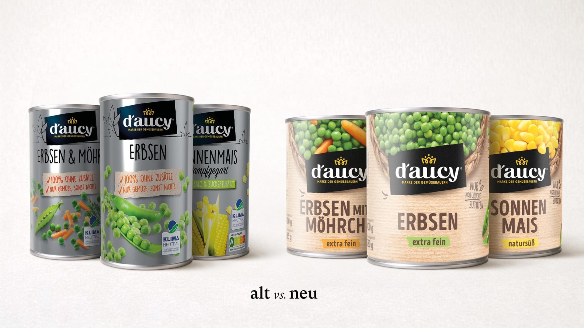
The previous image was strongly product-oriented and technical: silver cans, dominant images, factual information. In the competitive environment, this made the brand appear interchangeable – with little emotional connection and little visible competence of origin.
Especially in a market dominated by promotional print and private labels, visual clarity is decisive for perception and value. The brand had substance – but its appearance lacked strategic sharpness.

The vegetable growers’ brand.
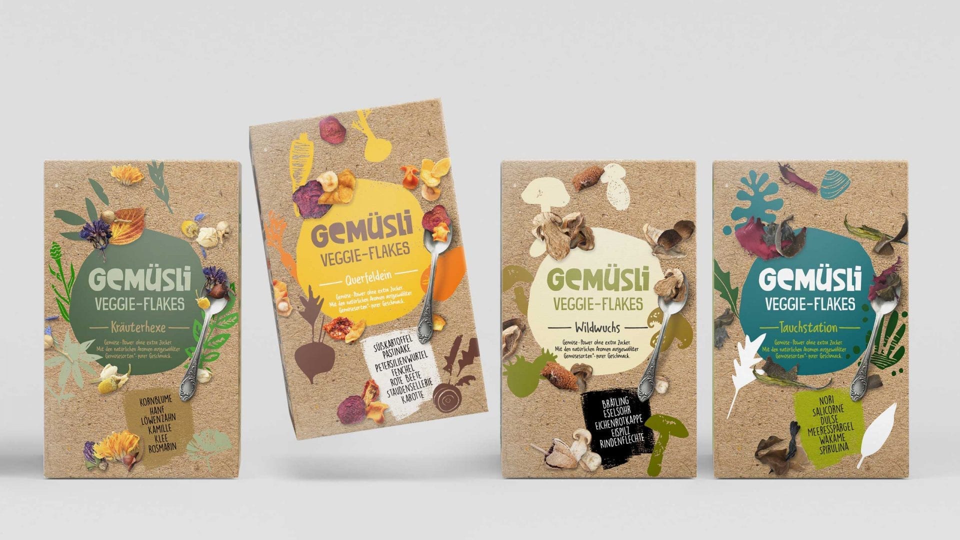
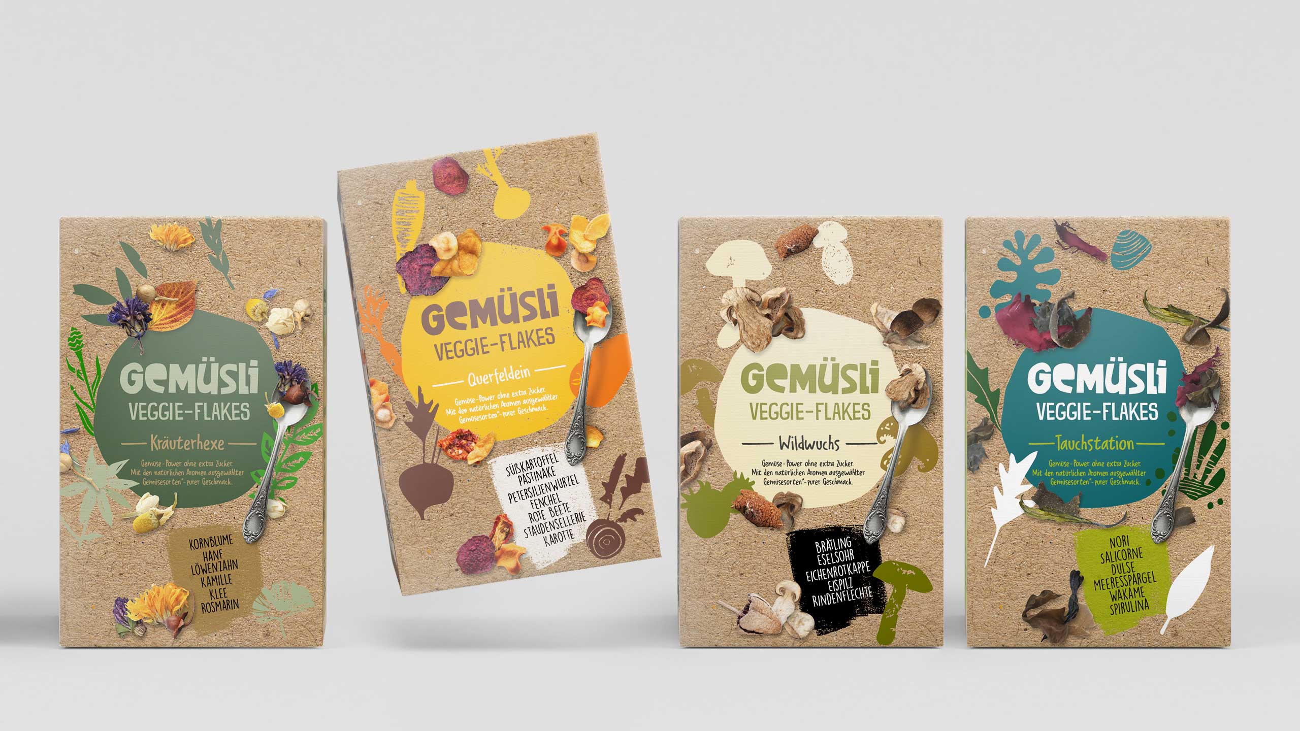
The aim was not a cosmetic update, but the development of a clear position: more competent, more natural, more credible. The central differentiation lever was the agricultural DNA of the brand – as an attitude and as a visually tangible promise. The positioning core: “The vegetable farmers’ brand ” – as an anchor for origin, trust and quality.

From technical to natural. From functional to emotional.
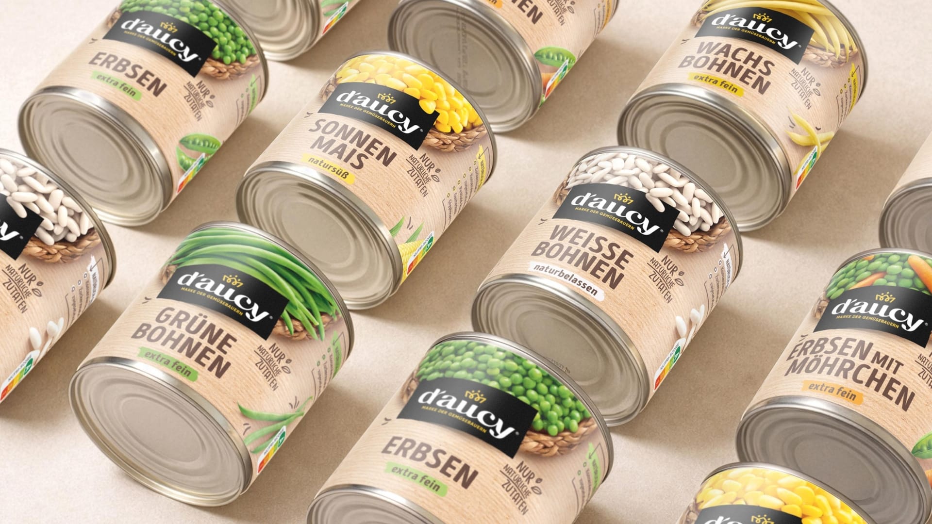
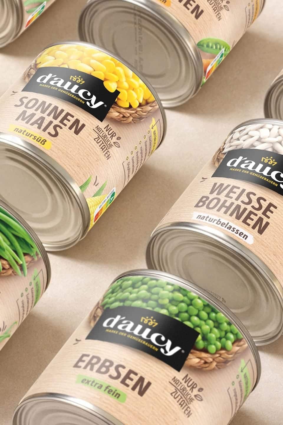
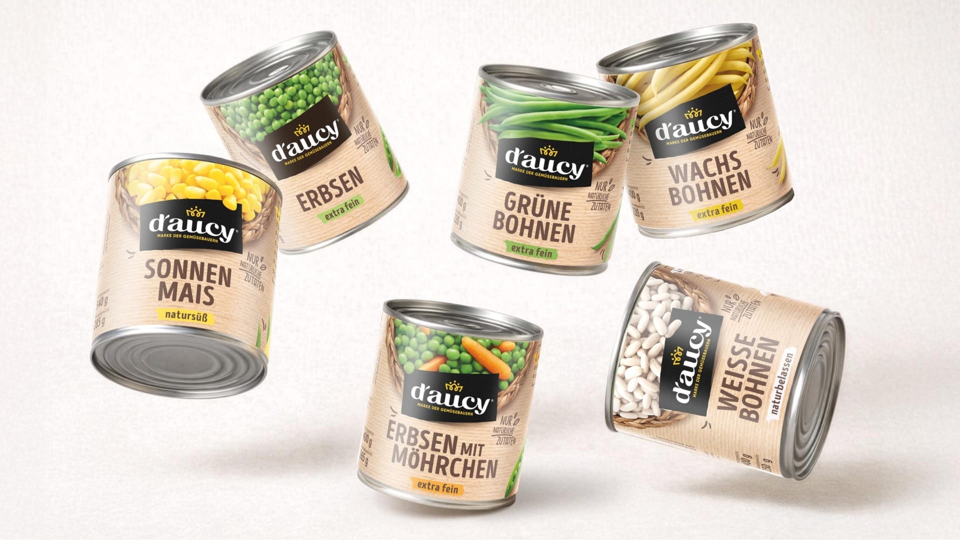
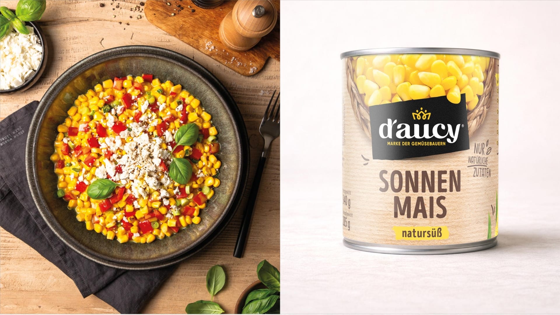
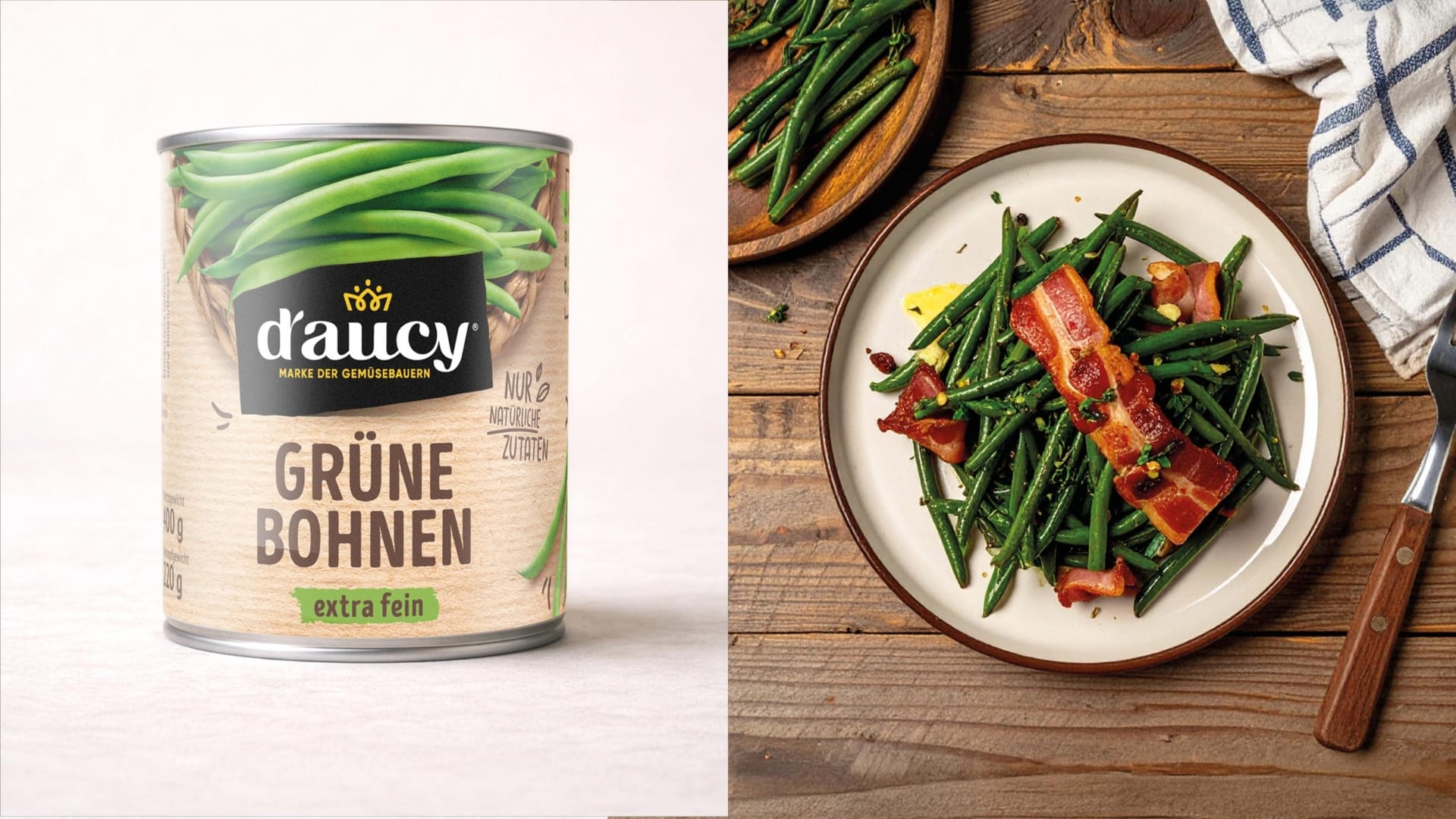
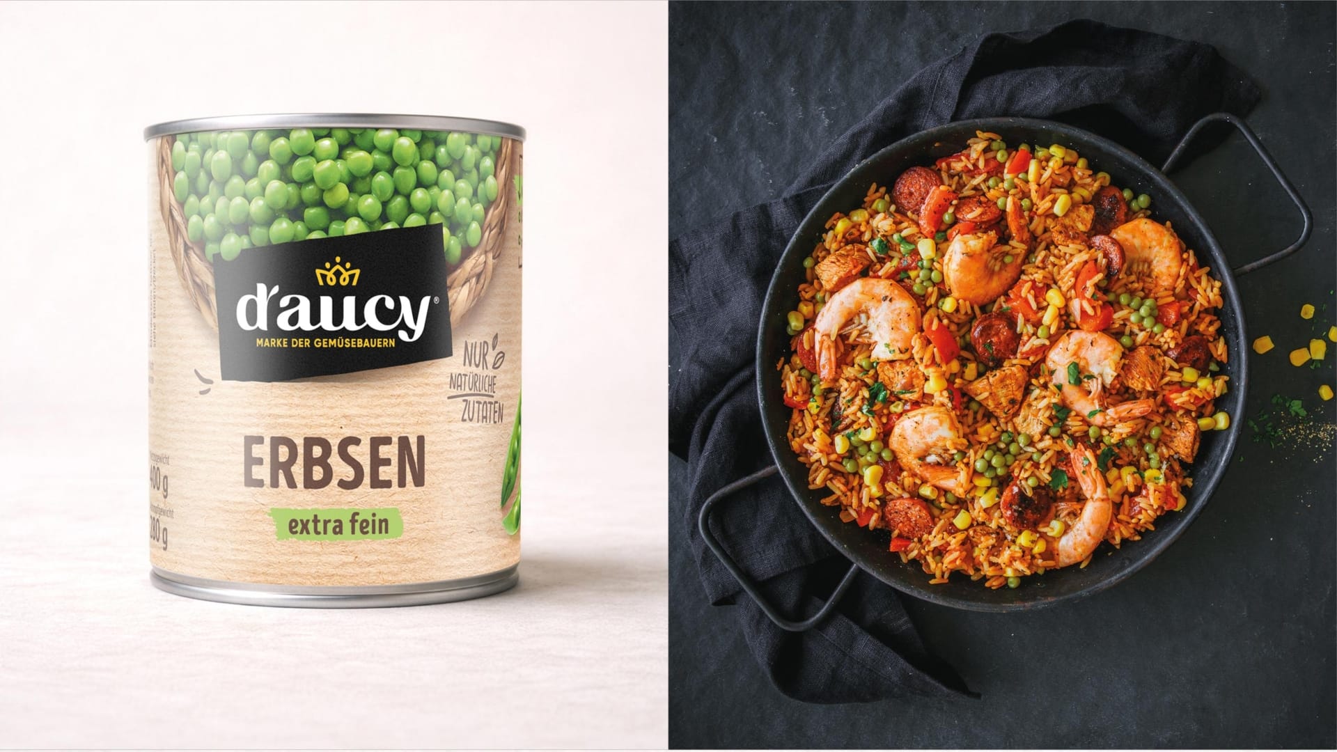
With the relaunch, we have taken d’aucy back to its roots in terms of design: away from the technical commodity look and towards a brand world that makes craftsmanship and naturalness visible – without losing sight of the shelf logic.

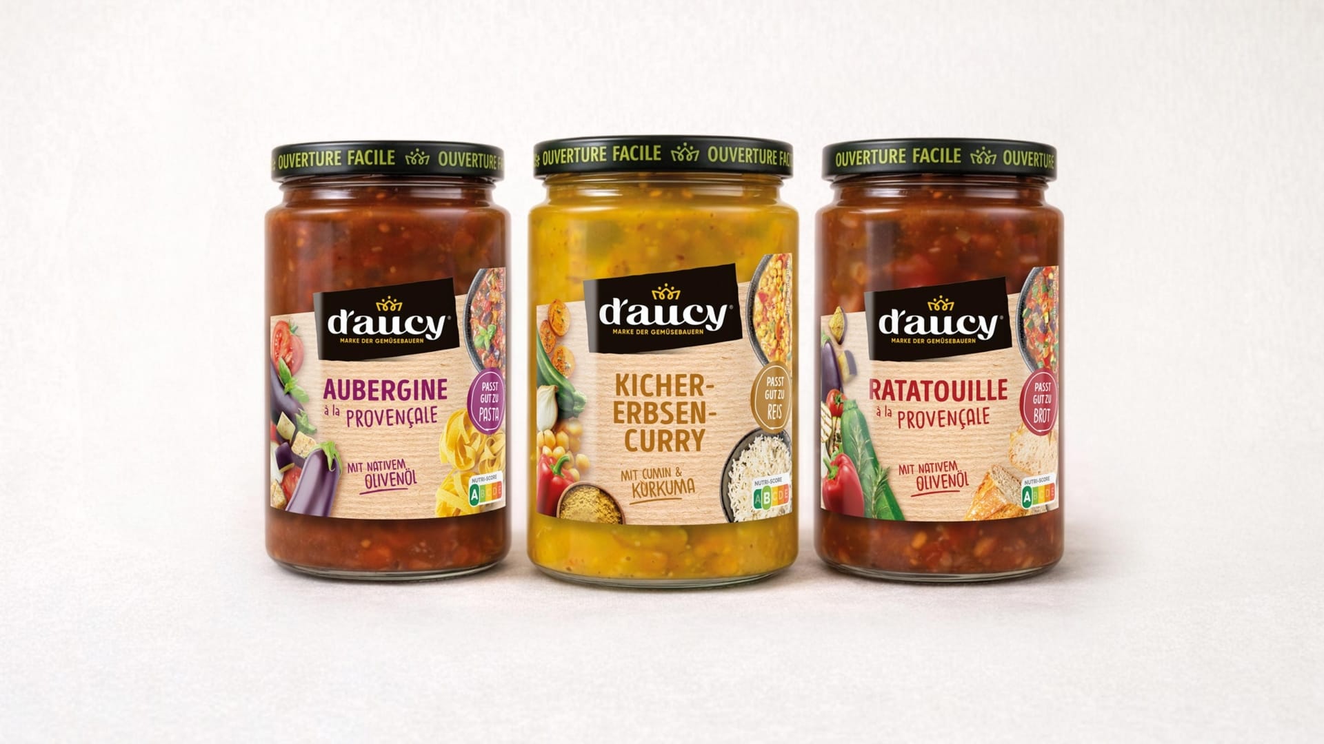
The new brand world.
The new design translates naturalness and quality into an independent visual language – with a clear system across the entire range.
- Warm, natural shades instead of a technical silver look
- High-quality, calm typography with a clear hierarchy
- Reduced, honest product presentation
- Stronger emphasis on origin and brand identity
- Clear orientation on the shelf thanks to differentiated variety labeling
The black brand panel acts as a concise sender: it creates recognizability, bundles the range and acts as a visual signature on a highly competitive shelf.
Rethinking shelf impact.
The strategic realignment becomes clear in a direct comparison of “old vs. new”: a functional canned product becomes a strong brand presence with emotional quality. The new design creates more value, more naturalness and a significantly stronger differentiation in the competitive environment.
- More perceived quality and trust
- More differentiation from private labels
- More clarity and recognition at the POS
- Stronger brand management instead of pure price comparability
System instead of individual design.
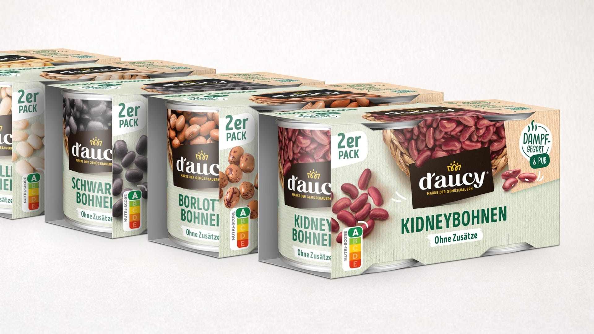
In addition to the individual products, the multipack system has also been rethought. A modular design ensures consistency across formats – from single packs to multi-packs – and enables clean scaling for variety, product lines and future expansions.
French origin. German market requirements. A clear brand attitude.
The relaunch is a change of position – not just visually, but strategically: d’aucy appears on the German-speaking market as an origin-based, independent brand offering that creates value through attitude and clarity.
- Significantly stronger shelf presence
- Higher perceived value through reduction and materiality
- Consistent brand presence across all containers and pack formats
- Sustainably scalable design architecture for product range and innovation