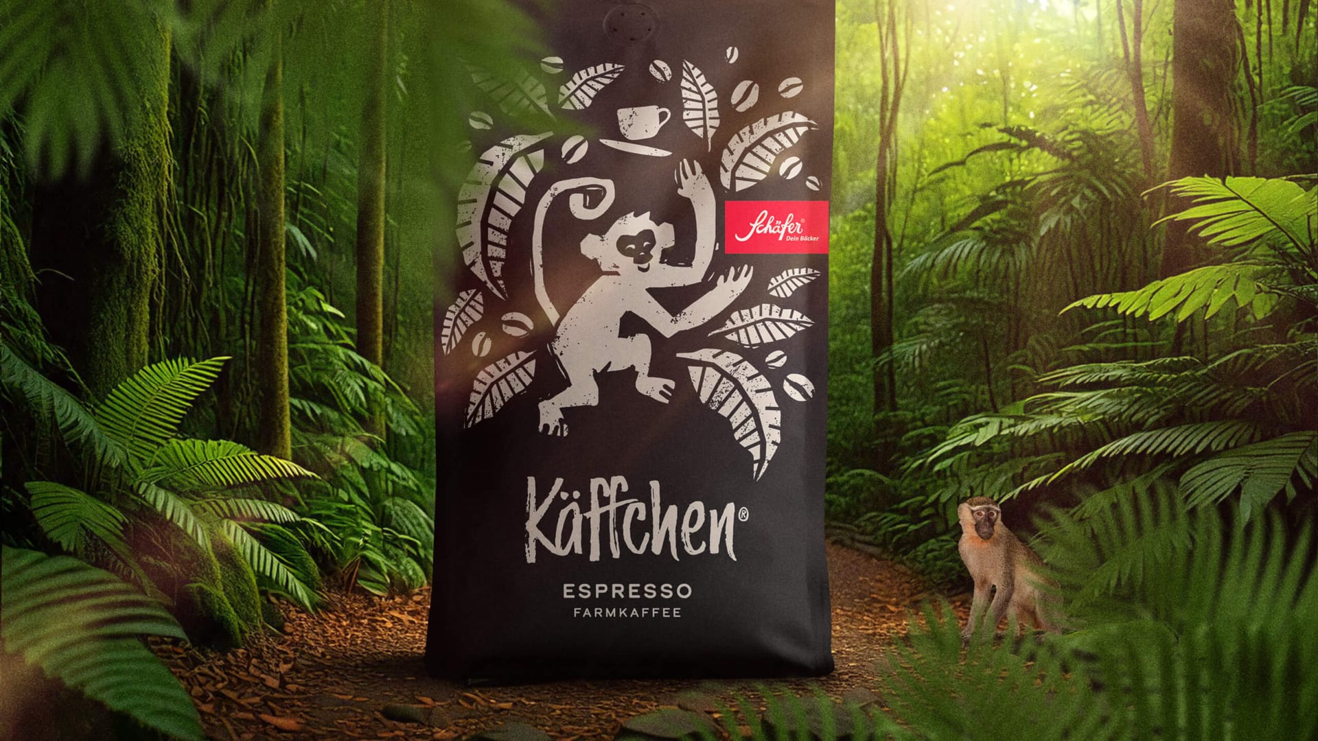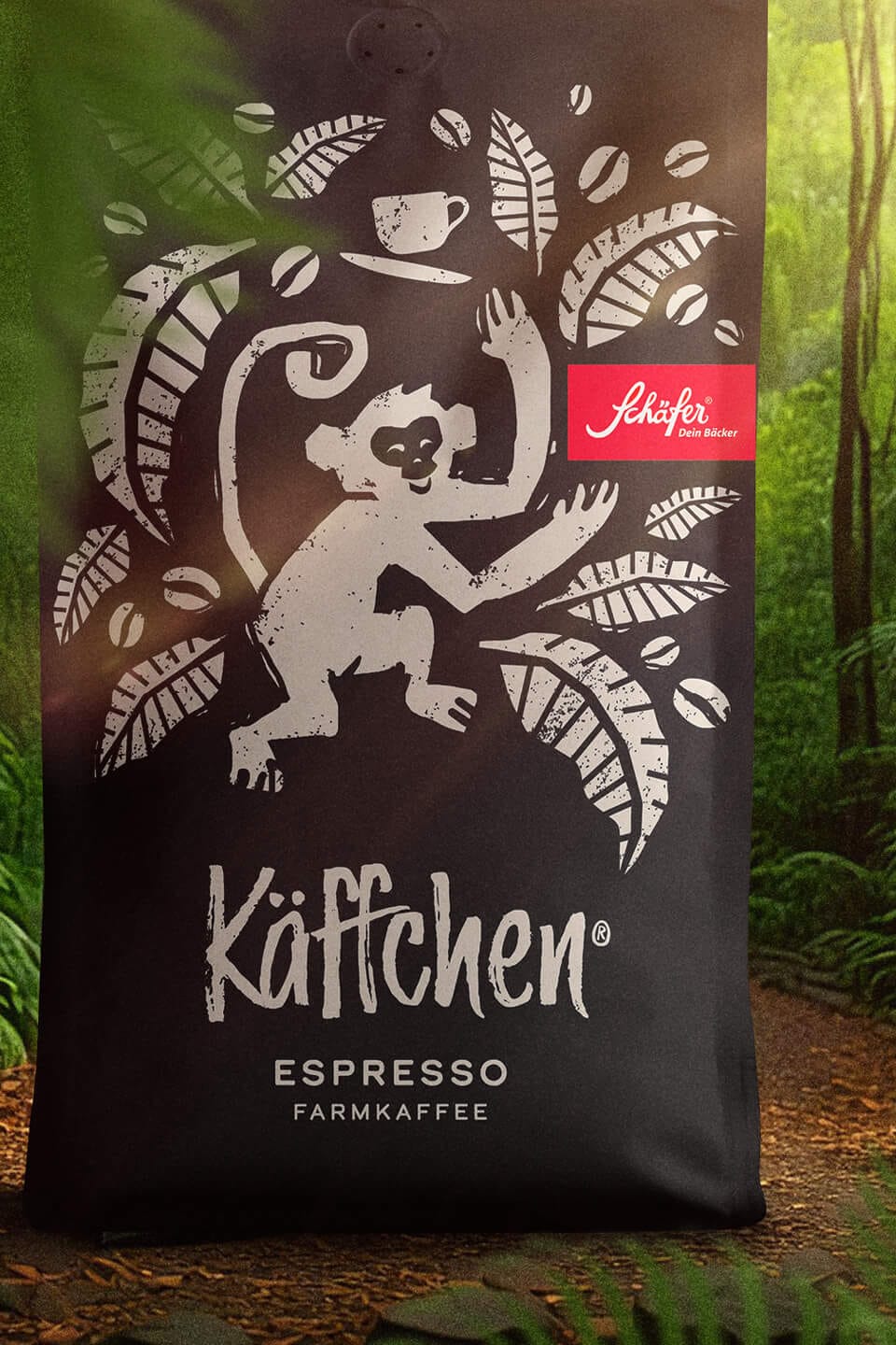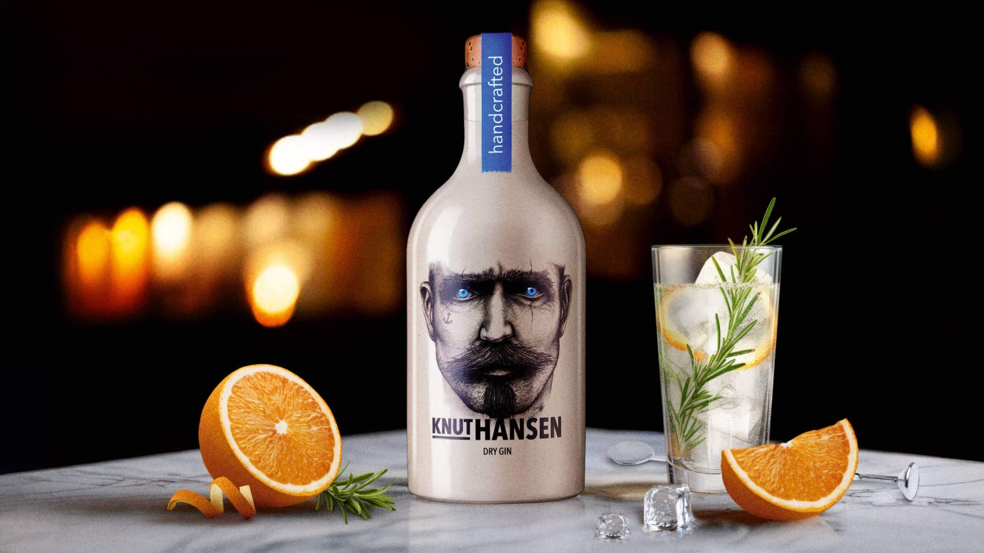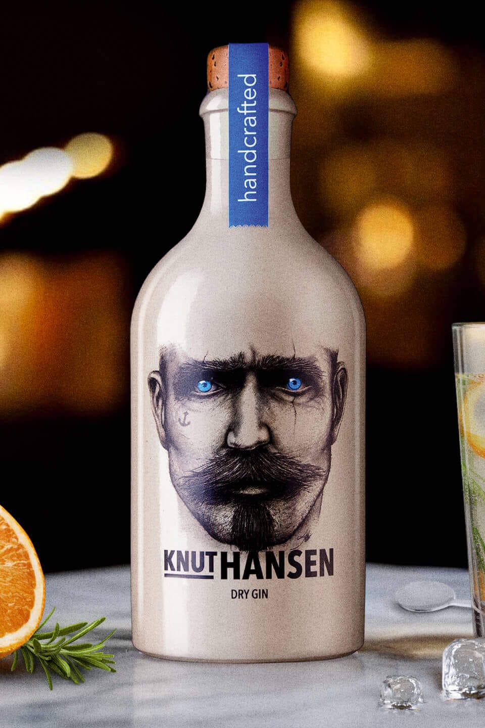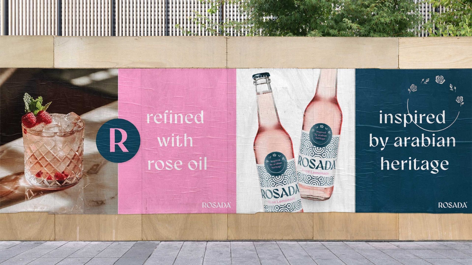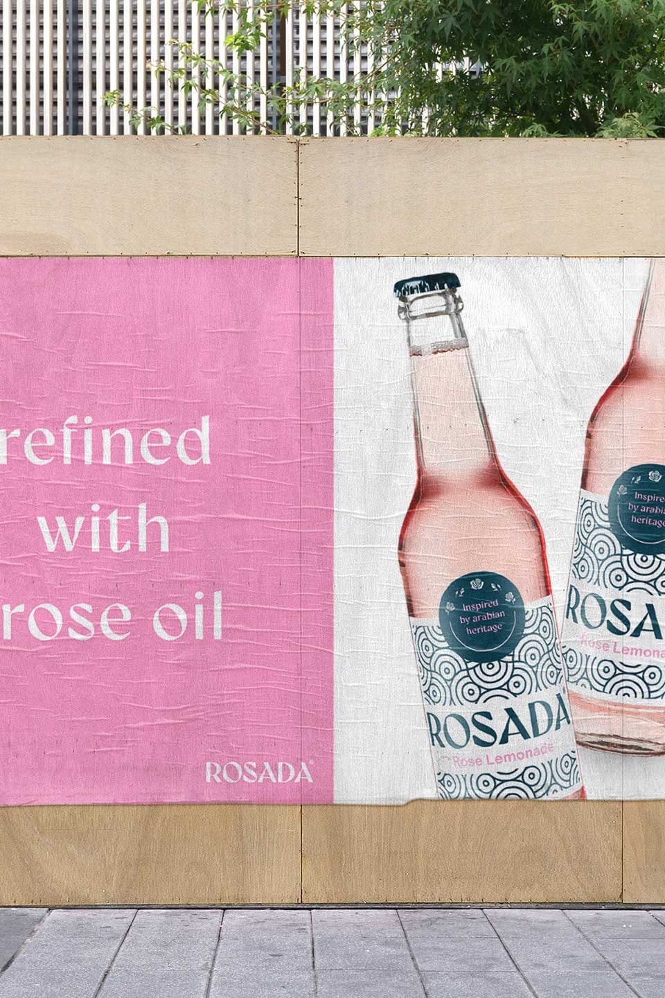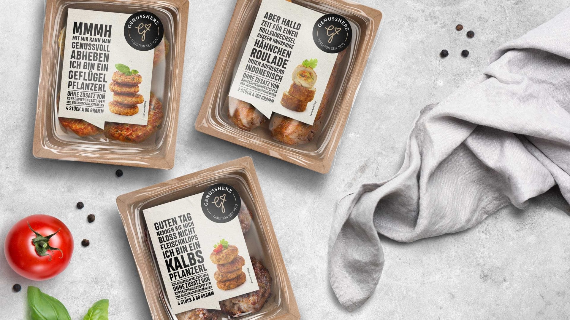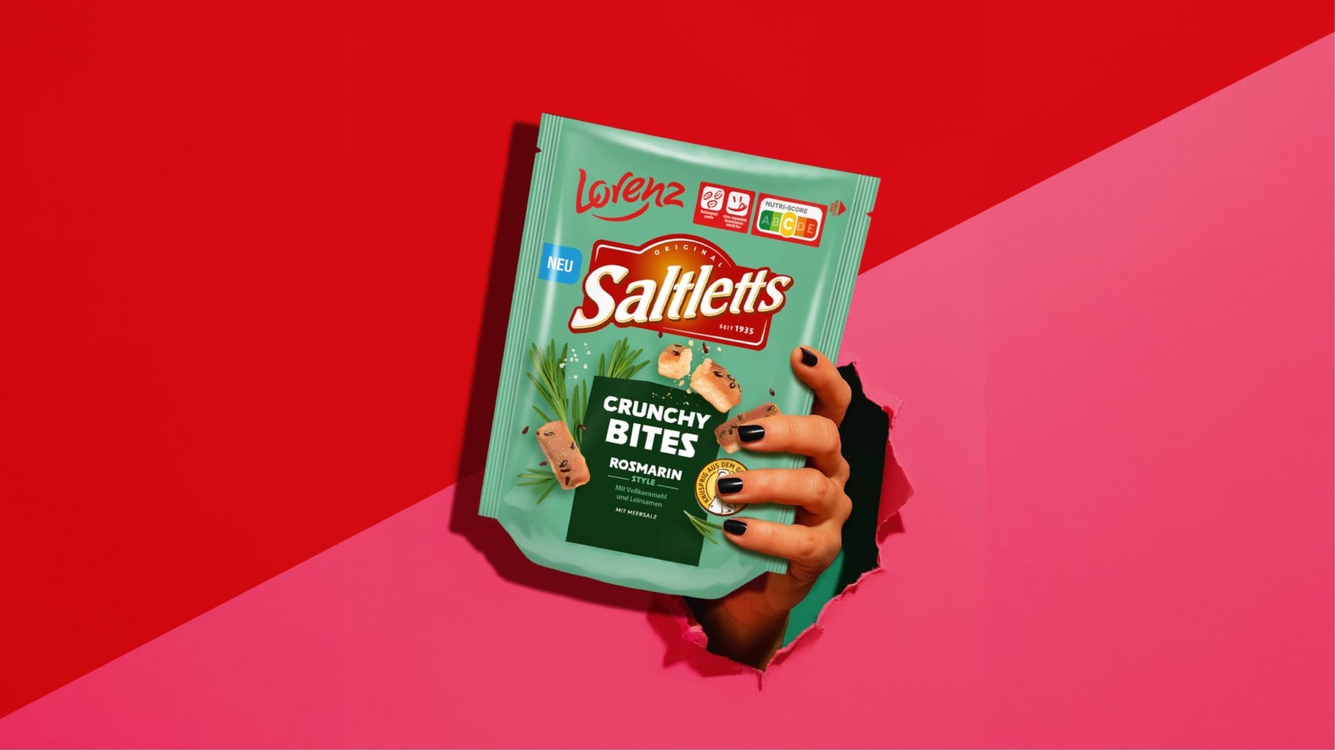
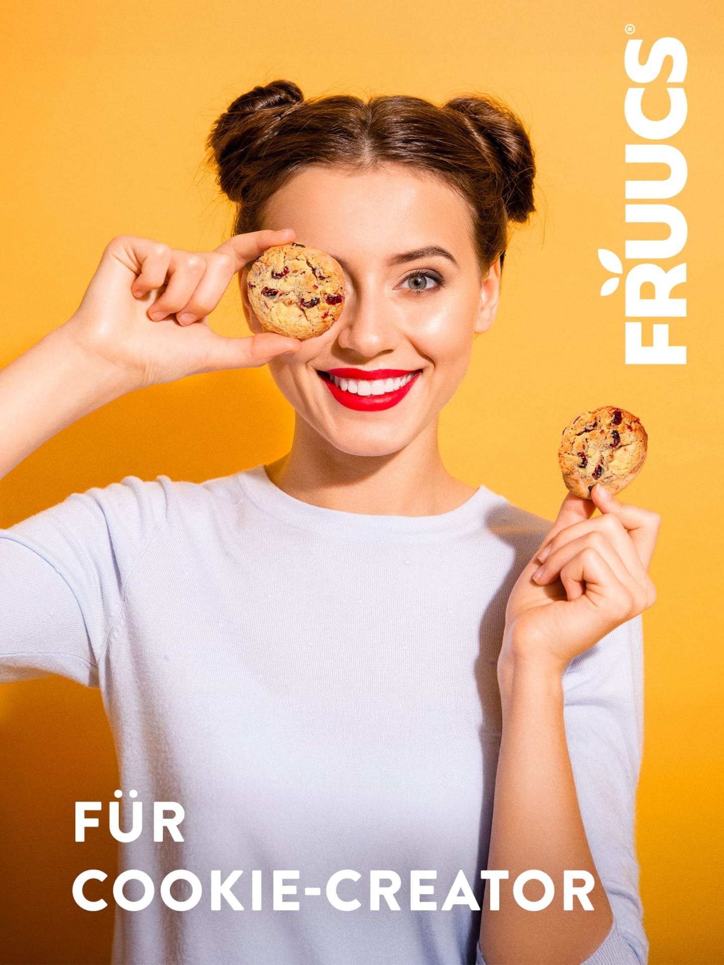
FRUUCS
100% pure fruit.
Services
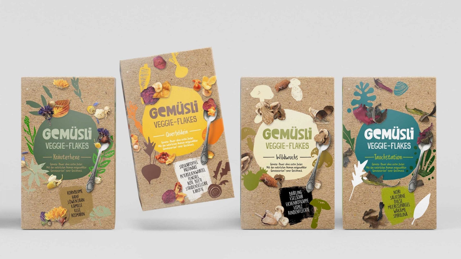
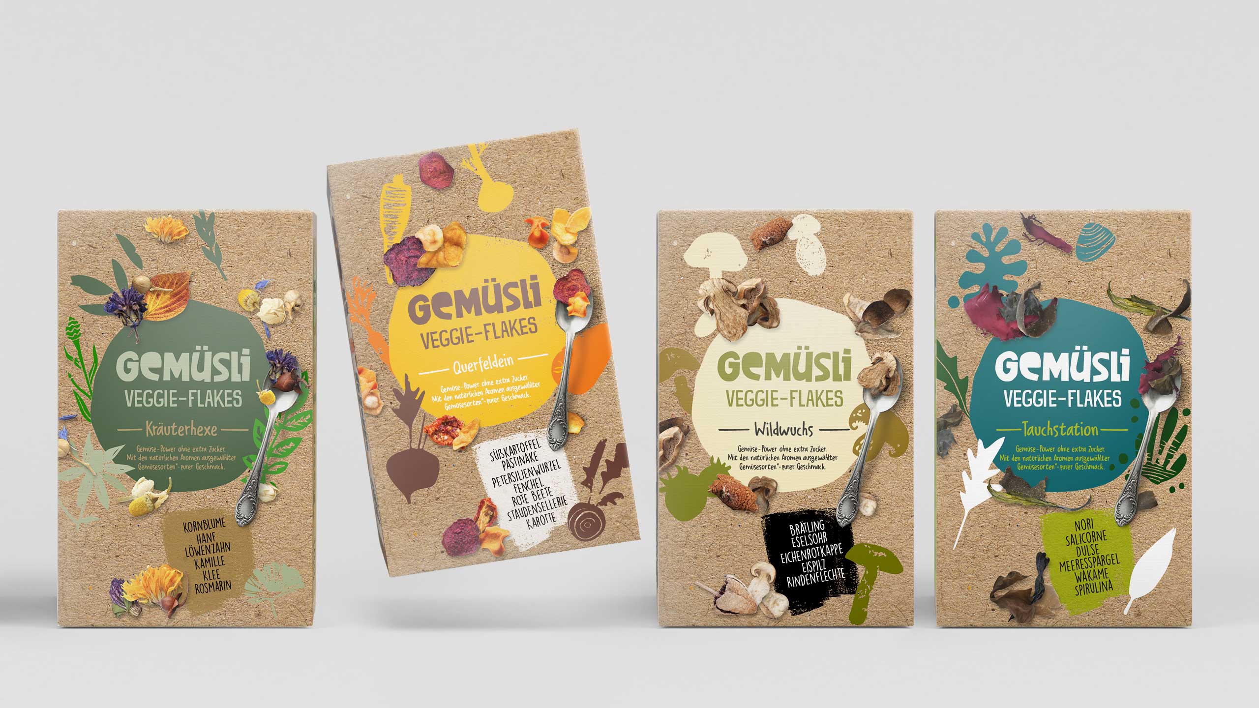
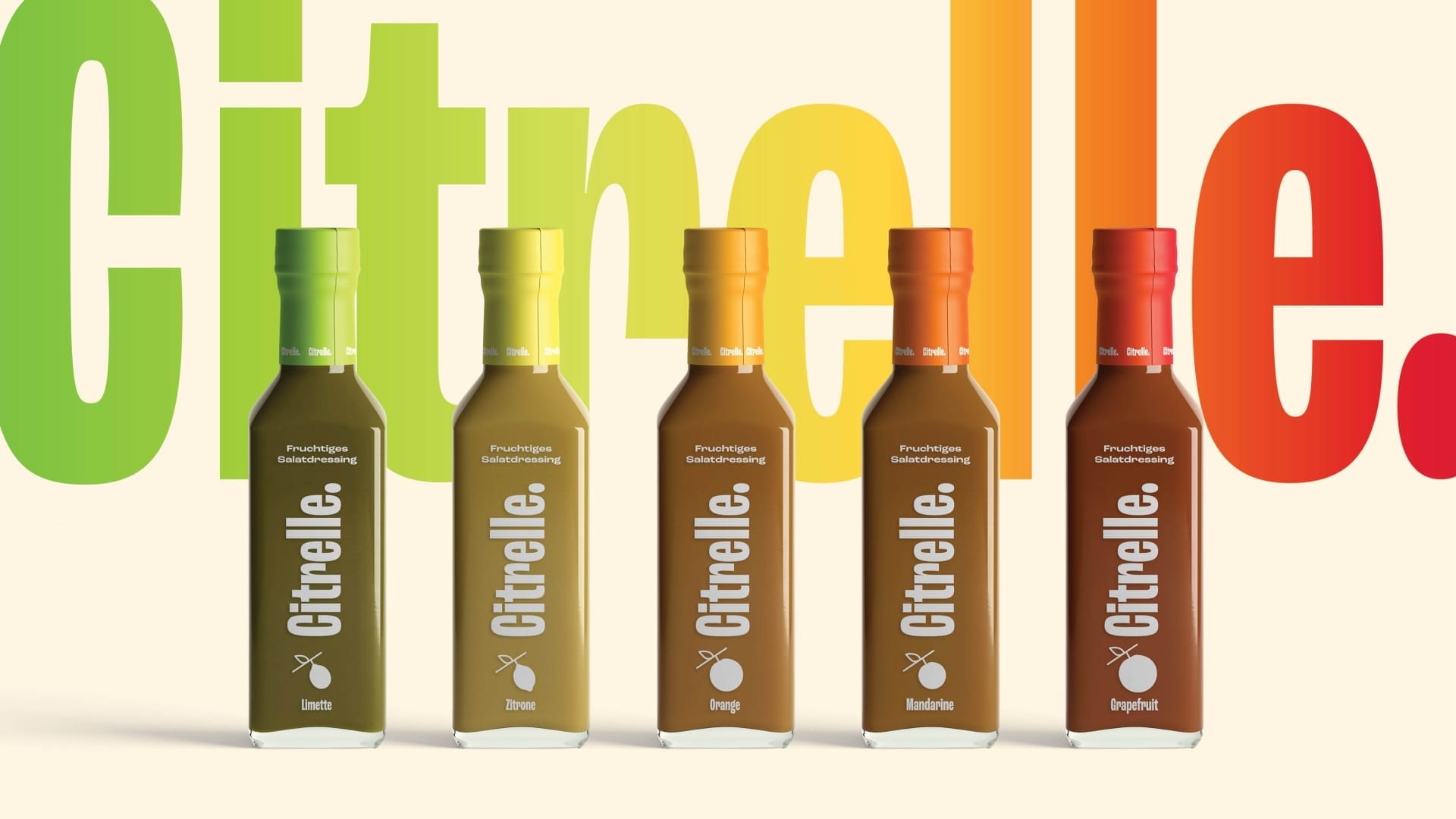
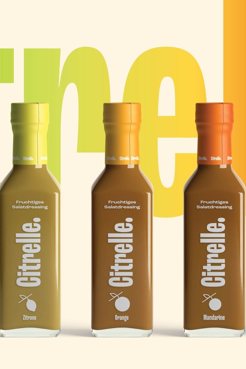
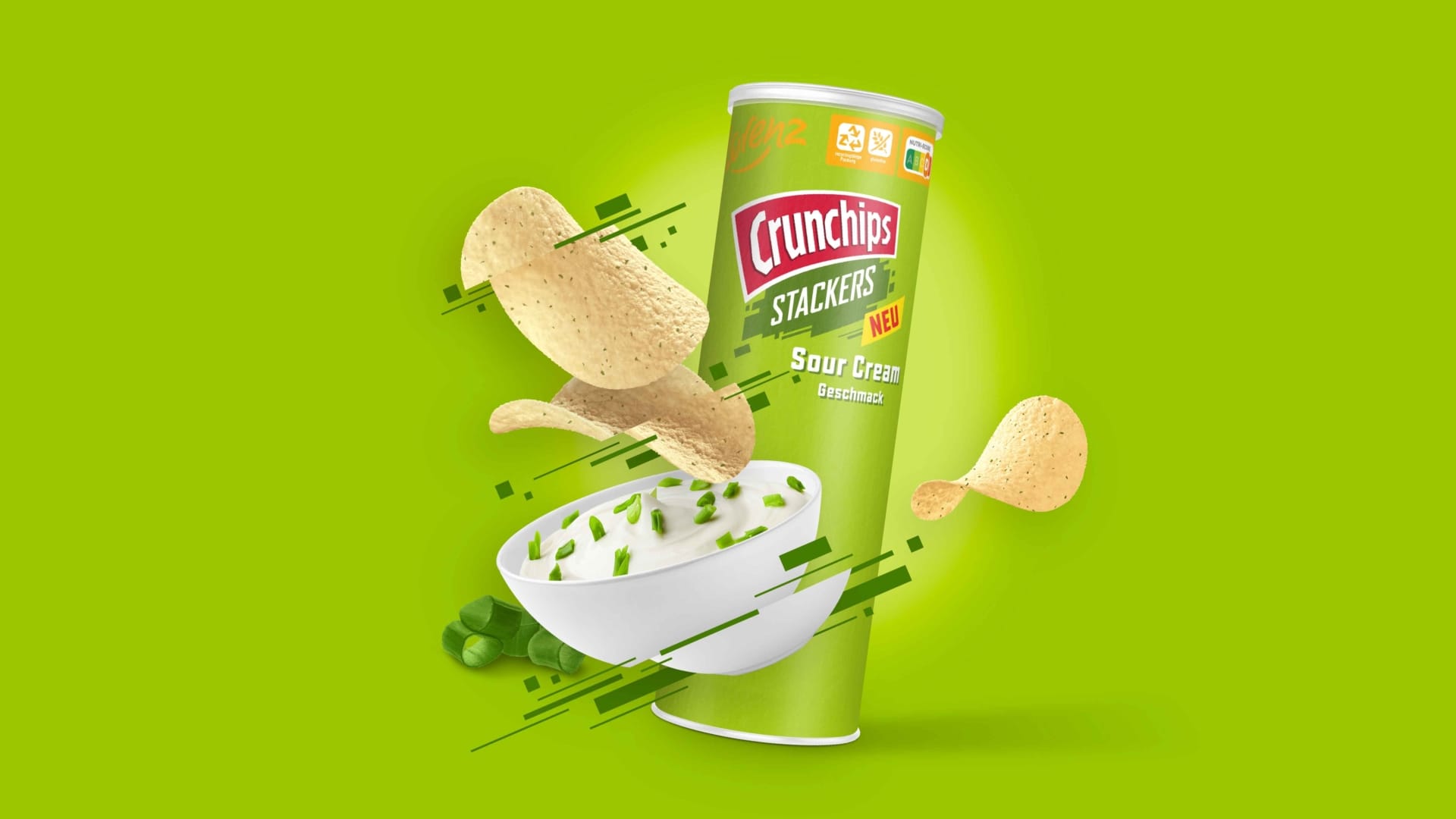
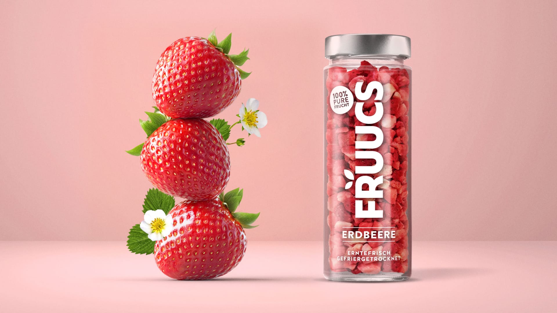
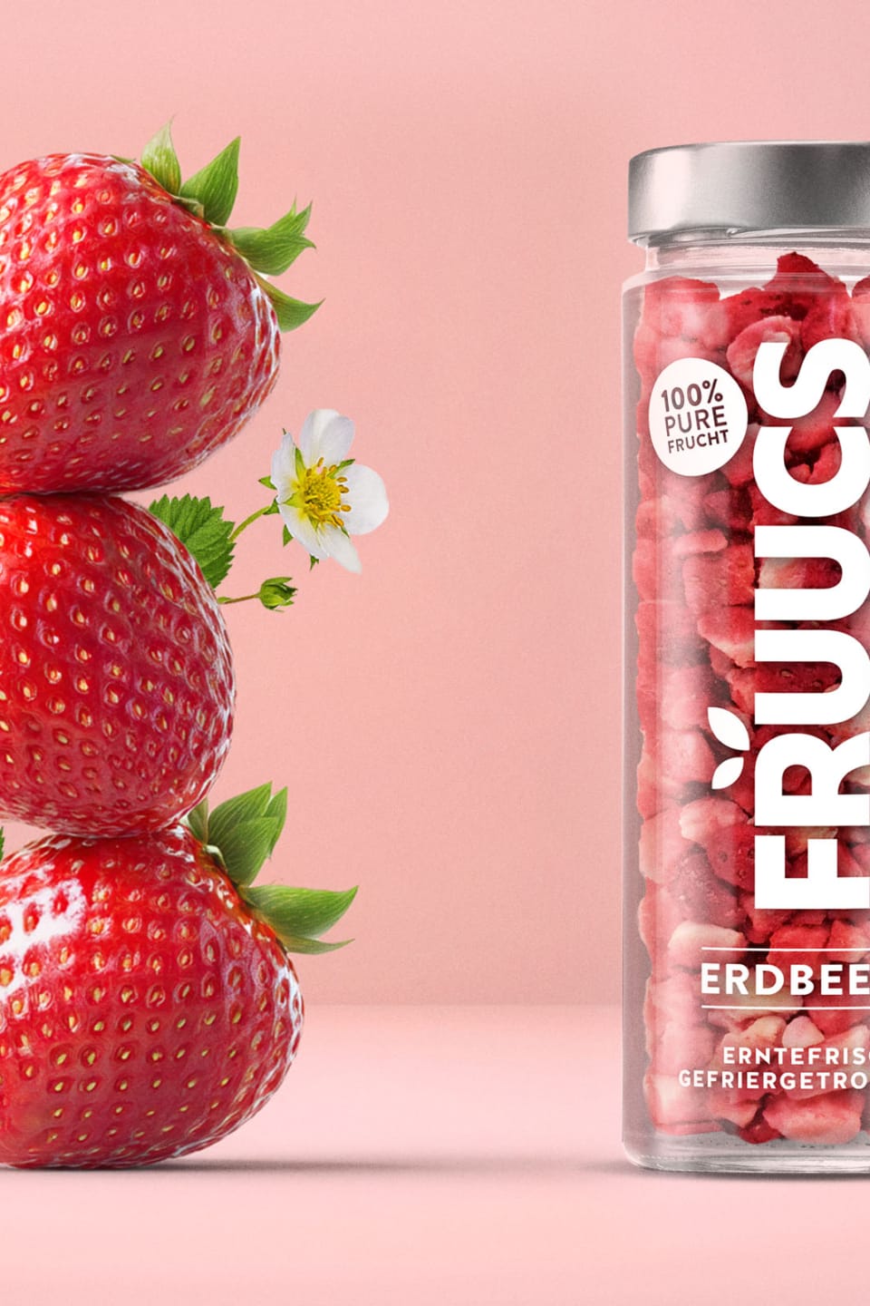
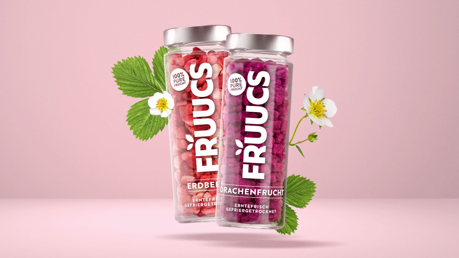
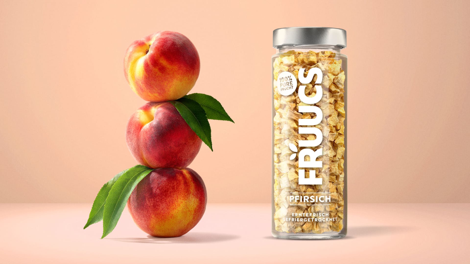
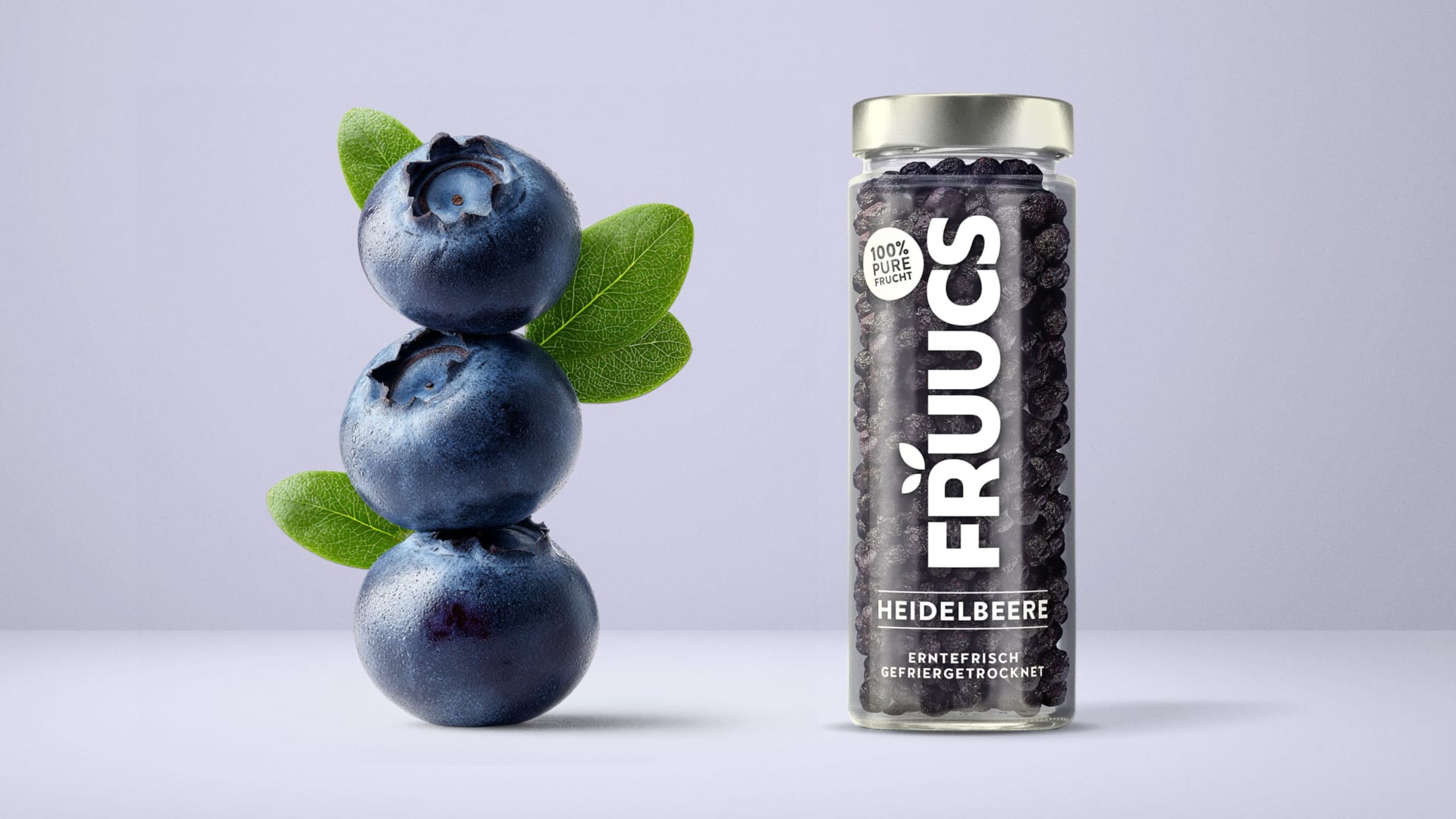
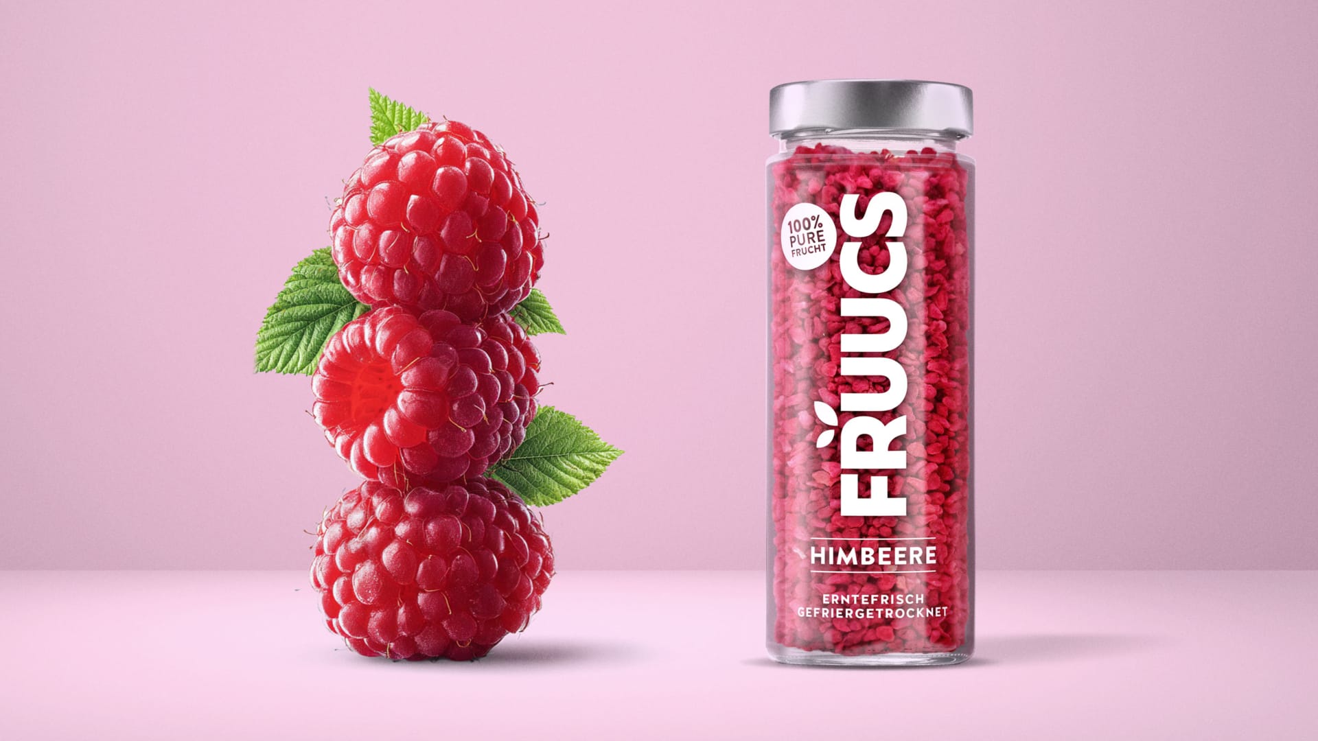
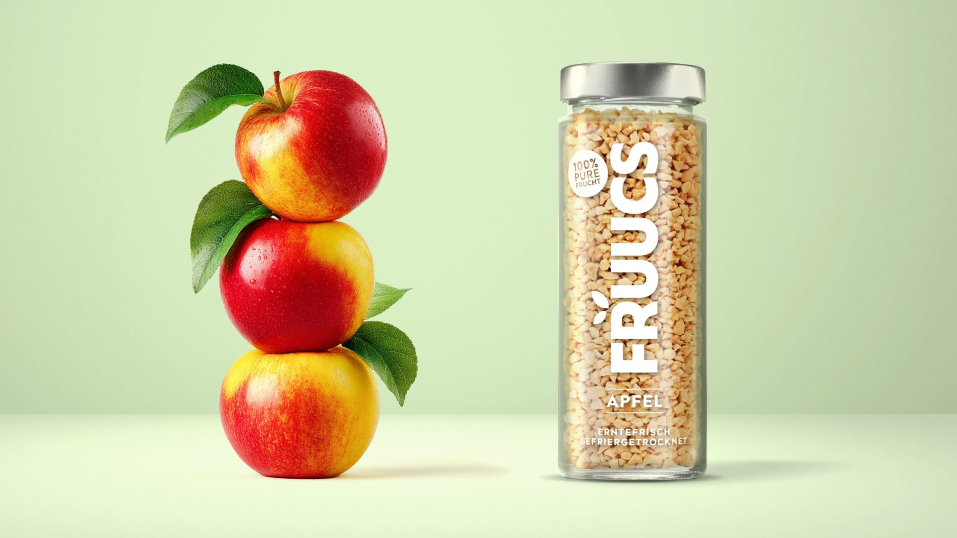
Our packaging design for FRUUCS tells the pure story of nature. From the orchard to the food retail shelf. The freeze-dried fruit takes center stage. Colorful, bright, lively – this creates an emotional connection to the product that you can see and taste.
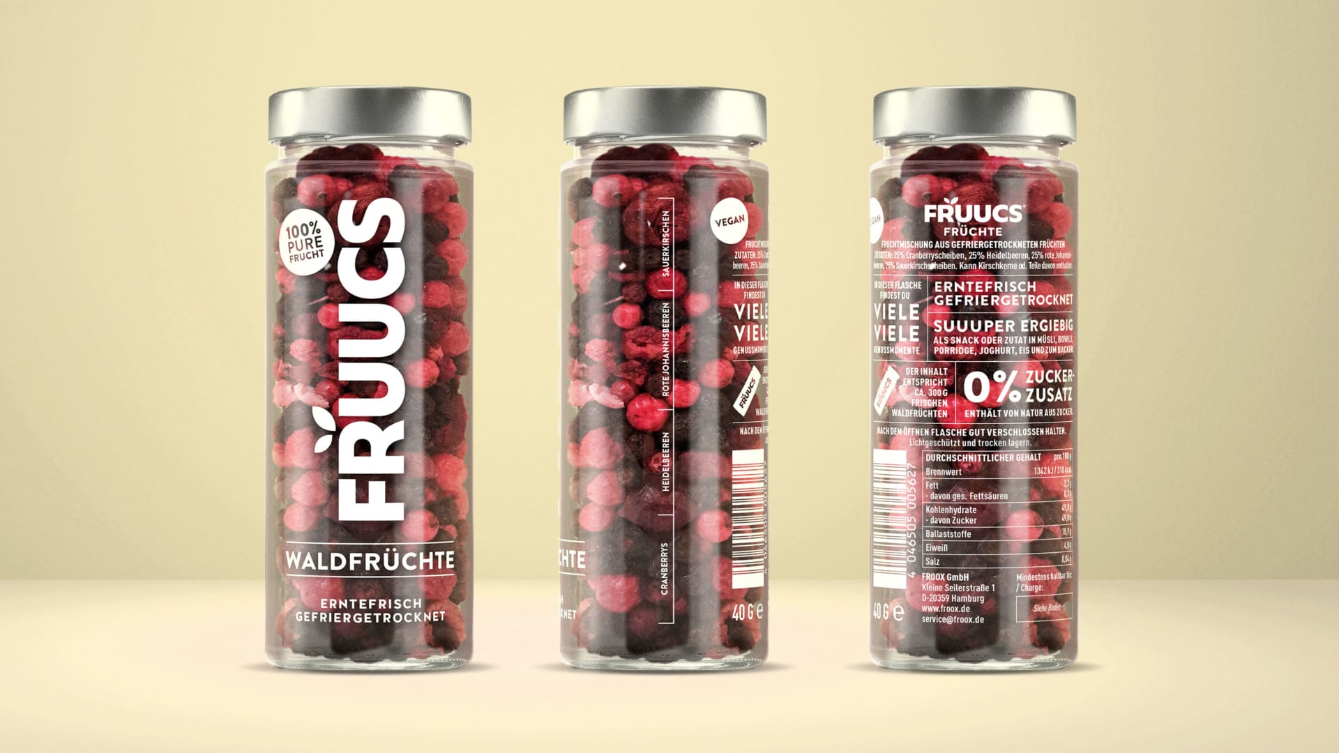
Not only pure fruit but also pure packaging: minimalist design in a directly printed glass cylinder.
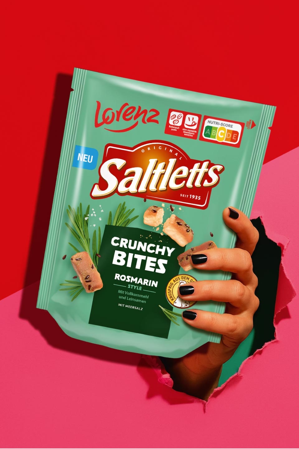
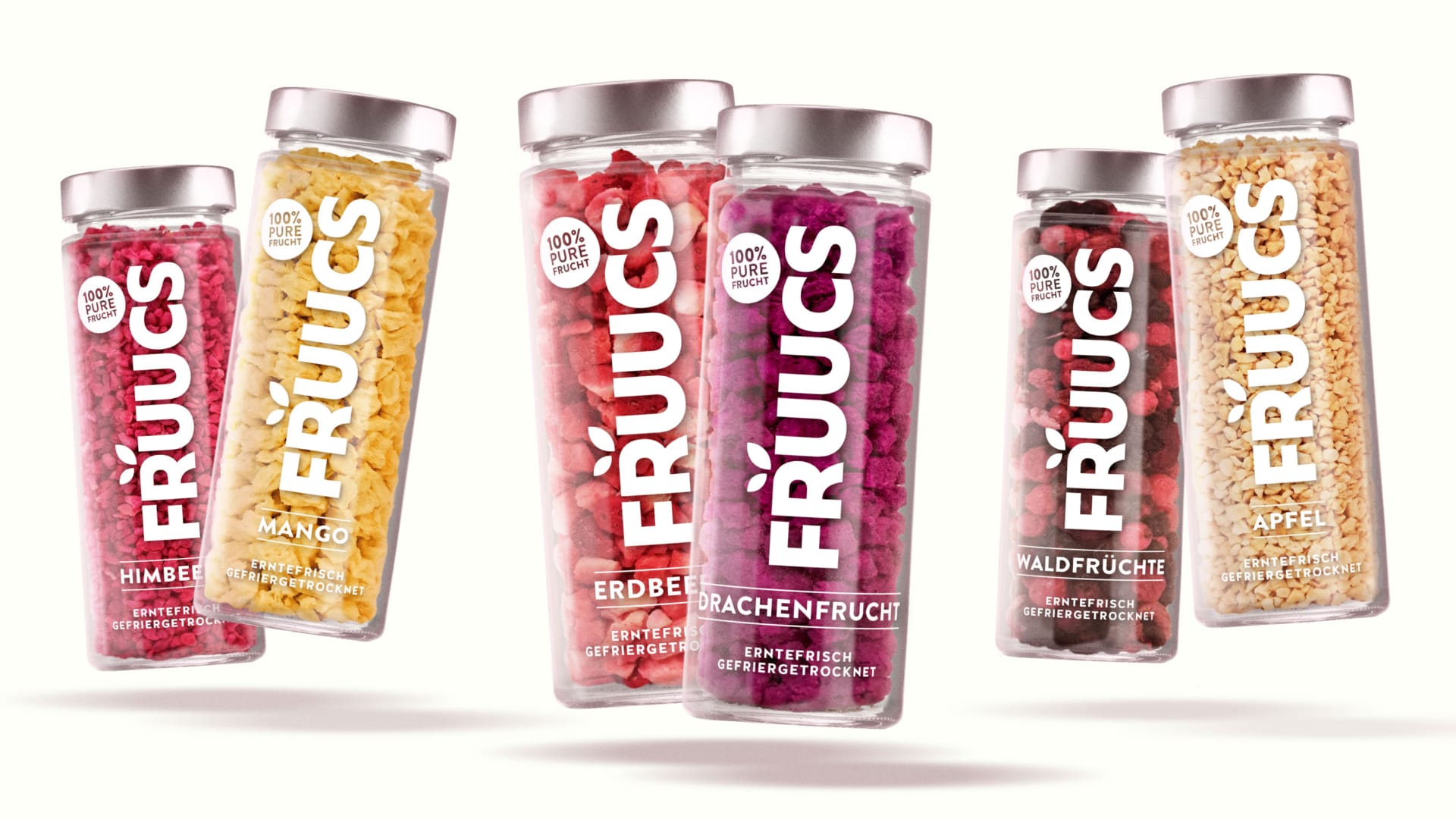
From rich strawberry red to deep blueberry blue. Each fruit provides its own natural color for a colorful variety in a fruity range with a high recognition value. The single-colored, white look of the umbrella brand with its fresh, minimalist style brings lightness to the shelf – and differentiates itself specifically in the snack segment.
Visibility that creates trust
The large white variety lettering on the delicious, freeze-dried fruit is a real eye-catcher. The real product colors and the minimalist glass packaging create a direct, visual approach to the product that conveys naturalness and invites you to grab it.
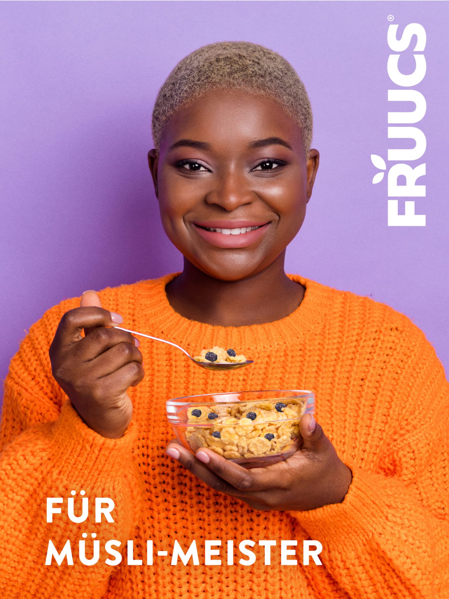
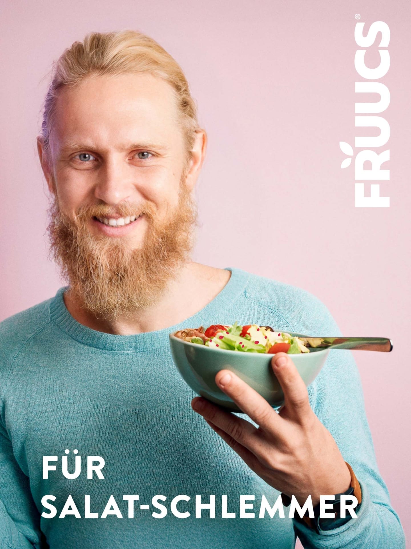
Every variety a statement
The minimalist, modern FRUUCS logo is complemented by graphic elements that combine naturalness and fruitiness. Stylized leaves, soft curves and a sans serif typeface form a brand that embodies clarity, freshness and purity – snackable, lovable, memorable.
Fruuty Shelf Impact
Clear wording, design without frills, bright variety colors and clear structures ensure strong visibility at the POS. A design that arouses curiosity – and sticks.
Work up an appetite?
Whether it’s a snack, topping or breakfast booster – we design packaging that communicates freshness and showcases naturalness. Let’s make it pop! 🍓✨